0

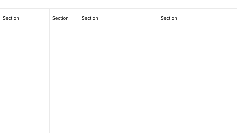
Consider the following layout:

sections with plain white background colours

It's divided into four horizontal sections using borders, each with their own heading.

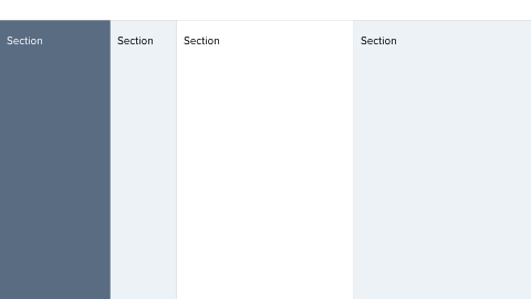
On the web and desktop, it's a common pattern to give sections a distinct background color, like this:

sections with distinct background colours

I prefer verifiable and understandable design decisions. That being said, both versions appeal to me for reasons I find hard to completely rationalise.

I can think of the following properties:

Same background color for each section

  • neutral, objective, sections have equal visual importance
  • optimal contrast between background and text
  • coloured elements immediately stand out
  • quiet, pure, serene aesthetic

Distinct background colors

  • increases recognizability, sections get associated with their color
  • ability to alter visual weight / balance using color
  • possibly a more dynamic, lively aesthetic
  • allows for branding

Is there more to it? Any research / previous experience I can base my design decisions on?

2 Answers 2

1

That seems like a pretty good breakdown of each technique.

I would emphasize that most distinctly (in my opinion), with all backgrounds being white (and no context as to where this pattern is being used), I would not assume there to be any hierarchical relationship between the sections (simply showing "details, details, details, ...").

However, the shaded regions (again, without any context) seem to imply that there's a relationship between them, perhaps the leftmost section is a higher-level category that becomes more granular in the next two sections, then the last perhaps contains details (showing something like "categories, subcategories, items, details").

The relationship that the shading seems to communicate is similar to the Macintosh file explorer (though the hierarchy here is illustrated just with position, "active" selection styling, and folder arrows that imply nesting):

Macintosh file explorer

0

Sections need to be distinguishable. Doesn't have to be by different background colour.

On my site, which is mainly and education site, I have a left menu with a distinct dark green background. The main content div has a consistent pale yellow. Photos are at least partially out of the main text stream, and are boxed, with italic captions. Users can either flow past the pictures or stop and check them out. The use of italic captions mean that readers can filter it out easily.

My thinking is that the menu is enough different in purpose that I want people to be able to easily ignore it when viewing content. For stuff that is consumed together, I want the transitions to be easy.

Your Answer

By clicking “Post Your Answer”, you agree to our terms of service and acknowledge you have read our privacy policy.

Not the answer you're looking for? Browse other questions tagged or ask your own question.