9

I'm exploring a new format for a calendar module. It only uses two lines for the dates causing it to be more of a landscape format than square.

enter image description here

The only problem is for users deciphering how the dates line up with the days of the week. So I used a legend and shade/tint coding system. I am just having a tough time determining how innate the usability is. If anyone could provide some feedback that would be much appreciated.

*Update

Here is another version with the weekends shaded and the weekdays tinted.

enter image description here

*Update #2

Here is another version based on @DanStiefel's Answer.
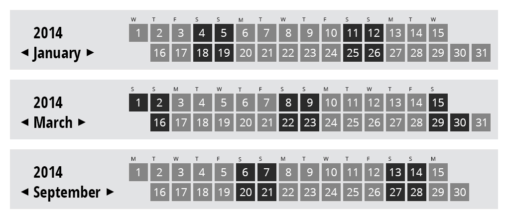
enter image description here

4
  • 3
    Not sure why you are redesigning the calendar format and in what context you plan to use it but the format you've shown is confusing as there are different shades on each day and I have to look at the legend to see what they mean...very hard to use. If you didn't have "March 2014" labeled, I wouldn't even know it's a calender. Commented Mar 5, 2014 at 17:35
  • Thanks for your input. Here is the module in the context of a webpage. kelliabeyta.com/sfdc/designs/sfdc-desktop-index1.html
    – sfdc
    Commented Mar 5, 2014 at 18:09
  • Is this a faceted search UI for filtering event data based on dates? Commented Mar 5, 2014 at 18:25
  • No, just simply a way to for users to get to that date's list of events on the events landing page.
    – sfdc
    Commented Mar 5, 2014 at 18:35

5 Answers 5

4

Alternate suggestion: Line up the four "center" weeks of the month vertically, with extra days before and/or after. This may take bit more room horizontally sometimes, but achieves nearly the same goal. This would require a different layout algorithm, but could probably be found from "perpetual calendar" tools.

Then instead of a color/gradient legend, the day letters could appear above the numbered days.

For March 2014:

s s m t w t f s s m t w t f s s m
1 2 3 4 5 6 7 8 9 101112131415
  16171819202122232425262728293031
1
  • Thanks @DanStiefel. I've comped out another version based your answer and added it to the original question. This feels like it could really be the solution.
    – sfdc
    Commented Mar 7, 2014 at 5:35
2

I actually think it's an interesting system. With the shading system being light to dark, it is very easy to distinguish week end from week start. Therefore, you don't have to refer to the legend but once just to see what day is lightest or darkest.

The main issue I see though is that if you look at any of the middle shades, you have to then look to the right or left to find the lightest or darkest shade to figure out what day it is. Now, this all happens pretty quick, but your mind still has to do that calculation every time you look at a Tuesday, Wednesday, or Thursday shade.

2
  • 1
    I'll look to push the gradient even further (adding more steps in between each shade/tint) and maybe that will help distinguish the middle of the week. Thanks.
    – sfdc
    Commented Mar 5, 2014 at 18:14
  • I would find it easier to view if there were fewer shades. Depending on what the context of the calendar, simply setting the weekend in a dark color and all weekdays in a similar lighter color could probably work. Its easy enough for the eye to orient itself within a set of five boxes. Commented Mar 5, 2014 at 18:49
2

The first example has too much going on, all the different shades make it complex.

The second examples works better.

But I think you should omit the legend. It takes too much room for its purpose, and this purpose might also not be immediately clear to users. When I first glanced at it, I thought this would have to do something with changing months.

All my calendars highlight sundays only (in red; all other days are black). So you can count from each highlighted sunday backwards/forwards to find out which weekday a specific date has -- an operation which probably everyone is used to. I’m not sure how widespread it is, but at least here (Germany) probably all calendar users would, without a legend, assume that the highlighted days are sundays.

But even when highlighting both, saturdays and sundays, it should be clear without a legend. Two days highlighted, five days not, two days highlighted, five days not, ….

3
  • To international users, it wouldn't be clear if the highlighted days are Sundays or Mondays. Worse, to users who are not aware that there is a cultural difference in calendar highlighting, might see a calendar where the Sundays are highlighted but assume that these are Mondays, because they never heard of a calendar where the Sundays are highlighted, or vice versa. So, some kind of legend is needed, unless the application is very strictly localized and intended for users from one culture only, and it is acceptable that people from other cultures (e.g. recent immigrants) will be confused.
    – Rumi P.
    Commented Mar 6, 2014 at 13:39
  • @RumiP.: Thanks, I feared something like that. Do you know a specific example of a country/culture that highlights mondays in calendars?
    – unor
    Commented Mar 6, 2014 at 13:46
  • It is very common in the USA. I don't know if it is the only option used in calendars there, but it is the default one in systems with US localizations, so I assume it is much more common.
    – Rumi P.
    Commented Mar 6, 2014 at 14:48
1

That's a fresh and unique way of presenting at a calendar.

Even if Sunday were White and Saturday were Black (as extreme as you can get), I would still have trouble telling whether something is Wednesday or Thursday.

You may also want to visually show the current day - maybe a border or a bold version of the tint you choose, which is not to be equal with your darkest shade.

With what you have, I would put a small letter in one of the corners of each date box to indicate which day it is. I would use R for Thursday (maybe non-standard, but they do it in academic calendars to not confuse with Tuesday) and A for Saturday (not to confuse with Sunday).

If you include the letter for each day, you will then not need to "shade by day". In place of your legend, you could put the current time. To "fill" your date boxes, make it so that they're holes (or transparent like glass) showing a faint image behind your front layer.

1
  • I tried it with small day letters in the upper left hand corners of the date boxes and it ended up looking like a periodic table. It was very busy too. And yes a current day addition would be helpful, thanks.
    – sfdc
    Commented Mar 5, 2014 at 21:53
0

This isn't finished. You stated you want to indicate when events are but those are not shown in this new calendar format. Introducing a new format requires a lot of work from the user and is not better for them, but rather a result of the odd formatting of your page. If the only relevant data are the days of events you should probably focus on a simple list with the names of the events themselves or just list the numbers of the days events are happening. All of the empty spaces really are not helpful here other than establishing the day of the week. If you a) only have a few events, list those or b) if you have a lot of events, then this micro view will not provide any new information.

I'd suggest focusing on the data you will be presenting, the dates of events. And work from that instead of every day in a month and your page layout, then maybe adjust both as needed.

Your Answer

By clicking “Post Your Answer”, you agree to our terms of service and acknowledge you have read our privacy policy.

Not the answer you're looking for? Browse other questions tagged or ask your own question.