11

I'm working on a OSX desktop application for rebalancing investment portfolios. I have a screen where the user can input his desired target allocation for different sectors (US equities, Bonds, cash...). The user can have as many sectors as they like with varying percentages. However, the total percentage obviously has to be 100%.

Currently, I just have a running total displayed, so the user can see where there are in relation to 100 and a I display an alert if exit the screen without a 100% total. But, there must be a better way to remove the burden from the user. Any ideas how to easily maintain a 100% total, while adding and/or adjusting sectors?
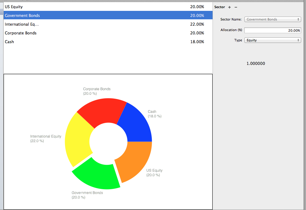
enter image description here

4
  • Just a side question, are you setting this for new contributions only or redistributing assets to this allocation mix? Do you also want to show them the risk vs potential increase/decrease in return rate to help them allocate more intelligently?
    – Mark Sloan
    Commented Feb 5, 2014 at 22:43
  • Dupe? ux.stackexchange.com/questions/17789/…
    – Bob
    Commented Feb 5, 2014 at 23:48
  • @MarkSloan Currently this is just used to compare to the users actual allocation and assist in rebalancing.
    – Cory
    Commented Feb 6, 2014 at 0:19
  • I'd love to know an answer too. Sadly, I have never seen a solution which behaved intuitively for me, or for users I have observed - all, including the ones from the answer below, were a pain to use. So, I'd say it is impossible, but I would love to be proven wrong!
    – Rumi P.
    Commented Feb 6, 2014 at 15:35

4 Answers 4

15

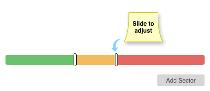
Two thoughts that come immediately to mind is to include a slider that is always at 100%, and allow the user to adjust the size of different segments. Allow the user to add, or remove, segments as needed.

enter image description here

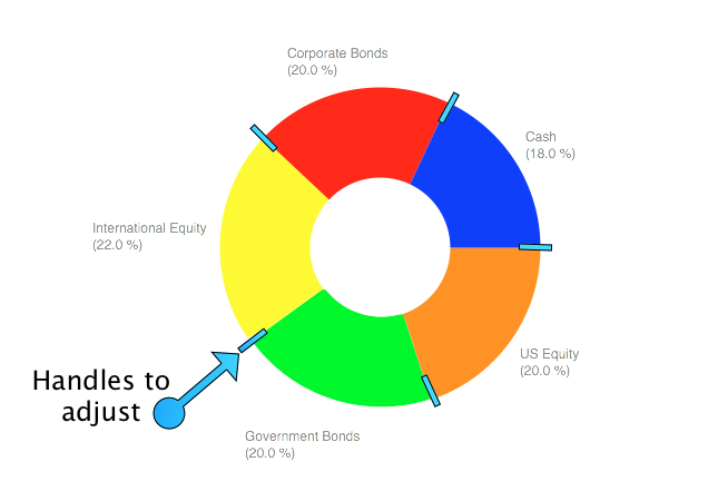
Another option might be to do the same with your graph. A slider plus a pie chart is visually busy, so why not combine the two?

enter image description here

Be careful of adding too much visual clutter. The bar line is more straight forward for adjusting and more traditional for adjust values (I've noticed others suggested the same while I was playing with graphics), while a pie chart might be more traditional to show percents of a 100% group. If you include both you are duplicating information in very graphical ways, which may not be a help to the user.

6
  • 2
    Nice illustrations! +1 Commented Feb 5, 2014 at 19:53
  • 1
    Nice, exactly what I was thinking. You'd probably want some toggleboxes or manual input fields for fine-tuning the numbers, given what the application is. Commented Feb 5, 2014 at 19:54
  • @JessicaYang, manual input fields would be a very good addition -- using sliders for gross adjustments and input fields for fine tuning. Good catch! Commented Feb 5, 2014 at 19:57
  • 1
    I don't like this approach because it assumes that if you want to increase one category that you also want to decrease adjacent categories (or all categories equally, not sure what you had in mind). What if I wanted to make Gov. Bonds at 25% and Cash at 13%? Seems like it would be a pain. Commented Feb 5, 2014 at 23:13
  • @JoshuaBarron, the OP wants to maintain 100% so adjusting other values has to happen in order to keep the total at 100%. If the question was "I want to stop users from submitting if the value isn't 100%" the possible solutions would be different. Commented Feb 5, 2014 at 23:28
5

Maintaining 100% will be impossible without adjusting other sectors any time the user changes something. That is likely to be confusing. Perhaps you could use visual feedback to show the unallocated amount or overflow.

Instead of a pie chart, show a progress bar with a segment for each amount. If the total is less than 100% show the unallocated amount at the end. If it is greater than 100% show the overflow. Make sure they are visually distinct from the other segments and from each other.

Chart showing total less than 100% with an unallocated sector at the end

Chart showing total greater than 100% with an overflow sector at the end

1
  • A similar option would be to use "cash" for the unallocated amount. If the user enters 50% for corporate bonds, 35% for US equity, and nothing else, then the system would assume that 15% of the portfolio will be cash. I don't know if this would be easier to understand than "unallocated". Commented Feb 27, 2014 at 3:57
2

Hopefully the mock is comprehensible enough:

mockup

download bmml source – Wireframes created with Balsamiq Mockups

(the values below graph are obviously made up)

The white dots (could be replaced with some more intuitive symbols) would be draggable and as in the result, the range's values would change. Optionally, clicking on a value would make it an editable textbox (this, however, would require some extra logic regarding maximum value so the range won't cover it's neighbors). This makes it easy to precisely control each range and each change influences only one neighbor, so this is pretty predictable for the users.

1

What you need is the ability to have over and under allocation so they don't have to micro manage every element, yet also prevent them from leaving before their total is 100%. Combining the pie graph with your list view and adding an indicator of "available percentage" at the bottom of your list will allow them to manage things either way. What I think is critical is that if the user increases one sector that it does not affect the other sectors but rather makes it clear there is an over/underflow. You can do this in a pie chart by leaking out of the graph/show a gap or use the bar graph example instead. (if you always keep the total at 100% it means any sector you change also changes it's neighbors which may not be desired)

Part of the issue with the text fields is that they can be annoying to use, Adobe After Effects has a clever UI where if you click and drag left and right on a number field, it increases and decreases that number so you don't have to type or click little up and down arrows.

Your Answer

By clicking “Post Your Answer”, you agree to our terms of service and acknowledge you have read our privacy policy.

Not the answer you're looking for? Browse other questions tagged or ask your own question.