19

Has anyone ever seen or used a good app interface (web or mobile) for changing relational percentages? E.g I need to change 3 amounts to make up £100 and I need to be able to use any permutation to do it.

Only approach I can think of is sort of slider, where you could click and drag dividing lines between pots of money to adjust the amount in each pot. Labels inside the lines would need to update dynamically to show the updated amount in each pot:

enter image description here

I'm not massively happy with this solution though, and I also need to be confident it would be usable if the number of moneypots changed to 10, for example (I don't know the maximum number of pots at the moment but am assuming it wouldn't go beyond 10).

Any suggestions gratefully received!

6
  • Hi sparklypips! (Nice name!). If you upload the image elsewhere and provide a link to it someone here will be able to embed it into the question for you.
    – JonW
    Commented Feb 27, 2012 at 13:45
  • Thanks! Can't do it right now (work thing) but will update this evening :) Commented Feb 27, 2012 at 14:01
  • Do you mean an interface that allows splitting a fixed value into several buckets? "Change 3 amounts to make up £100" confuses my Yankee brain.
    – dnbrv
    Commented Feb 27, 2012 at 14:11
  • Yes, sorry! Thanks to an up vote I get to post the pic now too, hope it clarifies a little. Big issue with my proposed solution is, how do I allow users to add Moneypot D and define the amount in it? I need some kind of restriction so that the total pot never goes above 100. Commented Feb 27, 2012 at 14:16
  • Also, you could just as easily consider it as % instead of £. Commented Feb 27, 2012 at 14:31

7 Answers 7

20

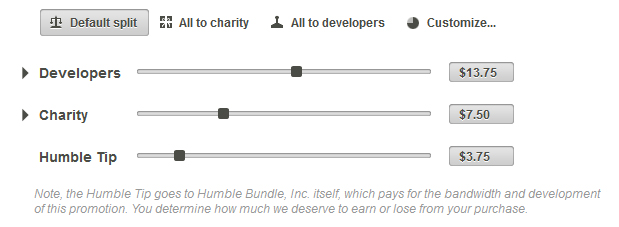
HumbleBundle.com has a interesting UI for addressing this. They sell a bundle of indie games and let the user choose how much each developer receives, how much to donate to charity and how much to leave as a tip for Humble Bundle.

3
  • 2
    I would recommend this one personally. A notable feature is that when you move one slider, the other sliders move at the same time to compensate.
    – mystery
    Commented Feb 27, 2012 at 18:35
  • 4
    Auto-adjusting is great as long as precision across the pots isn't a priority. It would be frustrating if you knew that Pot A needed to be exactly 12, but every time you adjusted another pot, Pot A auto-adjusts in reaction. Commented Feb 29, 2012 at 17:33
  • 3
    A common solution to precision issue is to provide a 'lock' button. Though that makes the UI more complicated.
    – Brian
    Commented Aug 10, 2012 at 19:52
6

I have had this problem many times, but never found a good solution. I have tried (and used, imperfect as they were, mostly because I didn't have a better way) several approaches.

  1. The one you propose. The problem is: what happens when you change a slider? If you change the amount next to it, the functionality would depend on the order of pots. What if you want to shift money from A to C? You'd have to first move slider between A and B, then B and C. It gets progressively worse as you have more pots.

  2. With a bar chart. Each pot is represented with a bar (duh). What I did at first when a bar was lowered was to distribute it over other bars; you could select them with a check box. That way you could lower bar A with 10 dollars, and if you had checked bar B and C but not D and E, then B and C would increase with 5 dollars. This looked good visually in demos (hey look when you move the bar the rest moves too!) but worked crap in practice. Nobody could figure out what the checkboxes were for until you told them.

  3. Simply let the user enter numbers, in normal entry boxes, in a list. This looks crappy but is very understandable and fast for real users (i.e., users who actually use the product, not just gee and gawk at pretty interfaces). However the big problem is (as always...) modality. When do you check if the numbers add up to the required total? I always checked the totals of the numbers as they were being entered, and displayed the background of the edit boxes red if they didn't add up correctly. In another case I just moved the whole thing to a modal dialog so that I could check it there. Of course modal dialogs are always a cop-out.

The next time, I want to try the following (if I have time): represent each pot with a circle with the amount in it, and all those circles (each pot) are arranged in a circle themselves. Each circle, when you select it, shows additional UI controls that says 'move amount:' and an edit box and a spinner. You can enter an amount there, and then drag it to another circle. This way, you can move money from one circle to another, and the total will always remain the same. Disadvantage is that you can't easily see how the total amounts in each pot relate to each other proportionally (maybe by using the circle size?) and that you can't split money over multiple other pots (which is something I may be willing to sacrifice). Maybe I would order the circles from big to small, so that it would look like a shell spiral pattern of some sorts, that would show the user relative positions immediately. When the amounts are close to each other it may not add much though and the jumping of the circles may be confusing. I'm not sure yet, there's quite a bit of room for experimentation :)

(in my use cases it wasn't usually money that was moved around (although it was in a few cases), but that makes no difference for the UI of course).

Edit:

By request, here is a mockup. In this case, the circles are sorted by size. Maybe a fixed position is better, I guess that would require experimentation.
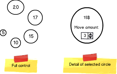
mockup

download bmml source – Wireframes created with Balsamiq Mockups

4
  • +1 for identifying the major problems with the slider approach. I can sense that comes from painful experience! I'm trying to visualize the circular-pot idea you have but that's a bit harder to comprehend though. Can you add in an image example or what you mean?
    – JonW
    Commented Feb 27, 2012 at 16:48
  • 3
    You've inspired me. I think I've been looking at this the wrong way round. I actually need to 'take' from existing pots in order to 'give' to new ones. Design hat back on... Thanks :) Commented Feb 27, 2012 at 16:49
  • with the numbers adding up ... I'm not sure they need to - could just apply proportionally. If they enter "1 1 7 1 1" then the middle pot gets 7/11ths - just a thought, and obviously you could signify to the user that this was the case Commented Feb 27, 2012 at 21:22
  • It's a good attempt of transferring real-work interaction into the digital realm (take X units from pile A and put them into pile B) but I'm not sure the execution will be intuitive to use because the process of removing units requires a modal dialog right now. Also, sorting piles by size will hurt cognition because piles will be changing positions - it's better to keep them in a row and change the size on the spot.
    – dnbrv
    Commented Feb 29, 2012 at 18:12
6

As Roel has pointed out, not everything that looks good in mock-ups works in real life. The main problem in this interaction that it's easier to be performed when visualized but using finite shapes, such as circles or bars, is impossible because we need to account for situations when users assign more than is available. Therefore, our conditions for a good user experience splitting values into buckets to are:

  1. Independent editing of each bucket
  2. The ability to add/remove buckets
  3. Knowing how much is left to be assigned
  4. A visual representation of distribution
  5. No restrictions of user actions except for accepting with invalid assignments

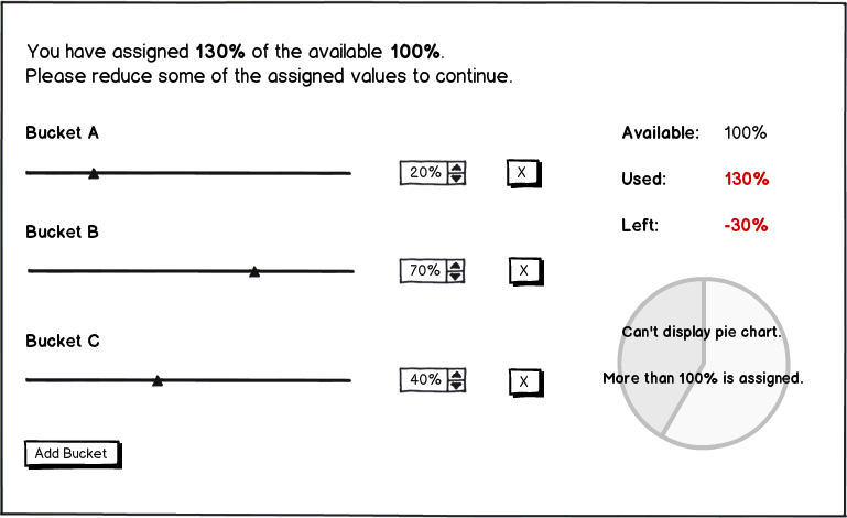
Here's what I propose:

mockup

download bmml source – Wireframes created with Balsamiq Mockups

With this setup, we accomplish all of the goals because users have total freedom of action:

  • they can use either the slider or the clicker to assign values
  • they can add or remove buckets
  • they know how much is available, used, and left

Moreover, if they go overboard, there can be up to four visual cues notifying them of the invalid selection:

  1. a message on top of the form (optional, can appear automatically or when a user tries to submit the invalid selection)
  2. red highlights of the values in the available/used/left table (an exclamation mark can be added to help color-blind users)
  3. disabled pie chart distribution (optional, if the pie chart is present)
  4. disabled submit button (optional, not shown)
5
  • I don't like this suggestion because it introduces modality. It needs a point at which one decides to 'continue' with the given values; the input can be in an invalid state.Using text (or even colors or disabling buttons or other visual cues) to indicate that the current input is invalid is an interaction weakness IMO; I think a primary goal should be to never allow illegal input in the first place, and in such a way that the user doesn't even need to understand the constraint.
    – Roel
    Commented Feb 28, 2012 at 8:58
  • @Roel In this situation, you can't prevent invalid input without confusing users. The options are: 1) you don't allow to increase individual bucket allocations when max is reached until others are reduced (user reaction: "why doesn't it work?") and 2) you adjust other buckets automatically to put the illegal increase into the permitted range (user reaction: "but I don't want less in this bucket, I want less in that bucket"). When it comes to manual operations, user must be in total control & our job is to guide them (with cues & instructions).
    – dnbrv
    Commented Feb 28, 2012 at 13:16
  • A slider approach for each bucket is a good idea because it allows you to set one (or more) of the buckets to be 0 while making it obvious that the bucket still exists, it's just empty. A lot of the other suggestions here, while usable, fail to show you a zero value for buckets.
    – JonW
    Commented Feb 28, 2012 at 13:41
  • In the circles approach I described above, you can prevent invalid input; the total state is constant at any given moment in time. Source/destination is always explicit, side-stepping the slider/bar issue.
    – Roel
    Commented Feb 29, 2012 at 10:57
  • @Roel: I'm not sure whether source & destination are explicit in your current iteration. I'm also at loss about the initial distribution: whether all piles have 0 at the beginning or the units are distributed equally among them.
    – dnbrv
    Commented Feb 29, 2012 at 18:15
5

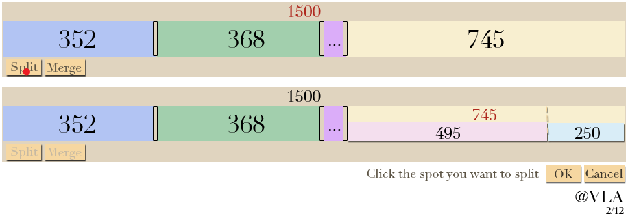
I created two mockups for you. Have you considered something like this:

http://imgur.com/mehj0

and here's a version with Split and Merge buttons to allow users to add or delete without a right-click menu (so it can work on mobile devices.) Clicking Merge would allow the user to select two or more blocks and then combine them (not shown.)

http://imgur.com/6GS0A

Another benefit of heading in this direction is that zoom + and - buttons on the top right corner will allow the user to split or delete thin slices effectively, even on a mobile device. It will also allow them to see small labels that would normally require a tooltip hover on a device with a mouse. While zoomed in, a preview of the overall picture will need to appear below.

I believe that a secondary, permanent visualization should contain a swatch with the value and color for each space. This way, a mobile or desktop user could easily see that the overall design contains 352, 368, 35, and 745 without needing to zoom in or hover their mouse. The ordering should always match the primary visualization.

Depending on your application, the ordering might not matter. If so, you could have a button to rearrange the bars in the order that's best, such as decreasing or increasing. A subtle hint to the user to click the Reorder button should be provided after manipulating the bars. It would not be a good idea to auto-reorder whenever a user releases the mouse because it would be very confusing.

1
  • Wow, like it. Thanks so much for all your effort. My only additional comment (something I didn't say earlier) is that the user must choose a specific new 'pot' each time they add it. So it's not a case of just adding pot D. They must choose whether to add pot D, E or F. Commented Feb 28, 2012 at 9:07
2

How about the Humble Bundle direction but adding the ability to lock a slider so it doesn't adjust once locked.

D

1

I was always fond of bar charts ;) I suppose you could just add a bar for each pot and when user slides one of the bars then others change proportionally. But this still is some kind of slider :(

1
  • 1
    A bar chart is better than my proposal I think... it shows the comparison between different pots. My only worry would be whether users would intuitively understand that it was interactive, rather than a static image. Commented Feb 27, 2012 at 16:18
1

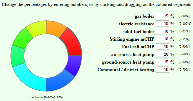
Following on from Christian's comment, I had a look at the Superfund ring-chart. Each segment goes live when the mouse hovers over or near it. By clicking and dragging the mouse up or down, the value of that sector increases or decreases respectively.

Using Raphael JS, I produced something with similar behaviour, and with linked input text boxes, to give two ways to enter the data:

But I haven't been wildly happy about it: it wasn't really that intuitive.

So I'm now working on a redesign using a modified version of the Jquery multislider widget:

enter image description here

Values can be changed by dragging the separator bars, by entering numbers in the text boxes, or by pressing up and down when the cursor is in one of the text boxes.

1
  • Agree that the slider is better. Humans are very bad at judging area percentages as circle segments; pie charts are generally a bad idea, suited only for 3-4 segments where the exact ratio does not matter.
    – Rumi P.
    Commented Jan 9, 2014 at 11:11

Your Answer

By clicking “Post Your Answer”, you agree to our terms of service and acknowledge you have read our privacy policy.

Not the answer you're looking for? Browse other questions tagged or ask your own question.