2

There are three different ways to accomplish a task in my Java assignment. One is fastest one is slowest. However the actual time difference is in milliseconds(of course). The task at hand is to demonstrate this difference. How do I show this? Here are my ideas:

  • Simply show how many milli secs each one takes. Not pretty enough.
  • Do the same task thousand times or more making the difference appreciable. Still no GUI.
  • Repeat a thousand times in each of the three ways simultaneously(threads) and show 3 progress bars below each other. Program terminates after completion.

None of these is catching my eye or mind. I want to keep running the three ways endlessly. And show visually the performance difference.

Ideas people!

5 Answers 5

4

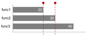
It depends how much results there is to compare but I'd suggest to display them on a bar.

enter image description here

Even if we're talking about ms you could "enlarge" it. This way it's easy to compare them and see which one is the fastest.

NOTE : this is a quick mockup, I didn't measured anything.

EDIT : if you want the slowest to be the smallest too, you could try to make a comparison from the fastest and display the difference instead of giving the total (once again, it's a quick mockup and there is probably some ways to make it easier to read).

enter image description here

3
  • nice idea!, but the slowest takes the most space. How can I make it the other way?
    – kBisla
    Commented Jan 29, 2014 at 9:10
  • Sure, it takes the most place because it is longer but in our culture (reading from the left to the right) the first you'll see is the fastest. Anyway, I'll edit my post to give you a way to make the fastest to be larger.
    – Gabin
    Commented Jan 29, 2014 at 9:13
  • Sectioned bar is good to demonstrate partitions within complex process. Still it doesn't provide convenient comparision for the different processes. Commented Jan 29, 2014 at 10:17
2

Your third option demonstrates the difference very clear. Being ordered, the difference is grasped in a moment, see the image. So the form supports the content.
enter image description here

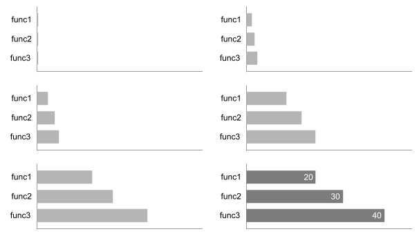
I also doubt in usefulness of endless measurement process. Having enough data to make reliable results from statistical point of view, the further process doesn't improve the results in significant way. So collect the data and show the progress, then stop and report:
enter image description here

3
  • I think that the pace of these bars should be constant and the others are going to continue to become bigger while the other is already giving the information of how much time it takes.
    – Abektes
    Commented Jan 29, 2014 at 16:02
  • @Abektes – Thank you, this is indeed good suggestion to tie animation and time duration. Still, if the difference between fastest and slowest processes is rather big (i.e. > 10s), it will be anoying to wait until last result. Commented Jan 29, 2014 at 16:15
  • agreed than you need to increase the speed of the animation according to the last waiting time.
    – Abektes
    Commented Jan 30, 2014 at 11:46
2

Flip the data point that you are presenting. Rather present the number of times the job (calculation) got done in the 'current' duration.

Idea should be clear from the mockup below, but queries welcome.

mockup

download bmml source – Wireframes created with Balsamiq Mockups

0

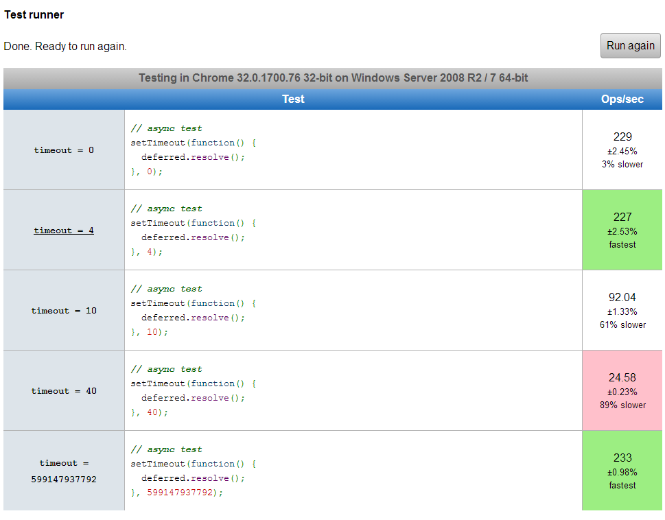
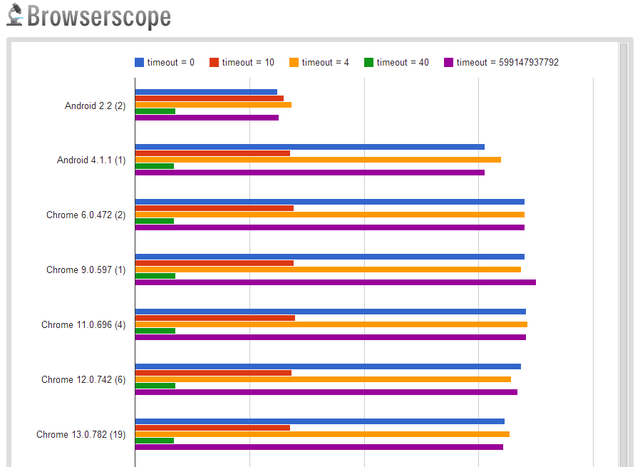
I think jsPerf does a great job of this exact thing.

Take the following Smallest Timeout Value test for example.


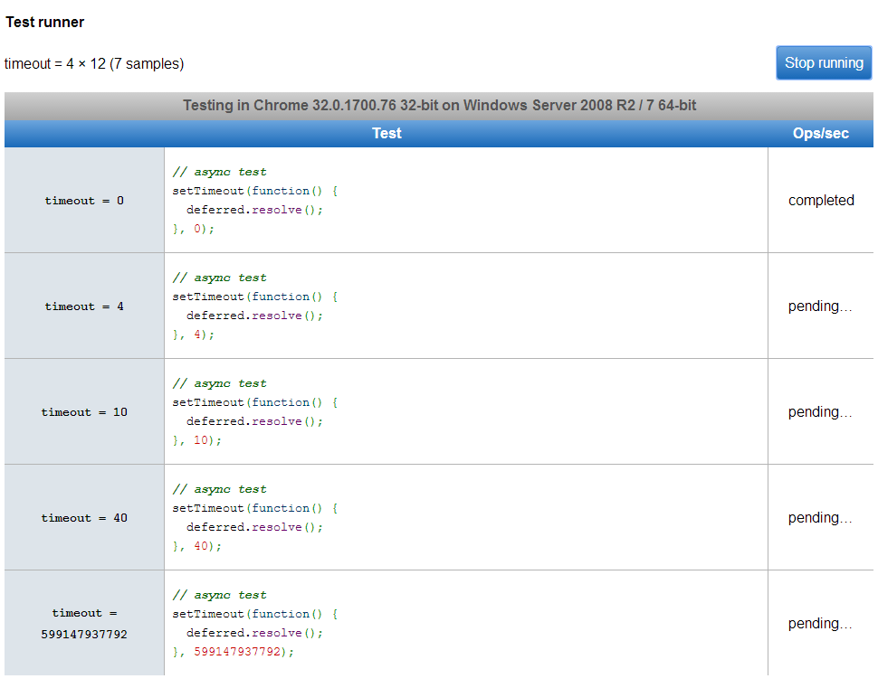
TESTS PENDING:

tests pending screen shot


TESTS COMPLETED:

tests completed screen shot


TEST RESULTS GRAPHED:

test results graphed

-1

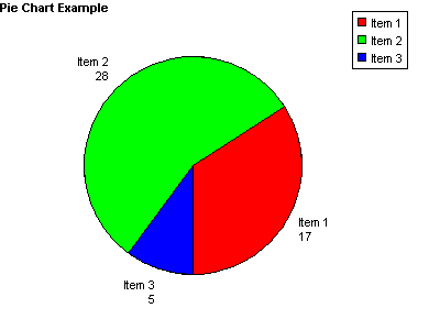
You can use animated pie chart like

enter image description here

Your Answer

By clicking “Post Your Answer”, you agree to our terms of service and acknowledge you have read our privacy policy.

Not the answer you're looking for? Browse other questions tagged or ask your own question.