14

I'm working on visualizing some data and it turns out that there are cases where one "data set" is significantly bigger (in terms of values) than the rest. It probably needs to be barchart as I don't care about trends, just values, but basically it looks like below now

enter image description here

As you can see the entire point of visualization got lost as it's impossible to differentiate between bar & baz values.

I was thinking about introducing logarithmic axis but there are 2 drawbacks here:

  1. non technical users may get confused with unevenly split grid lines
  2. visual proportions would be distorted

Do you have any experience with such cases?

1

4 Answers 4

9

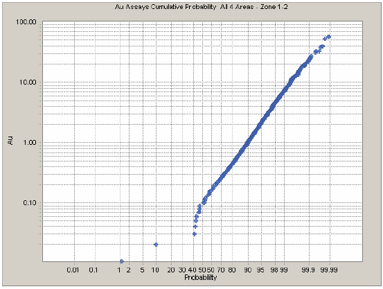
As others have suggested, I'd suggest using logarithmic scales.

I recreated your chart as close as possible with logarithmic scales using ZingChart, a JavaScript charting library. There are no unevenly split grid lines and there are value boxes over each of the bars to show their value, making it easier to read.

You can see and interact with it here.

Full disclosure: I'm on the ZingChart team. Holler at me or email us at [email protected] if you have any questions.

6

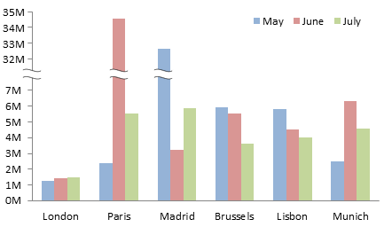
How about discontinuing the y-axis, don't remember what the technique is called so couldn't find any image.

It involves using the saw line cutting the y-axis so that below the saw line, in your case, could be values from 0 to 100 and above from 500 upwards. Grid lines should be differenty spaced above and below the saw line.

edit:

Here is an example of what I was talking about:

enter image description here

But on the same page they say:

Another suggestion is to “break” the axis, so that part of the axis shows the small values, then another part of the axis shows the large values, with a section of the axis scale removed. Sounds good, but you’ve lost any correlation between the large and small values.

So be aware.

1
  • Good idea although with stacked bars it'd be a bit difficult to achieve as the root of the problem is not the single data, but their composition that sums up to higher value. Anyway, thanks for the tip. Maybe I'll try to iterate on it to come up with something that suits stacked bars Commented Dec 17, 2015 at 8:51
3

What do you want to visualize? If you want to visualize the proportions between Foo, Bar, Baz and Boo, the image you attached will do fine. If, however, you want to visualize the proportions within a bar, four separate charts (with each its own axis) would do a better job. You could also use one chart to visualize the proportions between the bars and four other charts to visualize the proportions within the bars, pie charts for example.

If you really need to visualize it all in only one chart, you could indeed consider an logarithmic y-axis, although this is much more difficult to read and maybe not the best way for showing the proportions within a bar.

I would generally advice against breaking axis because this kinda defies the purpose of visualization. You're breaking the proportion you're visualizing so what's the point of visualizing it in the first place?

An example with logarithmic axis: logarithmic axis

2
  • Logarithmic axis is a great idea, but wouldn't it be a lot to assume that your audience know how to read them?
    – Raiyan
    Commented Dec 27, 2015 at 17:31
  • I do think so yes. Therefor I only would propose it as a solution if all proportions need to be visualized in a single visual and preferably in the knowing that the audience has a bit of experience in reading different graphs (physicians, programmers and economists for example would probably understand it). Like always with visualizations: what do you want to get across and what is your audience are the most important questions.
    – Ruudt
    Commented Jan 5, 2016 at 21:50
1

Why not combine parts of the two answers above, show the total value of each stacked bar as a whole undivided bar and then the individual parts of the bars side-by-side, all on a log scale - that allows you to compare totals between stacks, and compare parts within each stack and between stacks

Also to aid interpretation of a log scale you can draw the number values within each bar (90 degrees rotated) - since numbers are logarithmic themselves they fit quite neatly, there's even a variation where just the number itself is the bar (see the second paper linked below and comment)

There are also a couple of newish infovis techniques aimed at tackling this problem, but the caveats here are you're not likely to find them in existing chart drawing software and there's learnability issues to overcome too

http://www.vis.uni-stuttgart.de/~sadlo/download/hlawatsch2013scaleStack.pdf - Scale-Stack Bar Charts

http://cs.swansea.ac.uk/~csmark/PDFS/2014_infovis_order_of_magnitude_markers.pdf - Order of Magnitude Markers

(The second one reports the showing the bar as a number technique to be more accurate than linear or plain log scales)

Your Answer

By clicking “Post Your Answer”, you agree to our terms of service and acknowledge you have read our privacy policy.

Not the answer you're looking for? Browse other questions tagged or ask your own question.