3

Due to the awkward nature of my notification icon, I've been forced to settle with a red dot near the notifications icon, which seems less than ideal from a UX point of view particularly because it isn't clear enough. I tried to putting it at the top right of the icon, but it did not work, so I wanted to ask, can user notification alerts be displayed in any better ways?

In a situation where I would need to change the icon - I would welcome any suggestions.

enter image description here

4
  • This might have an obvious answer, but couldn't you just change the notification icon?
    – Sherwin
    Commented Dec 26, 2013 at 21:20
  • @Sherwin - thanks for your answer Sherwin, I'd welcome any suggestions.
    – methuselah
    Commented Dec 26, 2013 at 21:23
  • Or I guess, what do you dislike about the existing notification design?
    – Sherwin
    Commented Dec 26, 2013 at 21:24
  • I think it does the job well, but I would struggle to display the number of notifications the user has without disrupting the overall UX flow with the current setup.
    – methuselah
    Commented Dec 26, 2013 at 21:30

4 Answers 4

6

I would make 2 changes:

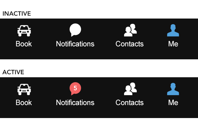
  1. Replace the notification icon for the one shown on the screenshot. It's from the Iconic theme. (http://somerandomdude.com/work/iconic/)

  2. Have 2 states for the icon:

    • Inactive: display white icon.
    • Active: change the icon's background color and display the number of notifications. I would limit the numbers up to 3 digits. This way, if you have more than 99 notifications display "+99".

enter image description here

1
  • 1
    Not sure if that was a typo but it may be better to say 99+ instead of +99
    – Rajmera
    Commented Nov 9, 2015 at 7:05
1

If the icons and labels can not be changed, maybe you can add the number of new/unread notifications to the red dot?

[ICON]      # No unread notification
[ICON] (1)  # one unread notification
[ICON] (2)  # two unread notifications
…
3
  • Thanks for the response - I have toyed with this idea. Does the placement of the red dot not bother you?
    – methuselah
    Commented Dec 26, 2013 at 21:41
  • 1
    @methuselah: In combination with this megaphone icon, not at all. Placing it to the right is the obvious choice here (well, it’s where the "sound" comes from). What exactly does bother you? Aesthetics?
    – unor
    Commented Dec 26, 2013 at 21:46
  • Perhaps because traditionally I've grown accustomed to seeing the red dot on on the top right of a notifications icon, but due to the shape of the megaphone icon, the top right seems a rather awkward position to place it.
    – methuselah
    Commented Dec 26, 2013 at 21:48
1

What about simply replacing the red dot altogether with a red number in a badge? This is a pretty common design element; for example, see Bootstrap badges: http://getbootstrap.com/components/#badges

iOS notifications, for example, doesn't have a red dot at all; only the number of notifications is shown.

1

Changing background and border colors might be worth consideration, too.

Your Answer

By clicking “Post Your Answer”, you agree to our terms of service and acknowledge you have read our privacy policy.

Not the answer you're looking for? Browse other questions tagged or ask your own question.