2

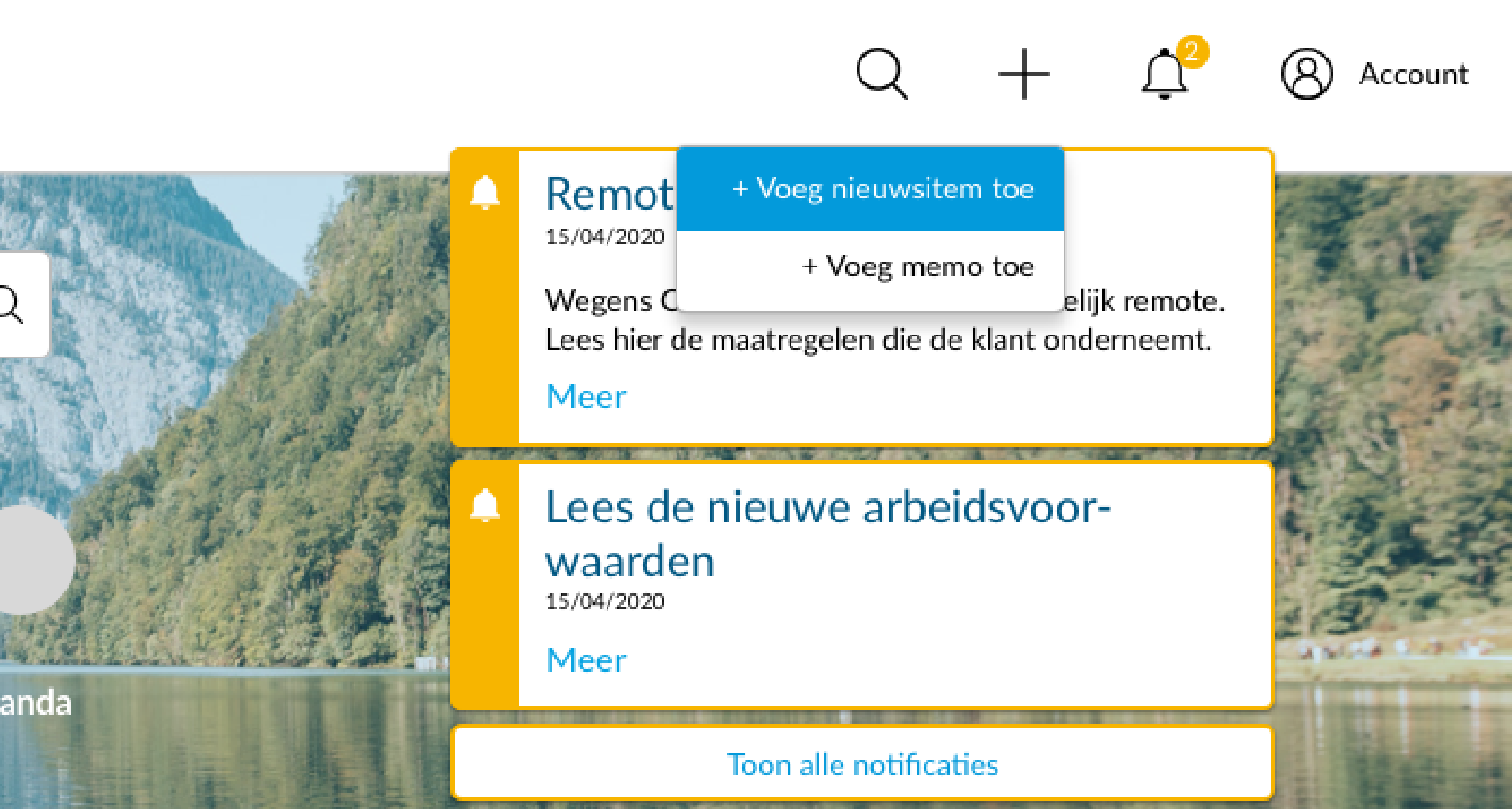
I'm designing an intranet application for a client in which notifications are displayed through a fixed flyout pattern in combination with a 'notfication' icon in the header menu. The image says more than words can ;) The notifications should stay in focus because they ought to be read by users. However, when the user wants to add something using and icon in the same menu (in this case the '+' icon), another flyout menu appears on top of the fixed notifications. It seems a bit odd to me and I can't really find a better way. Someone has experience with this or any better ideas?

Thx

enter image description here

2 Answers 2

2

I think having the notifications always display is a bit odd of an implementation because notifications by nature are meant to be temporary.

Option 1 If you want to keep your current implementation then at least add an "x" icon to each notification and a "dismiss all" link that's easily accessible (either at the top or bottom). When the user selects the "+" icon, hide the notification bar and bring it back once the user finished interacting with the dropdown.

Option 2 Implement the notifications as a modal instead of persistent cards so then you'll never have the overlapping issue

Option 3 Reorder the icons so the "+" icon is all the way to the left and alerts icon to the right and move the notification bar all the way to the right so they don't overlap each other

1
  • thanks DBD, I agree that it's not a gracious way of representing but the client really wants the notifications to be up all the time the user hasn't read them. So the user should click on them, read the post (or not) and only then the notification will have gone. I understand your option 1 and it seems to work for me. I don't really agree with option 3 as it's a quick fix that's not sustainable when other options would arise that also require the same (consistent) flyout-menu. Besides, the account option should always be completely left. Thx anyway! Commented May 6, 2020 at 7:31
1

I never experienced a case like this. And to be honest, I would be totally annoyed that these notifications are there all the time. It's distracting.

Anyways, I have two suggestions for you:

  • You can darken everything else while the context menu of the "+" icon is open (just like a lightbox)
  • Rebuild the context menu into something horizontal and replace the icon menu after clicking "+" - Then you need a possibility to leave the context menu, maybe with an additional icon "x"

I hope I was able to communicate my idea and that it will help you a bit.

1
  • hi chris, i understand your assumed frustration with this pattern but the client requires that the notifications are always up unless the user has read them. I thought abaout darkening the background but it seems an unusual option and it doesn't concur with other patterns in the application. Thx anyway Commented May 6, 2020 at 7:33

Your Answer

By clicking “Post Your Answer”, you agree to our terms of service and acknowledge you have read our privacy policy.

Not the answer you're looking for? Browse other questions tagged or ask your own question.