4

I am building a Website on which the status of different machines will be displayed. System Status: ON/OFF/CLEANING/etc. and Cleaning Status: CLEAN/DIRTY/WARNING. The system status is communicated fine over a single icon without text needed but the cleaning status we just can´t get right.

The 2 options we have tried are

  1. Putting text next to the icon that displays the current cleaning status. This looks ugly and we have not found a short concise word for cleaning status(cleanliness,cleanness are all long and look out of place next to the icon)

  2. Only use our Icon which currently consists of a green box with a tick inside it for clean and a red/orange warning triangle for WARNING and DIRTY these don´t get the point across without the user beeing told one time what they are supposed to represent. We have also tried some other icons but they end up not getting the point across or needing language which we are trying to avoid in our icons.

Any suggestions are welcome

2
  • 3
    Why not use words? A word should be your first tool in trying to communicate something to the user. Pair it with colour for additional perception effect. So a System status icon + Text ( Clean/Dirty/Warning )
    – Paran0a
    Commented Feb 24, 2020 at 9:00
  • I suppose that is the best option. We wanted to avoid using words so we do not run into problems when translating but i guess this is a fine solution. Commented Feb 24, 2020 at 9:33

2 Answers 2

3

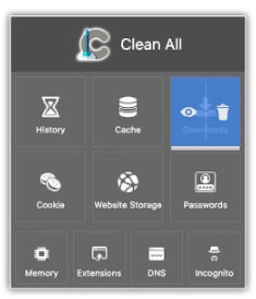
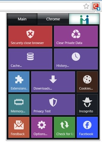
Without images from your application is quite difficult to give a good suggest but based on what I imagine you need I would like to show these two different Chrome extensions that do it well.

enter image description here enter image description here enter image description here enter image description here

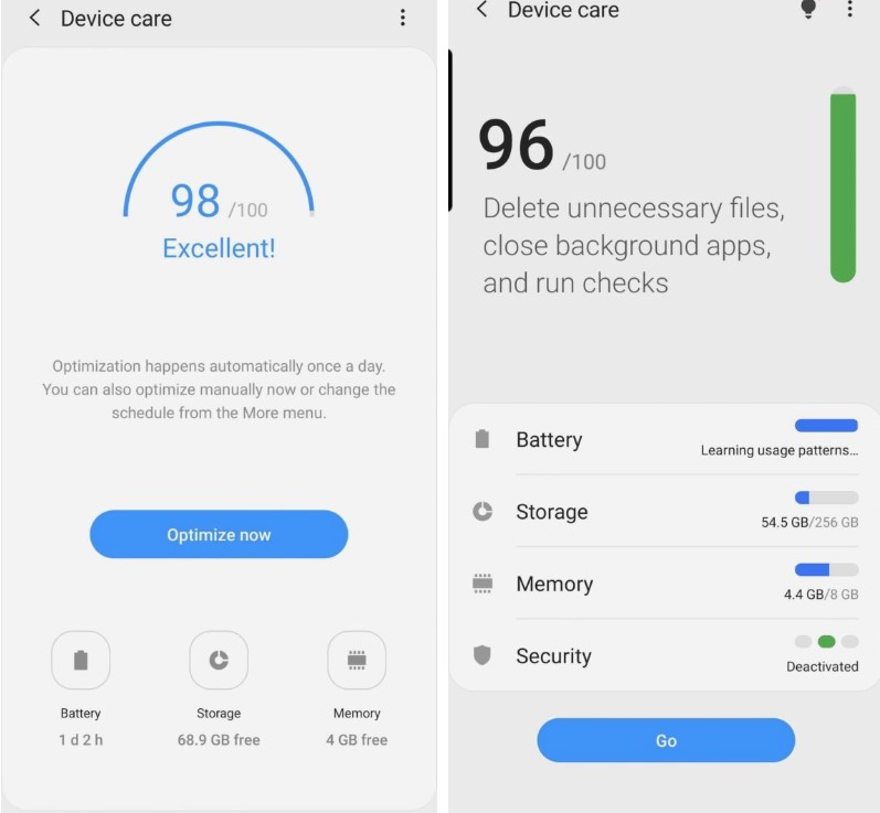
I also brought a print screen from Samsung Galaxy Device Care.

Based on the last reference, you can use something like this with 3 types of alerts (error, warning and recommended) with different colours and priority. And here they also using icon + text.

Observe that in both cases you have an icon and text together to avoid misunderstanding. The main problem that you having is on design. You should search for good references.

And please, add some designs alternatives that you've trying. This makes easier for us to help you.

I can't give you the right answer without templates and tests but at my viewpoint, you should use icon + text.

Have a look on this Icon vs Icon + text discussion.

1
  • thank you for the examples and the link to the discussion. I will be going with icon+text based on the discussed UX Stackexchange question Commented Feb 25, 2020 at 9:10
2

Instead of dirty/clean, you might consider ready/done.

This keeps the status on the machine vs. the items being cleaned.

I'd recommend pills with text labels vs. icons so that there's no ambiguity in meaning, but the yellow triangle could call additional attention to a warning.

Your Answer

By clicking “Post Your Answer”, you agree to our terms of service and acknowledge you have read our privacy policy.

Not the answer you're looking for? Browse other questions tagged or ask your own question.