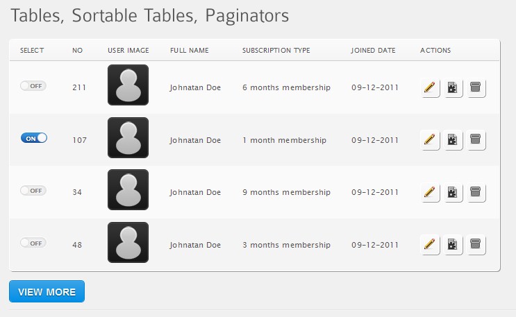
If you have a means to select individual objects with something like your Select column, then you don’t need separate command buttons like your Actions column, and vice-versa. Choose one approach or the other. The object-selection-action approach is preferred when space is tight and/or you have a lot of commands. Have a single sidebar menu (web app) or pulldown/pop-up menu (mobile) that lists each command once. The user selects one or more objects then selects the action(s) to execute on the selected objects. Each command only appears once, so you can use longer text labels, which are generally easier to understand than icons. You may want to consider abbreviating commands with especially long labels. Use tooltips to provide the full command name for users who are still learning the application.
Pulldown menus in particular can be relatively labor-intensive to use, so you can also have context menus (right click). However, context menus are generally considered to be back-up expert shortcuts since they have poor discoverability, especially on a web app, where users may assume right-clicking only brings up the standard browser context menu. Thus, they should be used in addition to a pulldown/sidebar menu.
You can also provide expert shortcuts via accelerator keys and gestures, including double-clicking and drag-and-drop. Unfortunately, there aren’t standard gestures for CRUD functions for mobile; we need them. For a web app, the Insert and Delete key are obvious choices as accelerators for the Create and Delete functions. Drill-down (i.e., Properties or Details) can be achieved through double-clicking the object or single-clicking the object identifier rendered as a link. The latter is easier and more discoverable, but makes it problematic to support edit-in-place of the identifier.
Yes, ideally you use edit-in-place to support the Update function. Use the appropriate control to support editing of each field wherever it appears. This not only eliminates the Edit command, simplifying the menu, it also keeps focus on the main content and eliminates navigation steps and even entire pages, thus simplifying the entire app. A Save command may save all changes (including any Deletes and Creates), or, even better, you can have automatic saving, eliminating yet another command and preventing lost of data.
The Retrieve function is generally best handled through a separate query dialog, even though that can take user focus away from the main content. To minimize that, keep the basic query dialog small and simple, supporting only the top three-to-five kinds of queries that likely account for 80% of all queries made, then provide an Advance or More button to get a more elaborate the dialog for general ad hoc querying. It may also make sense to have the controls for one basic query type (e.g., by object identifier) displayed full-time at the top of the main content page (e.g., as “search”).

