2

I am working on a Web application that consists of a number of forms. Each form can be edited and the user can elect to save their work so far and come back to resume at any time. However, once the user submits, their response is marked as complete and they are no longer able to continue editing it.

Right now I am representing this with floating buttons labeled "Submit completed response" and "Save and continue later," with the submit button having a highlighted color and the save button having plain white to match other buttons in the application.

I've received some reports that users do not understand the purpose of the two distinct buttons. I've added a help link below that triggers an overlay explaining the use of the buttons, but I'm not sure how satisfying that is (I'm not really optimistic about users bothering to read help text, even if it's only three sentences long).

Some other ideas:

  • Relabel the buttons somehow (although I have a hard time coming up with labels I think wouldn't be more confusing)
  • Change the positioning of the buttons (perhaps the submit button should be on the bottom and the save button alone should float?
  • Some sort of hover text for the buttons (don't think this helps much)

Is there a generally accepted convention for this sort of functionality? Other Web applications with similar functionality? I searched but mostly found a lot of argument about whether buttons should be labeled "save" or "submit" -- clearly not a question in my case, since the buttons represent different actions.

The client has suggested changing the colors so the save and resume option is highlighted, but my hunch is that hardly anyone will choose "submit" if I do it that way.

6
  • Possible duplicate of ux.stackexchange.com/questions/21614/…
    – elemjay19
    Commented Mar 11, 2014 at 18:27
  • 1
    I suggest "Save" and "Save & Submit" to make it clear the difference between the two.
    – DA01
    Commented Mar 11, 2014 at 19:09
  • 1
    @norabora No, because that question is for an application where the user is designing a form. This question is where a user is using the form, and both of the actions are available in the context of the form.
    – Casey
    Commented Mar 11, 2014 at 19:11
  • @DA01 Do you think that makes it clearer? I'd be a bit concerned that a user who can't distinguish between save and submit with some explanation at the end of each isn't going to be helped by a button telling them to save AND submit. Imagine I had two distinct, but ambiguously named actions, "compose" and "write." Would it help to change it to "write" and "write and compose?"
    – Casey
    Commented Mar 11, 2014 at 19:43
  • Well, this is just my opinion, but I would argue that it makes it clear that one submits, and the other one does not. Whereas if one just says 'submit' it might raise the question 'do I need to save first?' I don't think your imagined write/compose is equivalent as they are synonyms. Both buttons currently 'save' it's just that one also sends it to wherever it's supposed to go in addition.
    – DA01
    Commented Mar 11, 2014 at 19:51

1 Answer 1

4

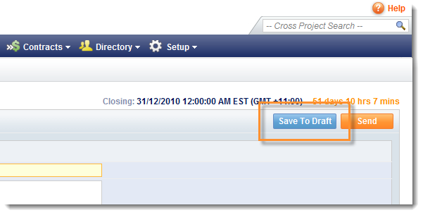
My suggestion would be to change the name of the save button as "Save as draft" so that users know that you are saving a draft entry which is not being submitted shown in the example below

enter image description here

With regards to the positioning of the buttons ,I am not a big fan of the example above as the submit\send button is right next to the save as draft button and there is a chance that the user might submit something without completion by accidentally clicking the submit options.

My suggestion would be to separate the two buttons as shown below

mockup

download bmml source – Wireframes created with Balsamiq Mockups

So you have a primary call to action and a secondary call to action with the secondary call to action more prominent which allows the the user to find the submit option quickly if desired

2
  • I don't have any rep here so I can't upvote you, but this is a thoughtful solution. I'm not sure if it's the solution yet, but I appreciate it nevertheless.
    – Casey
    Commented Mar 11, 2014 at 19:14
  • Aligning the buttons vertically and "save as draft" were both great suggestions. I ended up going with "submit as final response" for the other button and everyone seems happy now. Thanks again.
    – Casey
    Commented Mar 11, 2014 at 20:07

Your Answer

By clicking “Post Your Answer”, you agree to our terms of service and acknowledge you have read our privacy policy.

Not the answer you're looking for? Browse other questions tagged or ask your own question.