24

I am working on a personal project to sharpen my mobile development and UX skills and ran into a small UX dilemma.

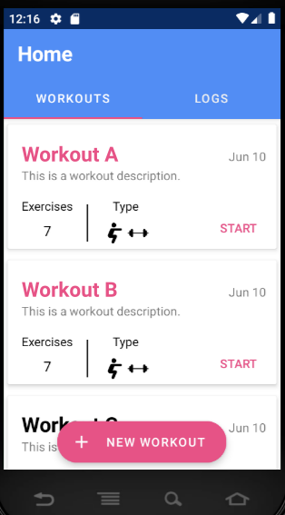
Each CardView contains some data and a start button that, when pressed, will take the user to a new screen marking the start of their workout. However, the user also has an option to view the routine and edit it if they wish to do so.

I've made the entire card clickable so that if the users tap anywhere else, it will take them to a different screen where they can view the routine. Is this a good design decision?

I'm not sure if the user will know to click on the card if they want to view the details of the workout. I thought about adding a VIEW button next to the START button but on smaller screens, it won't fit between the start button and icons.

Enter image description here

3
  • 5
    How important is it to have the start button in the list? Does it make sense to start multiple workouts? Are the workouts designed to be small modules such that you do multiple one after another, or is starting the workout something that you do once/twice per visit in the gym? I would consider moving the start button into the workout view. When you remove the start button, users will tap on the cards, because there would be no other action to do.
    – Frax
    Commented Jun 13, 2019 at 10:05
  • Another option would be to place two icon buttons instead of the start button, e.g. a little pen for edit and a "start playback" arrow symbol for start.
    – Falco
    Commented Jun 13, 2019 at 11:32
  • @Frax It's not super important. I just didn't want the lower right corner of the card to be empty white space. I also thought it would be nice to reduce the number of actions taken by the user to start the workout. Starting the workout is something you do once/twice per visit in the gym. I could definitely move the start button to the workout view. Commented Jun 14, 2019 at 1:16

4 Answers 4

35

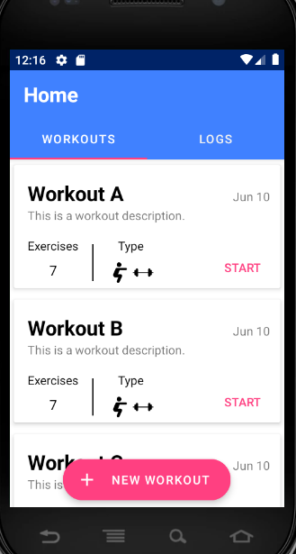
Make the title of the workout the same as the active click colour, so that it prompts users to click on the title. Even if the whole card is active - it gives the user something to focus on.

enter image description here

13

I recently did some testing with a similar design where the cards were not tappable, only the button like your "Start". The participants mostly expect cards and tiles to be tappable IF there is only one action. They also tended to click on the headers. In your design, I would think that tapping the card would start the workout, so if you want to have two separate functions on a card, you'd need two buttons and disable the card.

1
  • Thank you for sharing your insights! They're really helpful and give me a good idea of what to do. Commented Jun 13, 2019 at 4:01
8

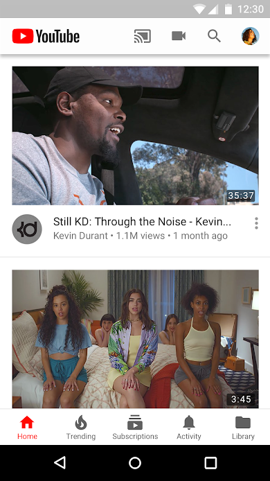
There's nothing wrong with having clickable cards. An example of that is YouTube: when you're browsing a list of videos, each video is represented with a card.

Example of clickable card, screenshot from Google Play

Notice that the card also has a "show more" button, which brings up a dropdown menu with additional actions. Most of the time, however, the user will just want to watch the video, and so that's what clicking the card does. The card itself represents a "primary action", and any other interactive elements inside of it are secondary.

In your case, I assume that the "primary action" would be starting the workout, so it will be more intuitive to have the card itself act as the start button. Other actions, such as editing or deleting, could be hidden inside of a "show more" button.

7

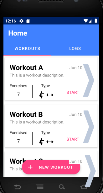
I think when a big chunky object represents an action by interacting with it directly (clicking, tapping, hovering, etc) there should be an explicit visual hint (especially given "Cards" in Material Design are not usually directly interactive).

Forgive the crude mock-up, but I added chevrons to the cards and I think that makes it obvious they're clickable without using up too much space - and users could also directly click or tap on the chevrons too:

enter image description here

Your Answer

By clicking “Post Your Answer”, you agree to our terms of service and acknowledge you have read our privacy policy.

Not the answer you're looking for? Browse other questions tagged or ask your own question.