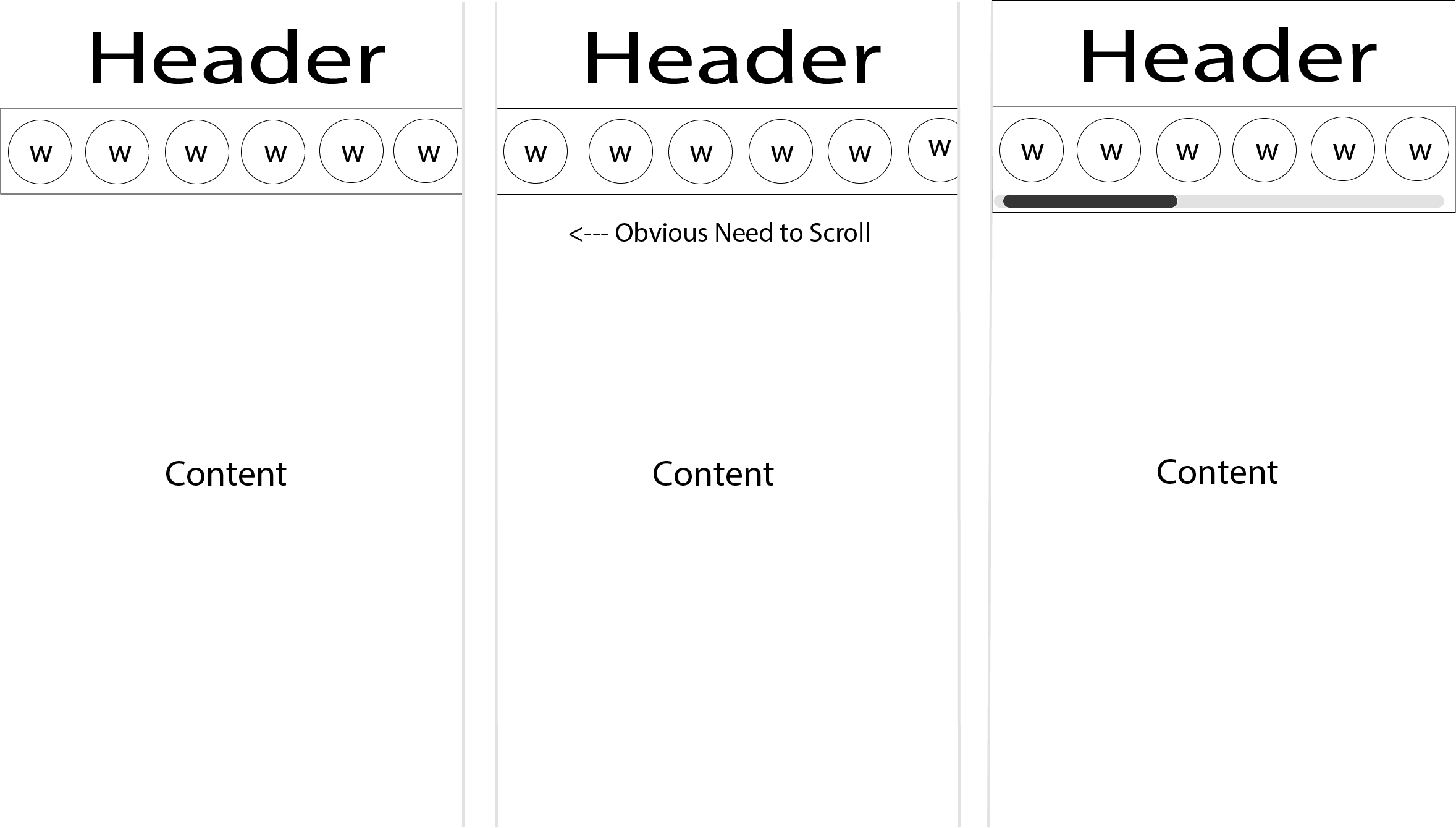
When building a responsive view of a page with a grid of content boxes, is it a good solution to use a horizontal scroll? Imagine page layout with a header, main column of content (680px) and a sidebar (300px), in the sidebar are widgets of members, about, tag cloud, related topics, etc. In mobile view, the idea is to place those widgets at the top (below header and above content) and use the horizontal scroll of the widgets.
3 Answers
Why not? With so little context, it is hard to know.
Don't use horizontal scroll for the main way to navigate in a page, because it is more effort-intensive than vertical scroll.
But for a side navigation, or a part of the page, why not use this to gain space on smallest viewports?
Really, you should rework your question if you want to get more insights.
If designed nicely users wont have problems using it I think.
However more natural would be;
1) place content box width to 100% of mobile screen
2) implement swipe left and right, and on swipe move to next or previous box
3) indicate that swipe left and right is available somewhere on top
4) place some nice animation for swiping
 There shouldn't be any problem with using horizontal scroll for a menu. That being said I have noticed that some mobile apps run into problems when the ability to scroll an element isn't apparent. Horizontal scrolling is not something users assume to do on mobile so you will need to be aware of how the menu informs the user of their ability to scroll.
Some tricks you could use to help the user discover the horizontal scroll:
- Offset some of the widgets, making them extend past the edge, so it is apparent there is more elements hidden to the right.
- Display a scroll bar either briefly as an on-boarding animation when they first load the app or at all times.
- Use another on-boarding animation that scrolls the menu slightly and returns it to its original position when they load the page for the first time.
-
1An approach that the ReactJS and PokéAPI websites use is to place a gradient mask at each end of the nav bar to indicate that the content continues. Ideally, it would only show the gradient if it's not already scrolled to the end, but I haven't yet found a way to do that in CSS (I made the PokéAPI website). Commented Sep 22, 2018 at 6:34
