From a UX perspective:
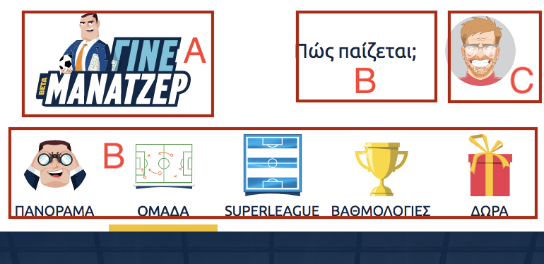
As others mentioned you are indeed shouting at your users a bit too much. There is such a thing as too much use of iconography. Due to that you are losing any sense of hierarchy within the site.
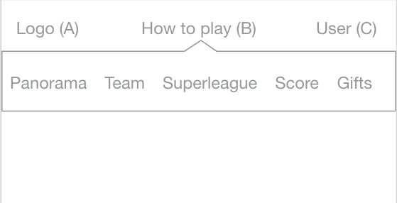
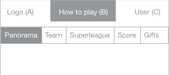
If "Πως παίζεται" is meant to be a CTA (call to action), make it look like one. A button in mobile would be better than just floating text next to the profile picture.
In general you need to re-approach where you want the user to concentrate on and work from there. I understand the need for everything to be approachable and visible to the user but there are limits to how much attention you can try to draw out.
Your text is inconsistent. "Πως παίζεται" in desktop is uppercase but lowercase in mobile. Keep also in mind that uppercase adds more "noise" and is not as friendly (considering the theme of the website) as you probably would like it to be.
If I could sum all this up: If everything is important, then nothing is.
From a UI perspective:
There are major inconsistencies in text and icons. Text I mentioned above. All icons look like they've been taken from different icon sets. Even the default profile picture looks completely out of place and has a different art style than the main guy in the logo.
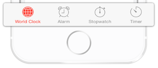
Uniformity is a must, especially when we are talking about navigation options.
Consider using icons from the same icon set or with a unified colour theme.
You can find some good icon resources here:
Consistency and attention to detail increases trust with your users and makes them consider that you have a good product to offer.
You are also giving a lot of emphasis in icon size but those icons don't have a direct correlation to the menu option that sits below them.
"Ομάδα" (team) has an icon that shows tactics and next to it you have a similar icon (only with gradients) for Superleague.
You are using a playstation controller to signify "Πως παίζεται" giving the impression that you can use a controller. Is that true? If yes then why is it missing from mobile as an icon?
In short: Simplify, I know you want to impress but bring it down a notch and draw attention to a couple of strong elements that help and entice your users.


