11

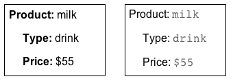
I'm redesigning a website that has some simple information presented as a table like this:

mockup

download bmml source – Wireframes created with Balsamiq Mockups

I read yet the again the Label Placement in Forms article. The article is a report on eye tracking study and basically says that forms are quicker to read if form labels are place above the fields instead of to left(left-aligned or right-aligned). I was wondering does the data from that article apply to any similar presentation of information? So would a better solution to the table above be simple linear list with headings like this:
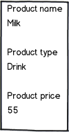
mockup

download bmml source

I appreciate any pointers to relevant articles.

2
  • Do your users need to have ability to sort or filter? And what are you expecting users to do with this information? If it's to find the best price, table view might be easier to scan since you will have all prices grouped together and labels will not interfere with scanning. Commented Mar 1, 2013 at 21:58
  • Placing labels above text fields is only recommended when a user need not scan the form to locate specific fields. It is not recommended otherwise, and probably wouldn't perform best when a design needs to communicate kinship between the items. Be very, very wary of mis-applying ergonomics "recommendations" from one context to another. Commented Mar 2, 2013 at 10:35

10 Answers 10

9
+100

Your linked article is talking about the relationshiop between labels and input fields. The use case is in there is read, think, type. Input, process, output. And during output (typing) a user may want to revisit reading and label-on-top-of-input facilitates that.

The use case of the information you are presenting is read, read. Or maybe simply read. Very different. Your illustration #2 doesn't facilitate reading. A table has too much unnecessary ink for a 2 item line and also slows reading. (But if you consider the information tabular in nature it would be correct to use a table, but I would either have it not display the grid or make the grid very faint.)

I think JohnBG's suggestion of the format is a good one.

1
  • Pointing out the difference of input and output, good answer!
    – Samuel M
    Commented Mar 3, 2013 at 9:43
7

For the most part it is a design issue. But in general I would use a table when there is a lot of information present, and simple text when there is little information presented.

When you present in text, however, you should pay attention to the formatting so that it is quick and easy to tell the label apart from the data. In general I would also keep the labels on the left rather than above the data.

Some rough examples:
enter image description here

6

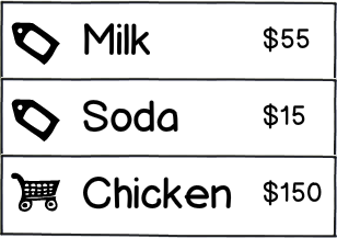
Note that in some cases it would be even better to leave out the labels entirely... In your example it can look something like this:

mockup

download bmml source – Wireframes created with Balsamiq Mockups

Using less wording in your designs will always make the more clear and easy to scan. Images (in the right amount) that will represent repetitive wording will always make the page more easy to read because the eye ignores them while reading text.

That way you will be able to enhance the important information such as the product name and price.

You should also use different font sizes to attract the eye to different data.

2
  • 2
    -1, this sounds like a strong case of iconophilia that has been a designer plague for years now. Unless the graphic is immediately obvious (by convention or imagery simplicity), it just adds confusion. You're not to try and make a smart sophisticated rebus, but an intuitive interface and a pleasant experience. Take this washing machine panel (not naming the brand) - while it has all the buttons needed for soiling, ironing, time travel and cake, it clearly doesn't have any washing buttons O:-)
    – Oleg
    Commented Mar 3, 2013 at 1:18
  • 1
    Just to remind you in my example there is only one icon so calling it "iconophilia" might not be rigth. While there is truth to what you say you should also take into consideration the amount of cognitive clutter reductions icons do. I never said that everything has to be an icon.
    – Mortalus
    Commented Mar 3, 2013 at 3:22
1

From the article we also can see that people just focus on what they need. We know that a textbox is for something usefull towards our objective in the page.

In my personal opinion if the label is too far from the information that represents it to difficult to read; so I think that:

would (...) be a simple linear list with headings

Acording to Jakob Nielsen’s article (I recomend this site 100%), Horizontal Attention Leans Left, so I would also recomend that thouse label where left aligned and put in a way that they look related; and like @JohnGB said, give the lables a different than the content.

Finally, this could help you in a more general way (if you have some pictures in your content). Tunnel Vision and Selective Attention (nngroup.com/articles/tunnel-vision-and-selective-attention/) Sorry the don't let me pots more that 2 links.

Best regards.

1

Don't mix "Question A" with "Answer B". Labeling a form is something completely different than structuring the output of data. If I got your question right you want to design an output interface and try to draw conclusions from an input interface.

So I'll first try to answer your output related question: when structuring output, a horizontal orientation would be the "natural" orientation because users are used to read texts that way. If you additionally want to put an emphasis on either part of your output by making it bold, red, underlined etc, that's fine – but basically not necessary since you structured your output already by placing the label on one side of the ":" and the data on the other. Often these types of outputs are not even placed in tables. Just a quick example:

Name: John Miller
Job: Designer

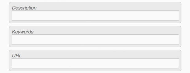
Well - and then there are forms and input fields - and I don't want to dig into form design now, but maybe a screenshot of the scenario "labels above fields" might be useful at this point:

form labels

1
  • Had to like this answer, was also thinking why piece of information is thought to be shown like input form, when it's not an input form.
    – Samuel M
    Commented Mar 3, 2013 at 9:41
1

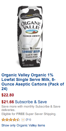
I have no links to the articles, but I think that you may look at Amazon, for example:

enter image description here

The screenshot above demonstrates one very important thing:

Let information describe itself. Use colours, currency chars, highlight the name of the product with font style, etc.

It actually doesn't matter how you will layout the labels if you can avoid them completely.

0

I'm facing a very similar issue. We have a list of articles that appear fall within 5 channels/categories (picture, text, video, etc, etc). They all have labels and headlines. Additionally each channel has a specific list of information like time stamps, date stemps, length of video, word count, image size, kb size, etc, etc. We have a view all page where you can see all articles from the different categories. The problem I faced was that the table columns were very inconsistent from category to category. After some research, I found that the user was most interested in the headline and label, so I stacked them. This makes the layout cleaner and allows for a quick scan.

Example:

LABEL
Headline that is pretty ridiculously long goes here
Time stamp | date stamp | image size | kb size

Additionally, I'm using color and line-height to emphasize the hierarchy of information.

0

I think you are trying at apply correct rules to wrong elements. Fist thing we need to do is keep the goals in mind.

GOAL: Complete form

The reason why "Labels" over "Input fields" is being used is because we want users to complete the form fast, so they could reach their goals, buy a product, subscribe or register. Also we want user to finish this asap because they can't reach their goal without completing the form.

GOAL: Get information about product

This is completely different goal. Here you want user to spend some time, to analyse the information that is provided. If they are not interested they don't have to read it, its not going to hinder their progress.

I believe there is no right or wrong way of displaying this information, as long as it is easy to understand what is the title and what is the item

0

This is the first time I've seen the study, but I remember it (or a similar one) being mentioned in a Lynda usability video. If I recall correctly, vertical alignment decreased scanability of the form when fields are not completed sequentially (basically any time the user goes oh hold on, I got that wrong a while back they end up spending a lot more time navigating within the form, arguably enough to offset or reverse the original reading speed increase).

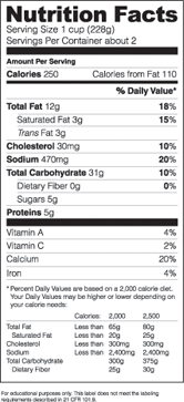
How does it apply to your question? Unless you expect all your information to be highly relevant to the user, a tabular layout may be preferable. Consider this: would you stick nutritional labels into a vertical layout even if you knew they are faster to read? No, because they are impossible to scan and users would hate you:

FDA label
(source: fda.gov)

-3

Why not have both and give users the option on which one they prefer?

1
  • Usually you would want to make the best decision for the users without asking them an extra question in the product. Although I am not sure if you are suggesting a study where you ask users preference. If that's the case, you have to be very careful with user preferences because often what users say may not match how they will perform with certain UI choice. Commented Mar 1, 2013 at 21:55

Your Answer

By clicking “Post Your Answer”, you agree to our terms of service and acknowledge you have read our privacy policy.

Not the answer you're looking for? Browse other questions tagged or ask your own question.