9

We make educational software. Each Lesson has instructions.

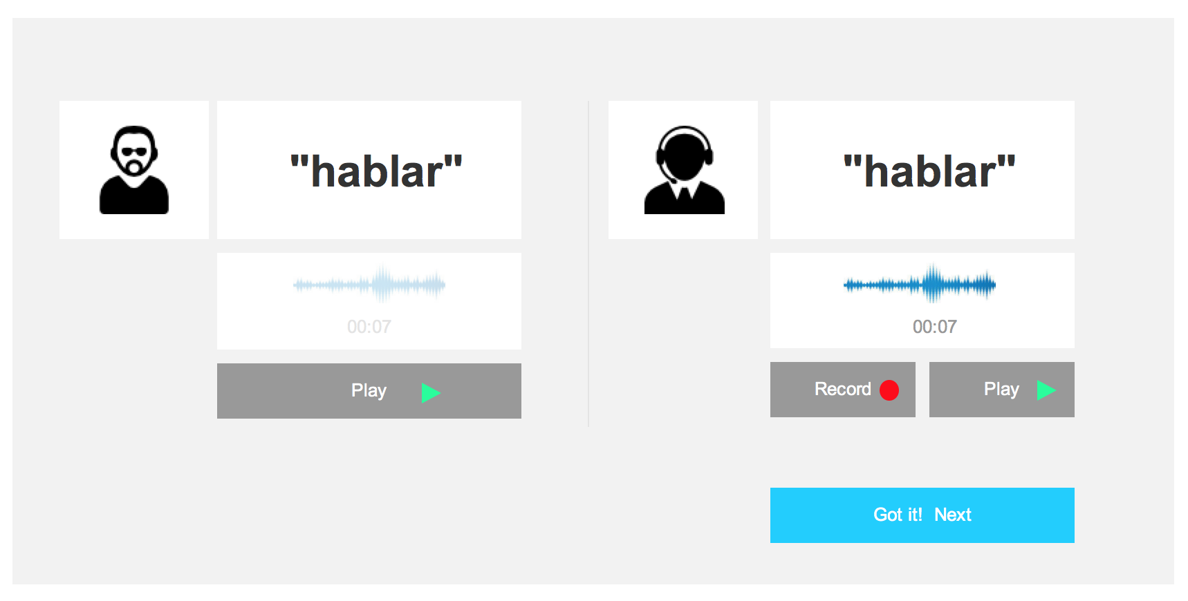
Sometimes the instructions are fairly obvious (Click the picture that matches the spoken word), sometimes they are more complicated :

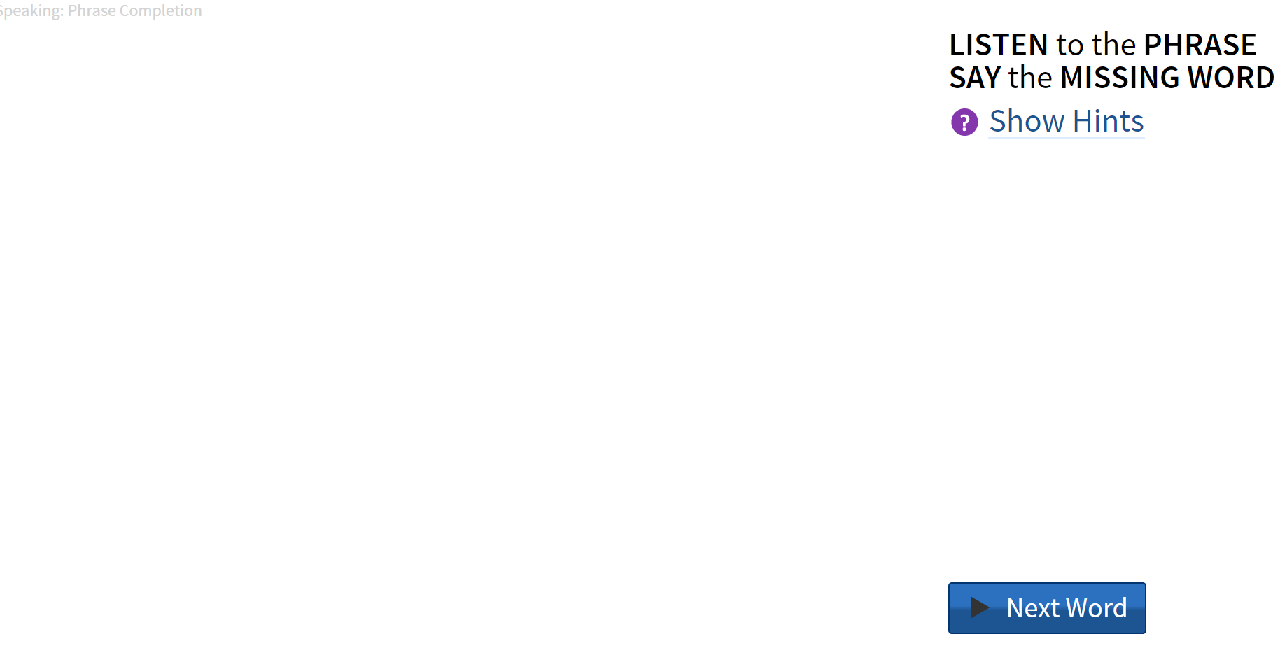
  1. Listen to the word.
  2. Say the word until you feel like you've got it.
  3. If you need help, click the Hints button.
  4. When you feel like you've Got it, click the Next Word button.
enter image description here

The problem we have is that 80% of the folks I test with don't read the instructions. At. All. (Not an uncommon problem based on my 20 years of experience with this).

Solutions I've considered:

  1. Display the instructions (the first time) one line at a time. This adds visual interest. (our education expert doesn't like this b/c he's concerned that changing the instructions in anyway ( like gradually revealing them the first time through) would confuse our brain-injured users.
  2. Use a very legible handwriting font for the instructions so they stand out more from everything else.
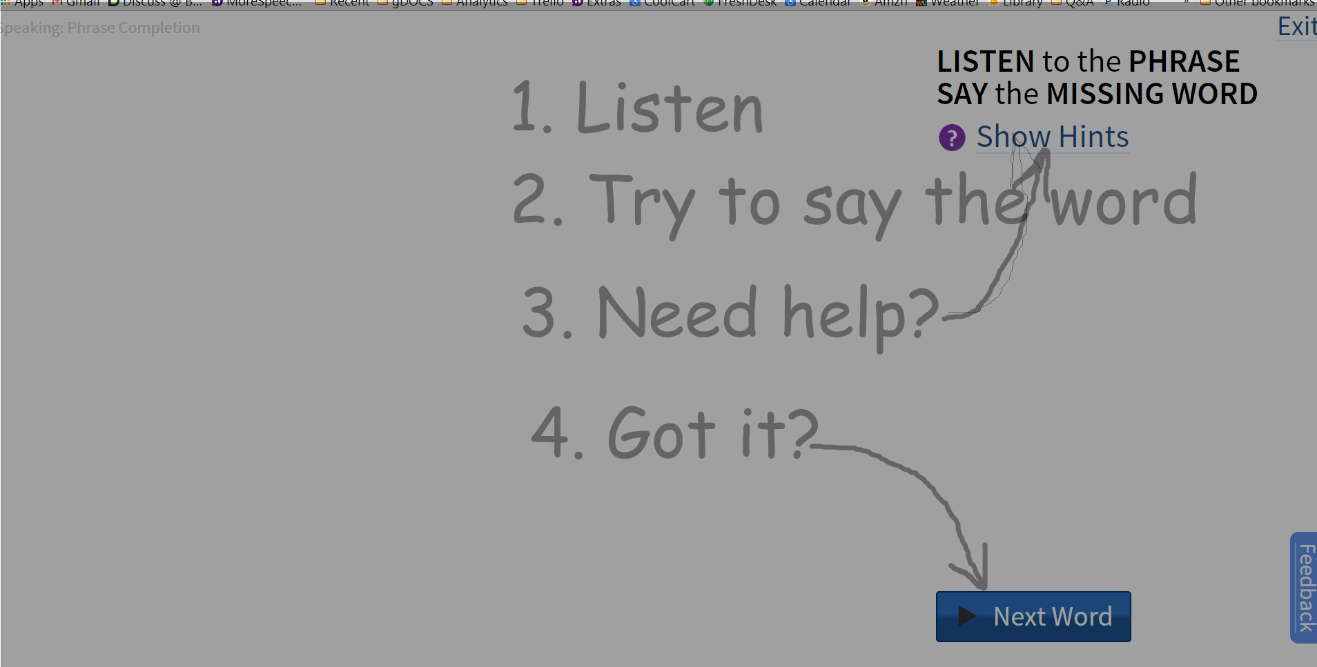
  3. Use one of those "sketch overlay" screens like this: enter image description here
  4. Changing the button name to Got it (but then adding a second button for Skip it
2
  • If you have users that have diminished cognitive capacity, you absolutely must test multiple ideas with them.
    – dnbrv
    Commented Feb 11, 2015 at 18:46
  • Many people do not respond favorably to CAPITALS as it is considered SHOUTING and is not as easy to read. Why introductions that just repeat the page with numbers? If the numbers help then put them on the page.
    – paparazzo
    Commented Feb 11, 2015 at 19:40

6 Answers 6

4

Users are generally very bad at dealing with instructions (unless they have to) so when you have to supply users with instructions you need to provide as much context as possible and link this to specific tasks with adequate feedback.

This being said. there are few things you could do for the short and medium term to manage the problem:

A- create a screencast or a video capture that incorporates the instructions.This has the advantage of enegaging a lot more senses than reading or visuals only approach and users will be more receptive to how to go through the learning process.

B- Use graphics and illustrations highlighting the steps needed to go through a task while clearly distinguishing these from where to seek help or hints.

C- Isolate tasks such Listen, Say and equip them with their own workflow and adequate feedback mechnism to allow users to engage with the learning process, for example:

enter image description here

D- Gamify the process by introducing scores and other forms of reward for better engagement and to indicate progress to your users.

1
  • I like the concept in the graphic. It replaces reading with doing.
    – PhillipW
    Commented Feb 27, 2015 at 23:32
2

You might try adding iconography (Ear for "listen", talking profile face for "say") to see if that changes the attention of the learner.

3
  • 2
    You need to be careful with just iconography. A lot of the times iconography can be very ambiguous, and without knowing it, it can make the process more difficult.
    – UXerUIer
    Commented Feb 11, 2015 at 20:19
  • That's why I suggested adding it instead of replacing words. Adding visual interest may get the people using the software to pay attention to the part of the screen they are ignoring.
    – Voxwoman
    Commented Feb 11, 2015 at 20:21
  • I agree. Too much text could be uninviting.
    – UXerUIer
    Commented Feb 11, 2015 at 20:26
2

A "sketchy screen" would be a good idea because you can differentiate layers and you won't lose your "learner" attention. To close this layer a close button under the instructions it's easier to find.

  • You could implement this by putting a big circled button right under your statement so they can clearly see it. Also you could put a tooltip to show a tiny title like "show instructions".

  • An animation on the button changing its scale to capture their attention when necessary(like adding this feature only when they hover the instructions container) it's a nice and user-friendly way.

  • For colouring you could use a light green or a light blue for the background of the button so it looks nicer to a child.

  • A Marker like typography can be very useful because it has a good lecturing and your "learner" is more likely to recognise them as instructions.

And you could also show the instructions when they get to this exercise.

2
  • Maybe an animation fading our or shrinking the sketchy screen would be preferrable to requiring user interaction in order to close the sketch.. I would get annoyed if the interface would block me in doing what I'm actually trying to achieve.
    – cacau
    Commented Feb 27, 2015 at 10:09
  • @cacau but the interaction is good in this case because it makes sure you understood the instructions. And this will only appear on every block of exercises.
    – UzendayoNE
    Commented Feb 27, 2015 at 21:59
2

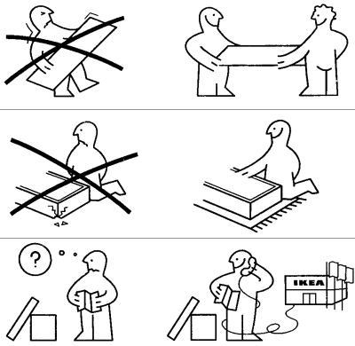
One approach to try is to visualize the instructions. A good example is how Ikea does this:

enter image description here

This is print only and Ikea uses no text so it is suitable for multiple countries. In the digital world you can of course translate and some text could support the images. You should test with different images to tell which one is best understood by it's audience.

1

I think solution 1 is a good one and I've seen it used in practice frequently. As long as there aren't a huge number of steps the user has to click through to get to "I got it", this is a great way to demonstrate functionality of the application and ensure they understand what they're doing. As long as you provide a way to exit the tutorial (small X button somewhere), I think this is a great solution.

1

If you want people to read them, minimize them. Reduce them into the smallest possible number of steps. Distill them into the shortest possible sentences, then cut them shorter.

If you think they're too complex, they probably are. Simplify your application so they don't need as many instructions.

Your Answer

By clicking “Post Your Answer”, you agree to our terms of service and acknowledge you have read our privacy policy.

Not the answer you're looking for? Browse other questions tagged or ask your own question.