1

I'd like to make use of a cycle button, i.e. a single button that will toggle between a number of states (three or four). Since these buttons are generally frowned upon, there are few examples of designs out there. I am considering something that visually conveys A) that this is something you can push to change it, and B) that there are multiple options. The button should convey the current state. There is no room for text. The button must be small, as small as it can get and still be easily "clicked" on a touch screen.

I have included a few sketches to illustrate what I mean:

Sample sketches

(Please, don't answer "use check boxes/button groups/whatnot". This a web application designed for all screen sizes (including mobile phones), so screen real estate is really, really expensive. Also, this is something the user will use many times a day, so once they have recognized that the button cycles, I think they will get it. Anyway, my question is not about which control to use but how to visually design a good cycle button.)

3
  • Welcome to UX, John. Could you perhaps clarify which states it toggles between? What's the app about?
    – Vince C
    Commented Dec 10, 2014 at 10:34
  • Thanks! The app keeps track of people. I have one control that sets "person A has checked in/person has not checked in". The control I now want to add provides additional info for each person: "Person A is having lunch/in a meeting/teaching/preparing a lecture". Commented Dec 10, 2014 at 11:08
  • Is it one-directional? So no cycling back, just all the way around and then it starts back at the first setting? Commented Dec 10, 2014 at 20:03

1 Answer 1

2

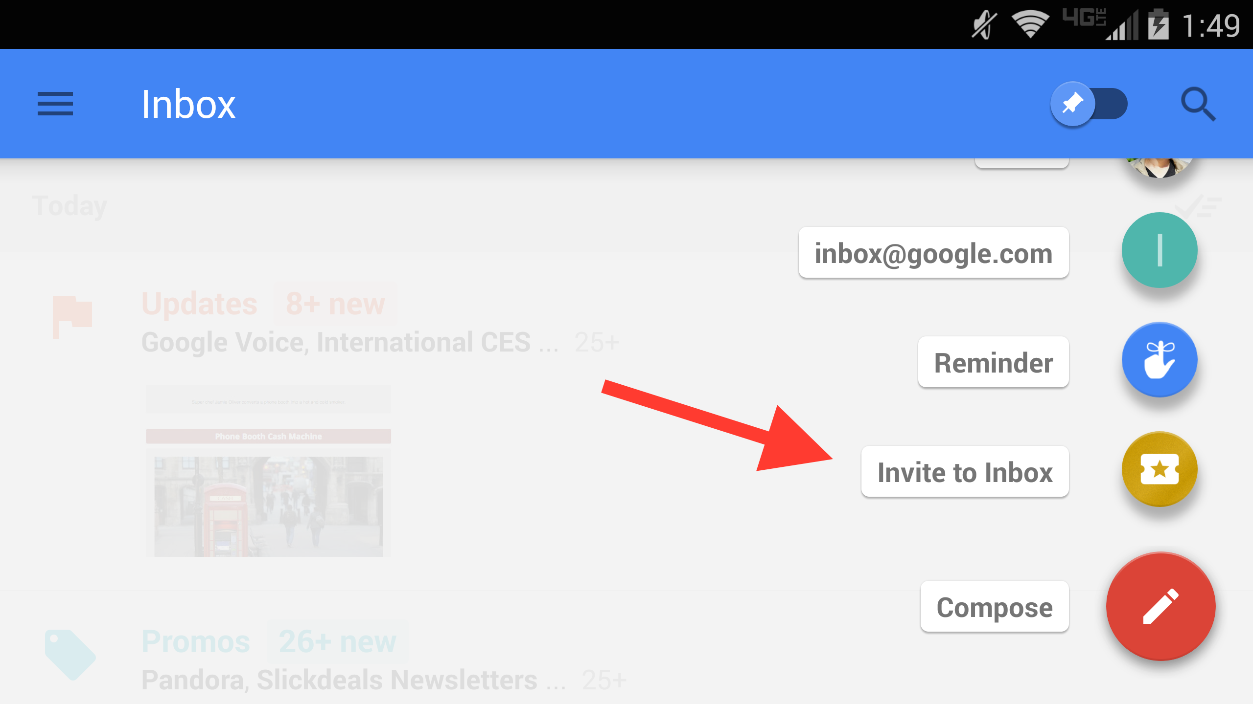
Well, if you have a limited set of options, you could opt for something like Google's action button in the new Inbox app.

Google Inbox

The user would have to press one button (the icon representing 'doing something'). Pressing the icon will give you the options:

  • having lunch
  • in a meeting
  • teaching
  • preparing a lecture

...in the form of icons (optionally with labels).

Reference: Google Inbox animation

2
  • Wouldn´t that be more like a drop-down, requiring one click to open the "menu" and another to select the appropriate option? (Couldn´t get the app right now, but will sure take a look!) Commented Dec 10, 2014 at 17:19
  • Well yeah, it does require an extra click action but this way you'd get some order. This way you also don't have to cycle through everything just to get the right one. For example, to get to 'preparing a lecture', you'd have to tap 3 times vs 2 times (the Google way). And if I accidentally skip the right one, I have to go through those options all over again..
    – Vince C
    Commented Dec 11, 2014 at 8:18

Your Answer

By clicking “Post Your Answer”, you agree to our terms of service and acknowledge you have read our privacy policy.

Not the answer you're looking for? Browse other questions tagged or ask your own question.