1

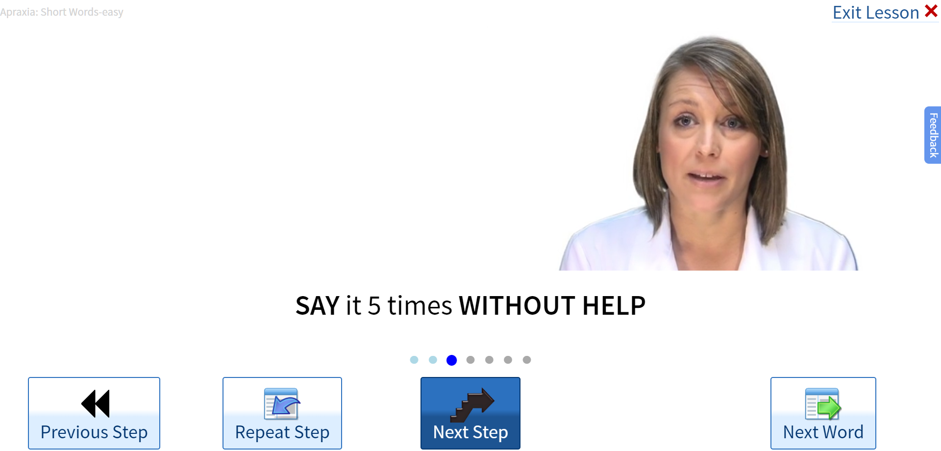
I've been doing some UX testing and those users (3 out of 3*) didn't realize the blue button (below) is the default.

I'm trying to figure out how to make the primary button more obviously the primary. The goal is that if they don't know what to do, that Primary button is what they should do.

My top option is to make it glow (pulsating) like this. It would probably be very very slow pulse ( off for 2 or 3 seconds, glow on for 1 second), etc. The idea is they'd learn that that was the primary button.

Any thoughts on that or better option?

LESSON SCREEN

User watches video of the woman and then repeats back what she says. They should click the Next Step button and go as far as they can. Then go to the Next Word.

enter image description here

SCORE SCREEN

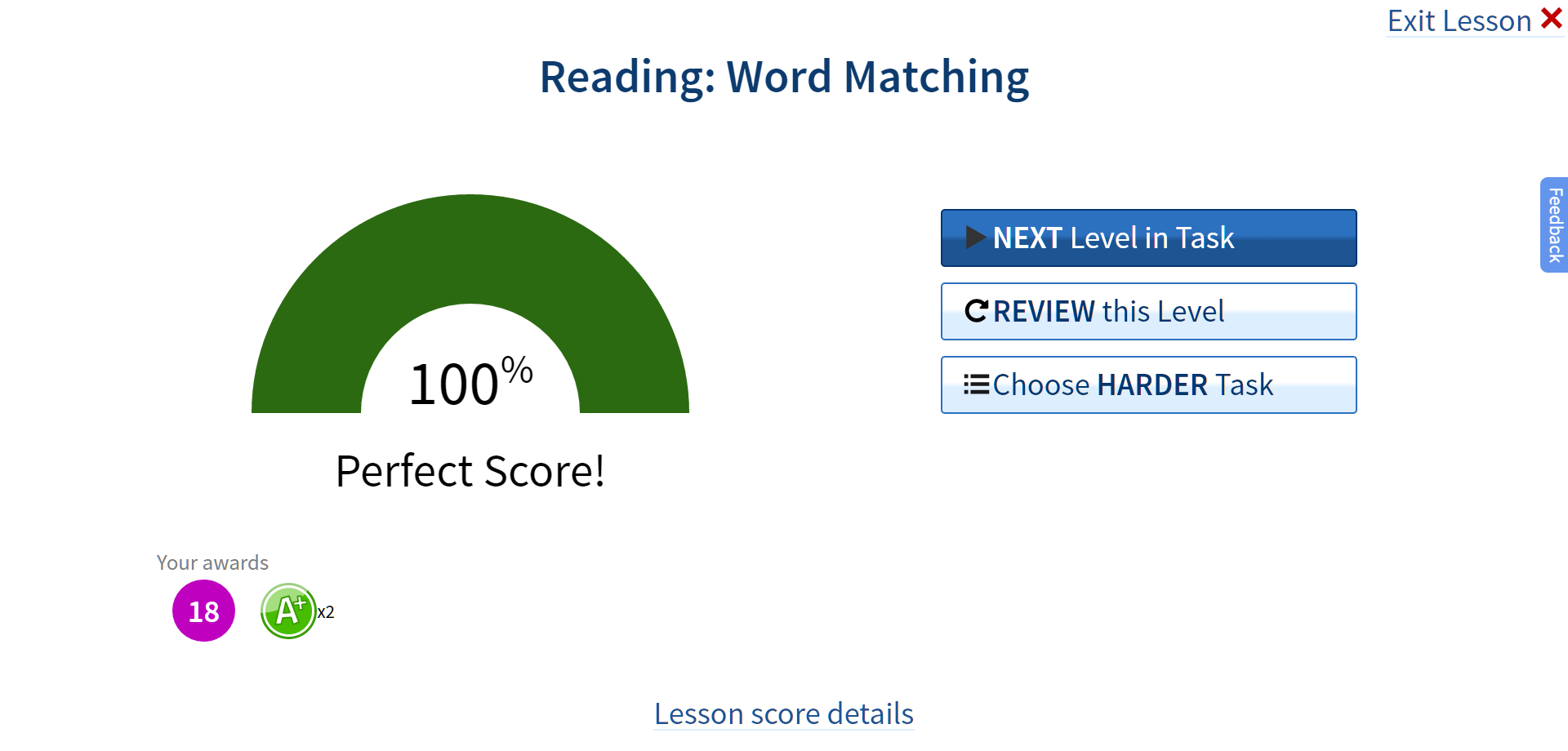
This is shown after lessons that measure their performance (so things like "click on the picture that matches the word). (We can't grade speech very well so we don't even try). We show them choices for what to do next. The primary button is our "recommendation"

enter image description here

Followup:

I realized that the ideal solution for the first screen is to make the First STEP not start automatically. So when they first get to the screen I'll make the button say "First Step". Then after they click it it'll change to "Next Step for this word" (may leave out "this".

That still leaves the issue of how to indicate the primary button.

6
  • Why is "next step" a primary button? I looks like all other buttons. Commented Jan 14, 2017 at 22:44
  • Do you mean "what about the appearance indicates it's the Default" button? then : Good Question. You are right, it does look like the other buttons. I'm trying to figure out how to make it look LESS like the other buttons. If you mean "why should next step" be the default action, then : This is the next step in the exercise for this word. (I am also planning to change that button text to "Next Step in word". But users also don't realize Blue is the primary for other screens. Commented Jan 14, 2017 at 22:52
  • How do you know that they don't know what to do next? And 3 out of 3 is quite a small population. Are you sure they're not outliers? If you're sure that they're representative, then perhaps it'd be good to get some fresh testers and ask them to report what they're thinking as they go along so you can see whether they all stall out in the same way.
    – MMacD
    Commented Jan 15, 2017 at 11:30
  • @MMacD. A reasonable Question. Just showed to 4 more people today. 3 of them didn't know what to do next (they chose Next Word) and also when asked what they thought the "suggested or "default" next button was, had no idea it was the dark blue one. So, 6 out of 7 so far. pretty significatn. Commented Jan 18, 2017 at 2:58
  • I looked at your business site and got a bit more orientated about what you're doing. I still don't know much, but now I understand why your users are having trouble. I've made a suggestion about that in the form of an answer. It'd be helpful to have more background information about terminology, the layout of your exercises, the purpose of the image of the woman in the page, etc.
    – MMacD
    Commented Jan 18, 2017 at 15:50

5 Answers 5

5

Visual weight

In the example below the secondary option has draws much less attention than the primary option. How you do that is up to you. Different situation but same issue.

enter image description here

The other thing that doesn't help in your design is that it's very crowded. Try to use more whitespace.

1

You followed a rule to make the primary button more saturated (blue instead of white) but have fallen into a couple other pitfalls.

Don’t reverse text for emphasis

Reversed text is not necessarily bad, but different people react to it differently. Many people, myself included, almost instinctively ignore reversed-out text — because they find dark-on-light text easier to read. Since different people react differently to reversing text, it’s not a good choice for drawing the eye.

Make the default button “first among equals”

Your default button looks so much different than the others that folks might not realize it “the same sort of thing” as the other buttons.

Instead of changing the color scheme, use a raised button effect to make the button literally more prominent. That is, the button should appear to be closer to the user than the other page elements, almost as if it were a separate piece of paper on top of the rest of the page. If your page design is largely flat, the raised button will strongly draw the eye.

Increase contrast in your primary button

Default buttons should “pop” by having a little more contrast than the others, but it looks like your primary button actually has a little less contrast between your text and background than your other buttons (maybe just because of how the white text dithers in the provided image). The is definitely less contrast between the button’s icon and its background.

Go Old-School and make the text and outline bold

It looks a bit dated these days, but the old practices of giving a primary button bold text and background background are still effective.

1

Dark and cool colors recede; light and warm colors advance. So in your design, the dark blue primary button seems further in the background than the lighter secondary buttons. Just switching the styles for the two type of buttons is another option to test with your users.

Size is another consideration. Your primary buttons are the same size or smaller than the others.

0

I have some suggestions:

1.You could remove the background color of the others button make them a ghost button which is really good if you wanna put them aside with the primary CTA.

2 If you want the Primary CTA more obvious to the users you need to leave it alone, you can put it to the bottom center.

3.For your first picture, the next step button should in the right position replacing the "Next Word" it will give a consistency because your previous step already in the left side and the icon I think should be opposite of the "previous" one.

4.You can use a strong color/ conventional color like orange, red, and green which will catch the users attention more than blue color.

2
0

I'd suggest a tighter visual organisation and making the instructions non-verbal insofar as you can (I've not tried to address the 3 buttons at the bottom, but two of them seem redundant). I've no idea who's supposed to use the "feedback" buttons so I didn't touch them, but they should probably be moved to the bottom edge along with the other housekeeping stuff.

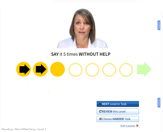
The biggest change I'd recommend would be to make the default visually obvious not by flashing lights or dancing text, but by showing the series of which it's a sequentially moving part.

I presume that "step", "word", and "task" relate hierarchically, but I don't know the relationship and so can't say much.

4
  • I see lots of benefits of this design. However, for our use there are some issues: 1. The button to click on for "next step" ends up being much smaller. Our users are older (70+ in many cases) with poor dexterity. Very easy to click wrong button. 2. It's visually MORE complex now. I wouldn't know which button to click on "next". See updated description of the goal of this screen. 3. I'm looking for the simplest (easiest) change. Changing BUTTON is much easier than changing the whole UI. Commented Jan 19, 2017 at 14:11
  • I don't think I'm following. Why would the "next step" button (the blank goldenrod one in the sketch) turn out to be smaller? If you're dealing with patients who have some aphasia, as it seems as though you are, unwrapping the progression and using guiding symbols (symbol recognition is conserved in aphasia patients) would seem to be your friend. In my sketch, I presume, from your original, that you have 7 steps-per-word, and that the patient needs to move to step 3 as indicated by your tiny row of circles above the Next button.
    – MMacD
    Commented Jan 19, 2017 at 15:30
  • I appreciate that you'd prefer a small change to a large one, but is ease of change preferable to improvement in use?
    – MMacD
    Commented Jan 19, 2017 at 15:30
  • 1
    The problem I find with your button u/i is that there's no inherent "next-ness" in a button. There's no sense of progression--it's the same button, every time. Now, you have that small progression of dots above it, but apparently, from your testing, people aren't making the association. Adding strobing to the button says "notice me", but it doesn't say "next". So unless you want to just tell people "this is the next-step button so click it each time you want to move to the next step", it'd be good to incorporate progression and next-ness into the design in a non-verbal way.
    – MMacD
    Commented Jan 19, 2017 at 15:54

Your Answer

By clicking “Post Your Answer”, you agree to our terms of service and acknowledge you have read our privacy policy.

Not the answer you're looking for? Browse other questions tagged or ask your own question.