7

Like most every site out there, I develop a site where we encourage people to share the content through Twitter and Facebook.

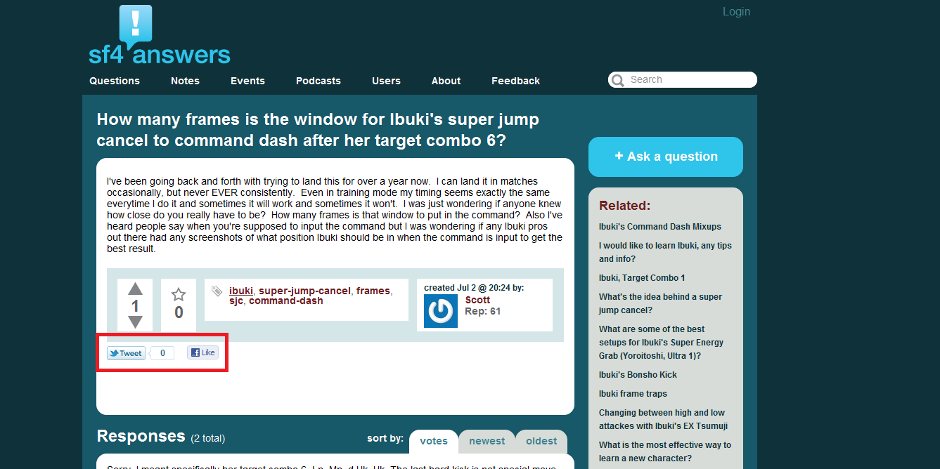
Also, like most other sites, the placement of the widgets is in a fixed position. Currently, mine are at the bottom of the main content like so (it is a StackExchange clone in many ways, so it is placed after the question, highlighted in red):

sf4answers question

The problem with placing it at the bottom is that if the content is long enough (and there are some very long entries), the user has to scroll to the bottom if they want to promote it.

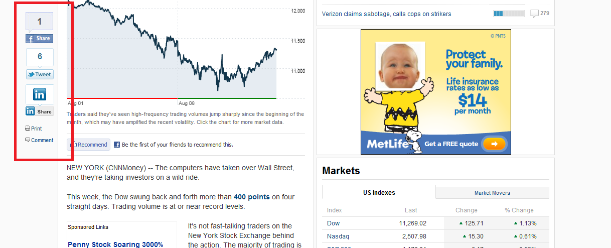
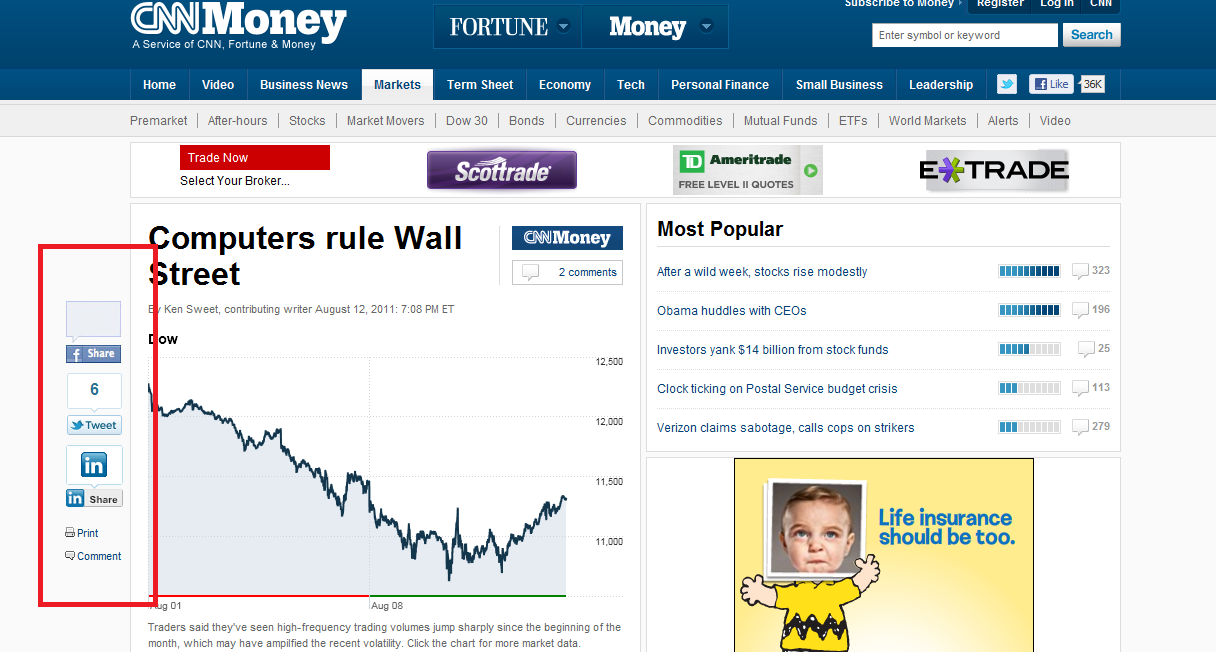
However, while browsing the Money site on CNN, I noticed that the share widgets were placed in the space beyond the margin where content doesn't typically go (highlighted in red):

CNN Money - top

While scrolling down, however, the widget floated with the content; the position is always fixed on the same place in the window (as opposed to on the page) producing the effect of floating while you scroll through the content (highlighted in red):

CNN Money - scrolled

The questions that arise are:

  • Is this generally a more or less effective way to encourage people to use/engage the share with social media buttons?

  • The content is outside the current "standard" width that you see for most content-driven sites (this one is 991 px but most people go by 960 px if I'm not mistaken). What are the concerns and/or benefits, from a design/usability/device compatibility standpoint?

(Note: I'll be adding a cursor heatmap image soon)

3 Answers 3

6

As long as people can find your buttons fast, then I would say you have placed your Social Media buttons in a good place. As for if a technique works well, the only way to know for certain would be to measure using actual stats over a quantifiable amount of time.

I'd hazard a guess and say they (money.cnn.com) get more through doing this way that simply having it at the bottom of the page for a number of reasons.

  • The icons are big.
  • They have popularity counts, so people don't feel they are alone in 'like'ing it.
  • They are easily findable and are not hidden in a sea of other information.
  • They are always to hand and never "under the fold".
  • They appear at a location that people move past with their eyes when going to the back button.

They've obviously made the decision that this is a key metric for driving customers to their site as they take a more prominent position that most sites offer.

When deciding where to put sharing links, I would suggest that the first thing to know is how people read your site, as I believe that will affect where you put the icons. Once you know that you can probably work more effort into finding a place where people will naturally look on your site at the point they've finished reading the article.

E.g. on this site, they are in two locations.

  • SO & SE in general: the almost invisible text that I would presume few people read that is directly below the question.
  • UX SE (here): They also exist underneath the rating arrows (a key part of the interface, where people will be drawn to after reading a question).
  • SE: They also exist very prominently underneath your answer when it appears - making it very easy to share your answer (a natural thought process that's been optimised for).
  • BBC.co.uk has theirs directly under the article.
  • ICanHazCheezburger.com has them under the article, but not immediately.
  • money.cnn.com has theirs (like you say) on the left. Always available for viewing.
  • Other sites have a similar idea where they are permanently at the bottom, regardless of scrolling.

Basically, the summary I would go with is that you want to catch where a person's eye goes to immediately after reading an article and I guess there are a number of tasks they would possibly be doing:

  • Looking to see if there is another page / more information.
  • Going to press the browser back button because they've got their fix of your site.
  • Looking to perform an action on your article, such as rate it or answer / comment on it.
  • Looking to find who the author is / what the site is called.
  • Any wealth of things that people do when they've read your content.

If you search on the web for sites that deliver content in a similar way to you and ones that have a similar demographic and see what they are doing - you might find a pattern emerging.

As a rule of thumb, if you are unsure - if I was looking to share something, the first place (as an experienced user) I would look, is slap-bang at the foot of whatever article / post / picture I was consuming. If in doubt, you place them there (as SE do) and then consider alternative locations - I don't think you'll end up being far wrong.

Basically:

  • There is no one size fits all.
  • Know your audience and how they behave.
  • Aim to make your icons "in plain sight" when they are needed, and out of the way when they are not.
0
4

So I'll preface my response by saying that it really does depend on the rest of the layout, as far as how you have certain elements grouped or layed out, but I generally am a big fan of using the approach the CNN Money site you referenced used. I can't count how many times I've experienced frustration while hunting for a site's 'share' options, since (as you've obviously noticed) there is no one standard place or method for displaying them.

So the main pro of using this approach is obviously that locating the options are a no-brainer. Not only is it right within easy reach of the content you wish to share, but it's highly probably that the user has already noticed the option there while scrolling through the document, so they'll know just where to reach for it when they decided to use it.

I'd say a con to this technique is that it may not agree with your current design. Referring back to the CNN Money example, I would actually prefer that it be on the right side of the content instead of the left, since the cursor is most likely to be on that side of the screen already (close to the scrollbar, or other links). Another could be that it may not play nice with other scripts on the page (e.g. performance issue, script conflicts, etc.), or work well within the mobile version or view of the website (e.g. obscures other content, performance issue, large download, etc.).

If the cons were to outweigh the pros for a given site or scenario, I'd say my secondary preference would be to have the social media options at both the beginning and the end of the content (probably top-right/bottom-right corner, respectively). This way the 50/50 chance of heading in the correct direction, and thereby easily locating the option, leans that much closer to 100/0.

0
2

I would put the share buttons in exactly two places, that being above and below the article content and no place else. Share buttons elsewhere confuse the user into not knowing what they are sharing. Share buttons above the article encourage article skimmers to share. Share buttons below the article, sandwiched between the article and the comments encourage article readers to share. I personally find the floating sharing bar extremely distracting. It detracts from a quality reading experience when you have a floating share bar in your face, like it's saying share me, don't read me. It's extremely amateur and ensures the article is not worth reading and much less worth sharing. Also, social share buttons are great for your sites marketing and all but make sure you also include a mail sharing feature. As this is still the most primary way people will want to share your content, for themselves and for their few select peers.

3
  • Good point: share buttons that float in a fixed position don't communicate what you're sharing. Commented Aug 14, 2011 at 12:59
  • @egfx: You say "It's extremely amateur", would you care to elaborate? What if it was applied to the voting section on SE sites (for really long content, I'd find this helpful)? I guess what I'm looking for is an objective view of whether or not it's amateurish (and why) vs convenience.
    – casperOne
    Commented Aug 14, 2011 at 16:36
  • well, i'm saying it's extremely amateur in the context of the detracting nature of them. Every time the user scrolls the page you will have a share bar flying in. This will detract the users attention from what they really want to be focusing on to the share bars. And I don't think that they will want to share your content at that time. I think the only two times the user will want to share is at the top or at the bottom of your content. Not in the middle of consuming it.
    – Chamilyan
    Commented Aug 14, 2011 at 18:52

Your Answer

By clicking “Post Your Answer”, you agree to our terms of service and acknowledge you have read our privacy policy.

Not the answer you're looking for? Browse other questions tagged or ask your own question.