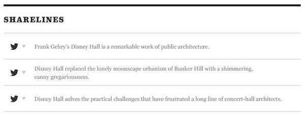
There are probably specific anecdotes and data you can get from talking to someone at the LA Times, but we can also look at the user related properties of the feature and the business needs of a media outlet. Media outlets put share buttons everywhere, but users are deleting the precooked text. It's possible that someone sat in a room and said, "what if we just gave them other choices so they wouldn't delete our text and tagging etc?" And that's where they missed the mark.
I believe why these failed is because they did not solve a user need successfully. The "sharelines" looked more like a bunch of editors unable to decide on an article title, than a representation of how a reader would want to share the content of the article. Snippets that are more "share worthy" are usually sweetly buried in the article. When you're reading it, a contextually placed Tweet button would go much further to attract new readership.
The way LA Times tried to implement this is summarized by the article you linked to:
The new site gives users several prewritten tweets to choose from at the top of an article and continues the shift toward an article-page-centric ethos for digital news design.
But take a look at the example sharelines. Yikes. These are just reworded titles and subtitles. These seem like dreadfully similar multiple choice options in a reading comprehension section of a standardized test. Ugh.

What would be better? How about all the zingy one liners that might be in the article? And how about a tweet button right next to that line. I found this article underwhelming, maybe because it's for a design comp, but even this line is more shareworthy than the force fed shorelines above:
He wanted to demystify and democratize classical music
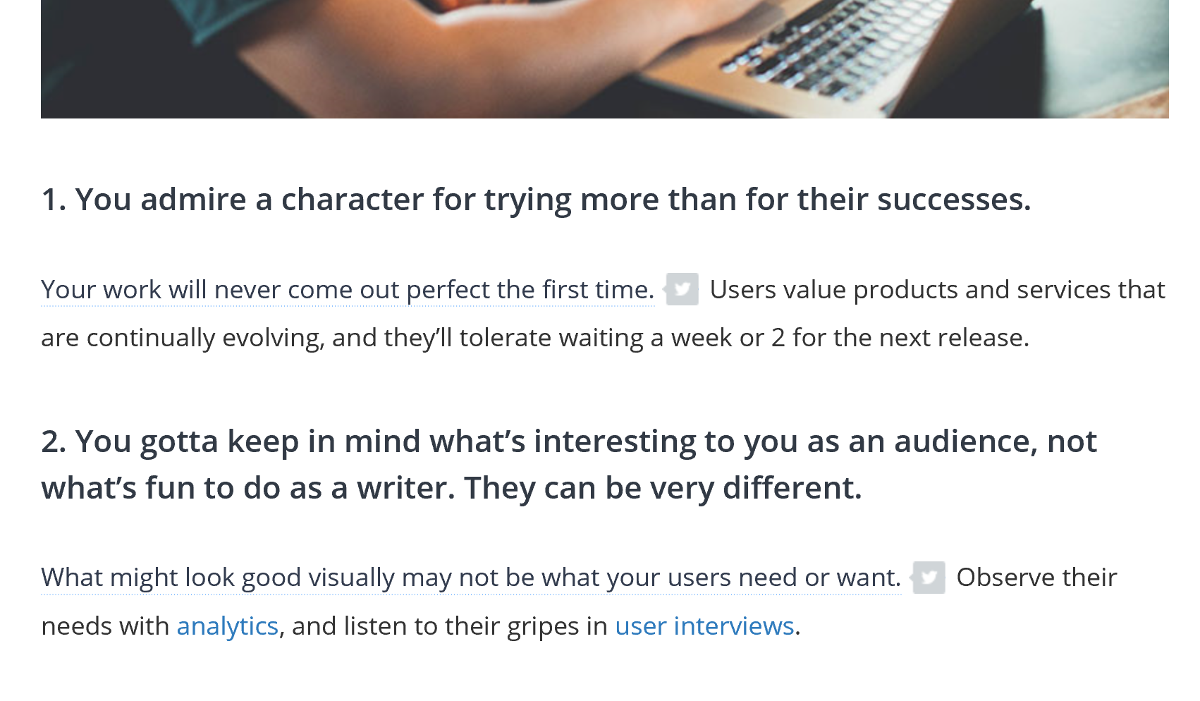
Ultimately, it is about meeting a user's needs to most effectively share an article on Twitter and there are obviously limitations-- 144 of them. So anything you can do to make it easier, offering to tweet a text selection in the article or making better headlines... will go a long way. Many sites are doing this, just-in-time twitter share button throughout an article. Notice the subtle gray tweet button to minimize reading disruption. Check out this one from the invisionapp blog:

Best of luck. :)


