2

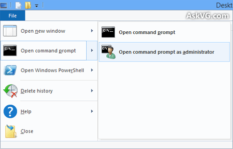
Since Windows 8, the file explorer has this glorified drop-down button: enter image description here

But why is it called "File"? It allows the user to do operations related to the OS, but has nothing to do with actual "Files". It's not "Create new .cmd file", or "Select all files". That functionality is in the ribbon tab called "Home".

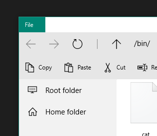
I ask this because I'm developing a remote raspberry pi file explorer, and want to implement a similar menu. But It doesn't seem to make sense:

enter image description here

Ideally, what should this kind of menu be labelled?

3 Answers 3

3

I can't speak directly for Microsoft, but i think it's pretty obviously a relic of earlier windows versions. Changing the name would hurt more users than a semantically incorrect button does.

You could call your button whatever you want because, hey, you're not Microsoft!

1
  • Right, names cling long past their shelf-life because forcing people to re-learn is so painful for them. I don't know if it is possible to take a longer view when designing things and NOT choose terms, icons etc that will become outdated (telephone icon, anyone?) but I suspect that the answer is No. What should the interface look like today so that we will not have outdated terms and ideas in 30 years? Hmm... No one has a brain that big, or that much time on their hands.
    – user67695
    Commented Sep 13, 2016 at 13:35
2

Take a look at the Windows Human Interface Guidelines, specifically the Menus section:

Standard menus

Use the standard menu organization for programs that create or view documents. The standard menu organization makes common menu items predictable and easier to find.

For other types of programs, use the standard menu organization only when it makes sense to. Consider organizing your commands and options into more useful, natural categories based on your program's purpose and the way users think about their tasks and goals.

Standard menu bars

The standard menu bar structure is as follows. This list shows the menu category and item labels, their order with separators, their access and shortcut keys, and their ellipses.

File

   New Ctrl+N
   Open... Ctrl+O

...

This just seems like a use of these guidelines in a not-so-appropriate situation, for the sake of familiarity and consistency (other Windows apps, e.g. Paint or WordPad, have a similar two-pane "File" menu).

Note, however, that these guidelines are pretty old. You should probably follow the new UWP design guidelines, which are used in all the new Windows applications. In this specific scenario, it seems like the "see more" button would be appropriate. (Since new Windows are meant to be tablet-friendly, putting buttons in the title bar, which gets hidden in table mode, may not be a good idea.) From the guidelines:

Overflow menu

The overflow menu is represented by the "see more" [•••] button, the visible entry point for the menu. It's on the far-right of the toolbar, adjacent to primary actions.

The overflow area is allocated for actions that are less frequently used.
1
  • "Use only when it makes sense to." Wow. I think maybe we could all use a reminder of that.
    – user67695
    Commented Sep 13, 2016 at 13:32
1

Note: I'm not very familiar with Windows 8, so I'm answering from what I've read not experience.

It appears it is because that menu isn't meant for actions targeting the operating system as you say, but for actions targeting the files themselves.

This menu is designed to provide you with quick access to some of the more general commands in File Explorer....For example, when you select Open command prompt, the submenu overlays the Frequent places and shows commands to open a regular or an administrator command prompt (Figure C). Both of the open a command prompt window selections are targeted on the currently selected folder.

http://www.techrepublic.com/article/get-to-know-file-explorers-ribbon-toolbar-in-windows-10/

So really the "file" dropdown is just a set of general commands targeted towards your current files or folders. Since it is for "general file actions" I assume the developers were looking for a general term to call the dropdown and went with "file". I do agree with Luchadora above though that something like actions may make more sense.

http://www.techrepublic.com/article/get-to-know-file-explorers-ribbon-toolbar-in-windows-10/

3
  • Good question. I don't know why it's named 'File', but I'd say 'Actions' or 'Tasks'.
    – Luchadora
    Commented Sep 1, 2016 at 12:40
  • 1
    My suspicion is they've kept the name because a large percentage of Windows programs have a "File" menu-option in the top-left corner for many, many years and not having it there was seen as too big a cognitive break.
    – TripeHound
    Commented Sep 1, 2016 at 13:21
  • @TripeHound that also seems very true and very related. For example in Word file opens up all the actions related to the file (save, info, print, etc.). So it's a matter of general term for actions to do with the file as well as consistency across all their software.
    – DasBeasto
    Commented Sep 1, 2016 at 13:25

Your Answer

By clicking “Post Your Answer”, you agree to our terms of service and acknowledge you have read our privacy policy.

Not the answer you're looking for? Browse other questions tagged or ask your own question.