3

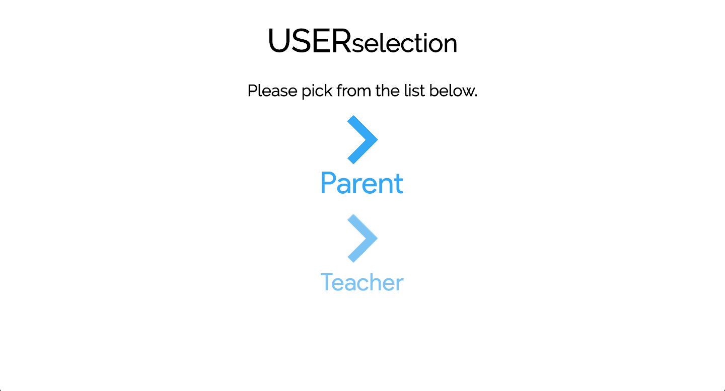
I am working on a site that requires users to identify whether they are a teacher or parent. To ensure I make this as intuitive as possible, are there any obvious changes I should make to the approach below?

user selection

I'd like this to look good and be intuitive enough so that it's clear to the user what I need them to do and how.

What would be some suggestions?

The color fade between parent and teacher is intentional.

3 Answers 3

4

Without seeing the context within which your user selection choice appears, any answer you get will require a bit of guesswork on our behalf. However, at first glance, I have the following to offer:

  • It seems relatively clear what you want the user to do, assuming this is located somewhere the user is drawn to. If it's lost on a busy page, then the user experience won't be a good one.
  • Using labels as well as icons is a good choice. However, using the same icon (elbeit faded) is not. Users tend to associate icons with certain choices, so I would use a distinct icon for each choice. This reduces the likelihood of returning users accidentally clicking on the wrong one
  • Your wording is fine, but if it was me I would shorten it. Something simpler like "Please choose below" to my mind is better than "Please pick from the list below"
  • Your font size for 'Parent' appears larger than that for 'Teacher'. Is this deliberate? I don't know whether parents are the great majority of users, but this will draw people more to the 'Parent' option which may not be your desired goal. I would use the same font sizing.

I hope this gives you some food for thought.

2

IMHO you do not need the label 'please pick from the list below' . You already have a title "User Selection" and the two options right down below, so the action to be taken by the user is clear enough, and you eliminate the clutter .

And also I suggest you change the title a little bit : the user here is in fact selecting the " user mode" , and "user select" inherently give the meaning of "select user name" , so I suggest you use something like "User Mode" or "Select Mode" or something alike .

Best regards.

2

Considering the purpose of this screen is to require "users to identify whether they are a teacher or parent," one approach would be to spell it out in plain english, simply say:

To continue, please select what best describes you:

[ I am a Parent ] [ I am a Teacher ]

This approach is a bit wordy, but makes it very clear what is expected of the user.

I have no idea how this fits within your wider context, but assuming the majority of usage is by parents, consider somehow removing this choice altogether in favor of streamlining the user flow for the parents, then providing an alternative flow for teachers. Once again, this may or may not work depending on your wider flow, but if it has potential to reduce the amount of choices a user is required to make, it's usually worth at least looking into to see if it makes sense.

Your Answer

By clicking “Post Your Answer”, you agree to our terms of service and acknowledge you have read our privacy policy.

Not the answer you're looking for? Browse other questions tagged or ask your own question.