Commonmark migration
Source Link

I am working on a site that requires users to identify whether they are a teacher or parent. To ensure I make this as intuitive as possible, are there any obvious changes I should make to the approach below?

[![user selection][1]][1]user selection

I'd like this to look good and be intuitive enough so that it's clear to the user what I need them to do and how.

What would be some suggestions?

The color fade between parent and teacher is intentional. [1]: https://i.sstatic.net/Ca5ax.png

I am working on a site that requires users to identify whether they are a teacher or parent. To ensure I make this as intuitive as possible, are there any obvious changes I should make to the approach below?

[![user selection][1]][1]

I'd like this to look good and be intuitive enough so that it's clear to the user what I need them to do and how.

What would be some suggestions?

The color fade between parent and teacher is intentional. [1]: https://i.sstatic.net/Ca5ax.png
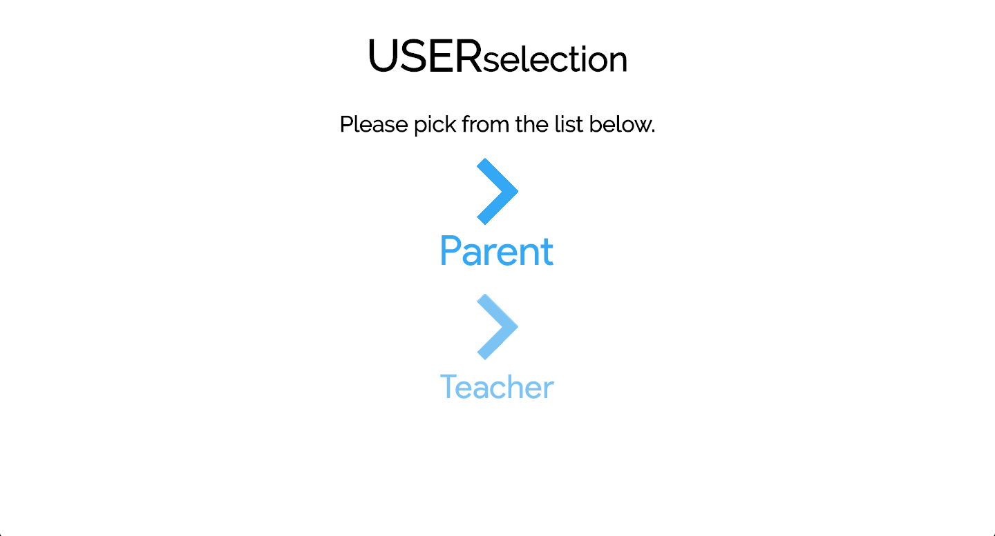
I am working on a site that requires users to identify whether they are a teacher or parent. To ensure I make this as intuitive as possible, are there any obvious changes I should make to the approach below?

user selection

I'd like this to look good and be intuitive enough so that it's clear to the user what I need them to do and how.

What would be some suggestions?

The color fade between parent and teacher is intentional.

Tweeted twitter.com/StackUX/status/723737396244807680
Edited the question to directly link it to 'user experience'.
Source Link
Dirk v B
  • 4.7k
  • 20
  • 43

I am working on a site that requires users to identify whether they are a teacher or parent. To ensure I make this as intuitive as possible, are there any obvious changes I should make to the approach below?

[![user selection][1]][1]

Obviously I'd like this to look good and be intuitive enough so that it's clear to the user what I need them to do and how.

What would be some suggestions?

The color fade between parent and teacher is intentional. [1]: https://i.sstatic.net/Ca5ax.png

I am working on a site that requires users to identify whether they are a teacher or parent. To ensure I make this as intuitive as possible, are there any obvious changes I should make to the approach below?

[![user selection][1]][1]

I'd like this to look good and be intuitive enough so that it's clear to the user what I need them to do and how.

What would be some suggestions?

The color fade between parent and teacher is intentional. [1]: https://i.sstatic.net/Ca5ax.png

Edited the question to directly link it to 'user experience'.
Source Link

How can I make this user selection screen offer a better user experience?

I am working on a site that requires users to identify whether they are a teacher or parent. To ensure I make this as intuitive as possible, are there any obvious changes I should make to the approach below?

[![user selection][1]][1]

I'm trying to makeObviously I'd like this to look good and feel betterbe intuitive enough so that it's clear to the user what I need them to do and how.

What would be some suggestions?

The color fade between parent and teacher is intentional. [1]: https://i.sstatic.net/Ca5ax.png

How can I make this user selection screen better?

[![user selection][1]][1]

I'm trying to make this look and feel better.

What would be some suggestions?

The color fade between parent and teacher is intentional. [1]: https://i.sstatic.net/Ca5ax.png

How can I make this user selection screen offer a better user experience?

I am working on a site that requires users to identify whether they are a teacher or parent. To ensure I make this as intuitive as possible, are there any obvious changes I should make to the approach below?

[![user selection][1]][1]

Obviously I'd like this to look good and be intuitive enough so that it's clear to the user what I need them to do and how.

What would be some suggestions?

The color fade between parent and teacher is intentional. [1]: https://i.sstatic.net/Ca5ax.png

Source Link
Joseph
  • 133
  • 5
Loading