Before getting to the solution, some clarification on the question.
Asking "How the user likes the hidden content styling" is pretty broad.
Hidden content could represent:
- Accordions - Showing content after some action
- Tabs - Showing content after some action
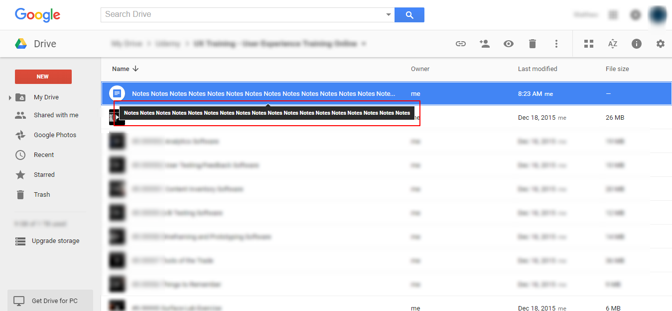
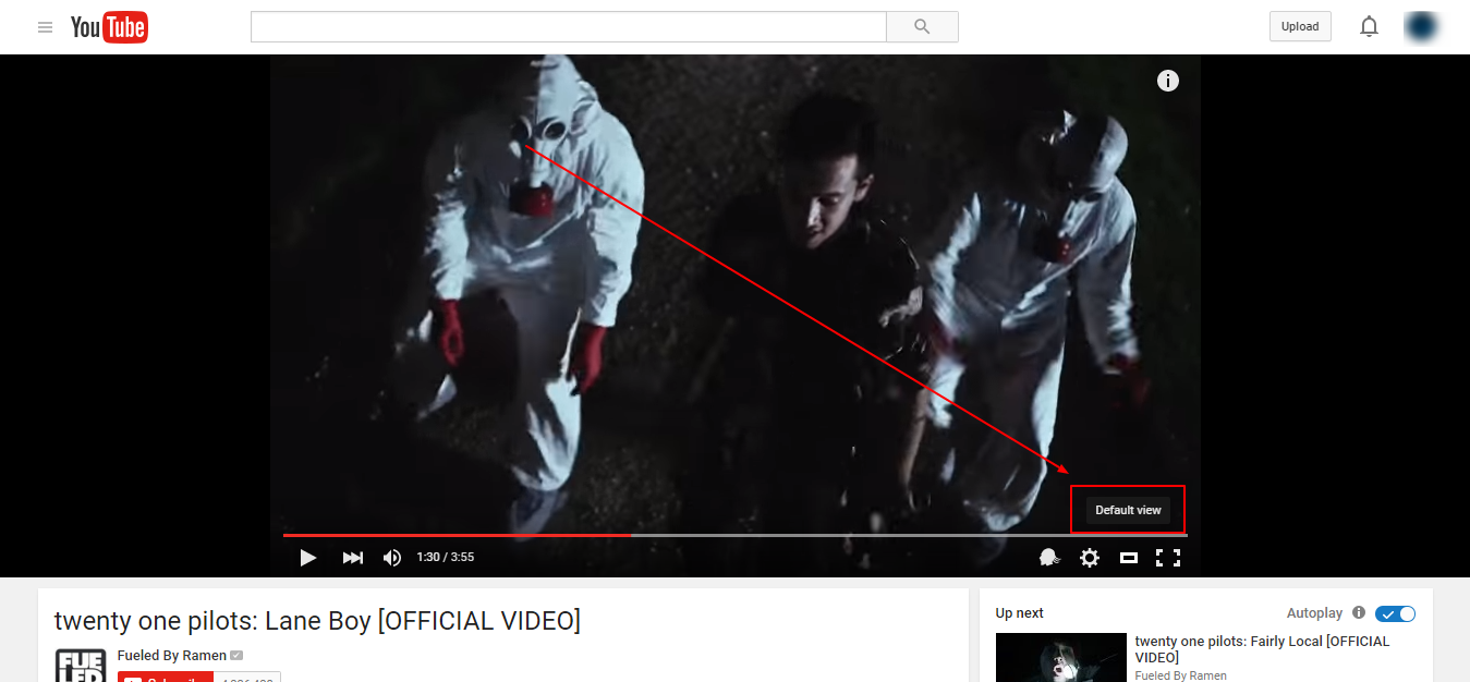
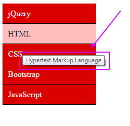
- Popovers, Tooltips etc...
Each are meant for a type of functionality like:
Type 1 -
Showing app content. Like accordions or tabs... They hide content so that the user can have a cleaner and focused navigation. The content is a part of the app flow.
Type 2 -
Showing content which gives some more information about the element/item/section. Tooltips for example. They can be used to show the user what the element/item is about or provide some hints on what to do.
So if this is to be considered, the question could have been phrased a little more specifically.
Now coming to the solution.
You can use a popover/tooltip to show the username for the avatar. Having it like style 1 can be a good option.
As you mentioned that it is an avatar table, will having username not be a good option as a table column? This will help the reduce work from the user's side. Username can be an important detail to be shown. So having the avatar icon in one column and the username in other column could also be one solution to consider.
If it has to be designed the way you mentioned then option 1 can be a good option.
Suggestions:
Crafting design and choosing elements appropriately can help dissolve a lot of design issues. Showing elements with proper design attributes and elements will help carve a good user experience.
Hope I could help you with some thoughts if not the solution :)


