1

I am currently in the process of redesining a checkout for an e-commerce that has non-techy savvy audince. I am worried that without an actionable element such as radio / checkbox / button, our audience won't know at a glimpse of the eye that these elements are selectable.

Below you'll find one of the examples with attached radio, but to be honest I'm not convinced that it's good.
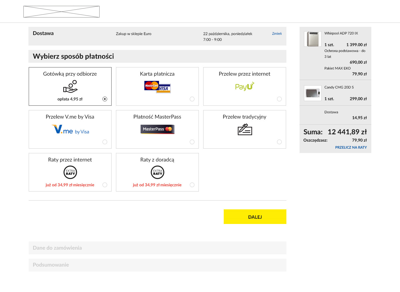
payment options

Have you ever seen a good addition to tiles that causes them to be perceived as clickable? Changing the design to skeumorphic is not possible, as the whole website is moving in the direction of flat style.

2
  • do you need to select radio button then press 'next'? or could pressing the tile just take you to the next screen?
    – Midas
    Commented Dec 16, 2015 at 14:30
  • I would rather let them select shipping / payment / delivery time option first, and then move on, as checkout summary (and price, depending on selecting premium options) updates at that point.
    – Matt
    Commented Dec 16, 2015 at 14:33

3 Answers 3

3

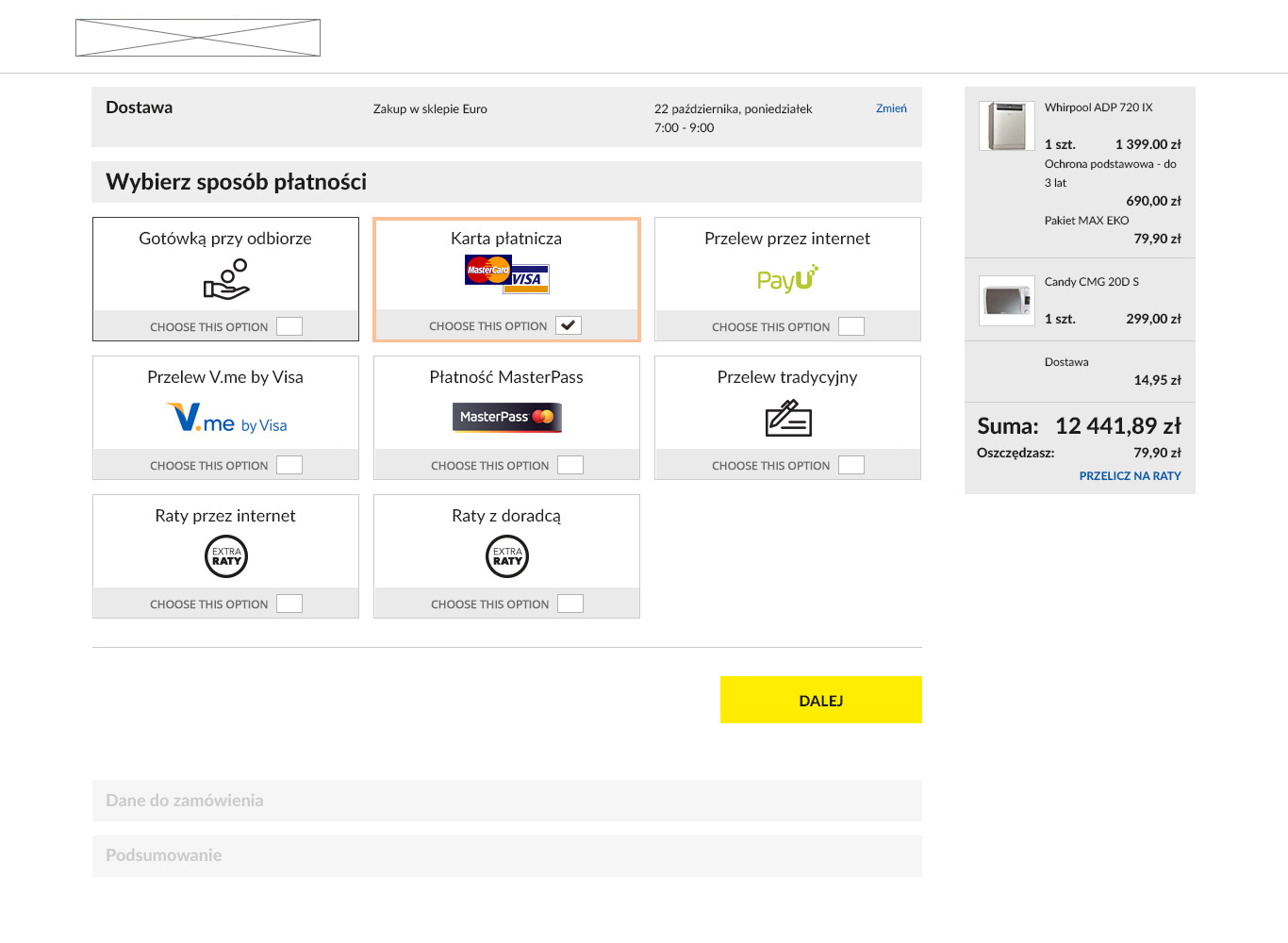
Since you mentioned this is for people who are non-techy savvy, I would advice to be as clear as possible. See an attached suggestion.

Few notes:

1) You could have this "Choose this option" bar persistent in all the cards, or have them come on "hover". On hover is a better idea, but then then one would need to hover first. So decide that on the context.

2) On selection, you can highlight the selected tile, suggesting clearly which tile the user has gone for.

enter image description here

1

Use one universal color (and preferably one other stylistic feature) to make clickable elements obvious.

In your example, the Submit button is yellow, so I would add yellow borders around the clickable tiles. An additional or alternate failsafe would be to use yellow for the tile headings or, like the Submit button, black with yellow backgrounds.

Color is the most salient of visual features. If used properly, color can be used to classically condition users to associate a certain color with a certain outcome or classification. Think about road signs:

  • Prohibitive
  • Cautionary
  • Temporary
  • Distance
  • Speed limit

Each category has its own predominate color. It's not a coincidence. You're currently using yellow to communicate that a button is clickable, so stick with that schema.

2
  • 1
    Tim, I kind of humbly disagree when you mention about using colors to make clickable items obvious, and also that Color is the most salient of visual features. Color is important, for sure, but giving it supreme importance hurts accessibility by lot. Some good reads and research here: uxmag.com/articles/…
    – Amit Jain
    Commented Dec 16, 2015 at 11:01
  • I agree clickable elements should have a secondary distinguishing feature, that's why I mention it in the original answer, but the article is a bit of different: it shows examples of non-clickable error messages being the same color as clickable elements, which defeats the purpose of having a clickable-indicating color. I would argue that the Avis and Budget error messages still work, even with the color-blind simulation, because of their contrast against the form backgrounds. The Budget one is better because the message is next to the affected element. Though the Home Depot form is the best.
    – Tim Huynh
    Commented Dec 16, 2015 at 17:26
0

You already have made the right choice here if your users are only selecting one item:

Select a single item

A single item may be selected by clicking on it, touching it or by hitting the SPACE bar when it has the focus (object selection). If an interface supports selecting multiple items, it shows a checkbox next to an item. Thus, alternatively, this checkbox may be checked to select the item (toggle selection). In both cases, a strong visual marker around the item signals its selection. In addition, any visible and enabled view for item details will refresh immediately and show additional information on the just selected item.

But if the user is supposed to select multiple items, then you need a checkbox:

Select multiple items

To select multiple items, you repeatedly select single items using their checkboxes until all your items are selected (toggle selection). If you use the checkboxes, all already selected items remain selected and the newly selected items are merely added to the set of selected items.

Source: Focusing, selecting and opening items

Your Answer

By clicking “Post Your Answer”, you agree to our terms of service and acknowledge you have read our privacy policy.

Not the answer you're looking for? Browse other questions tagged or ask your own question.