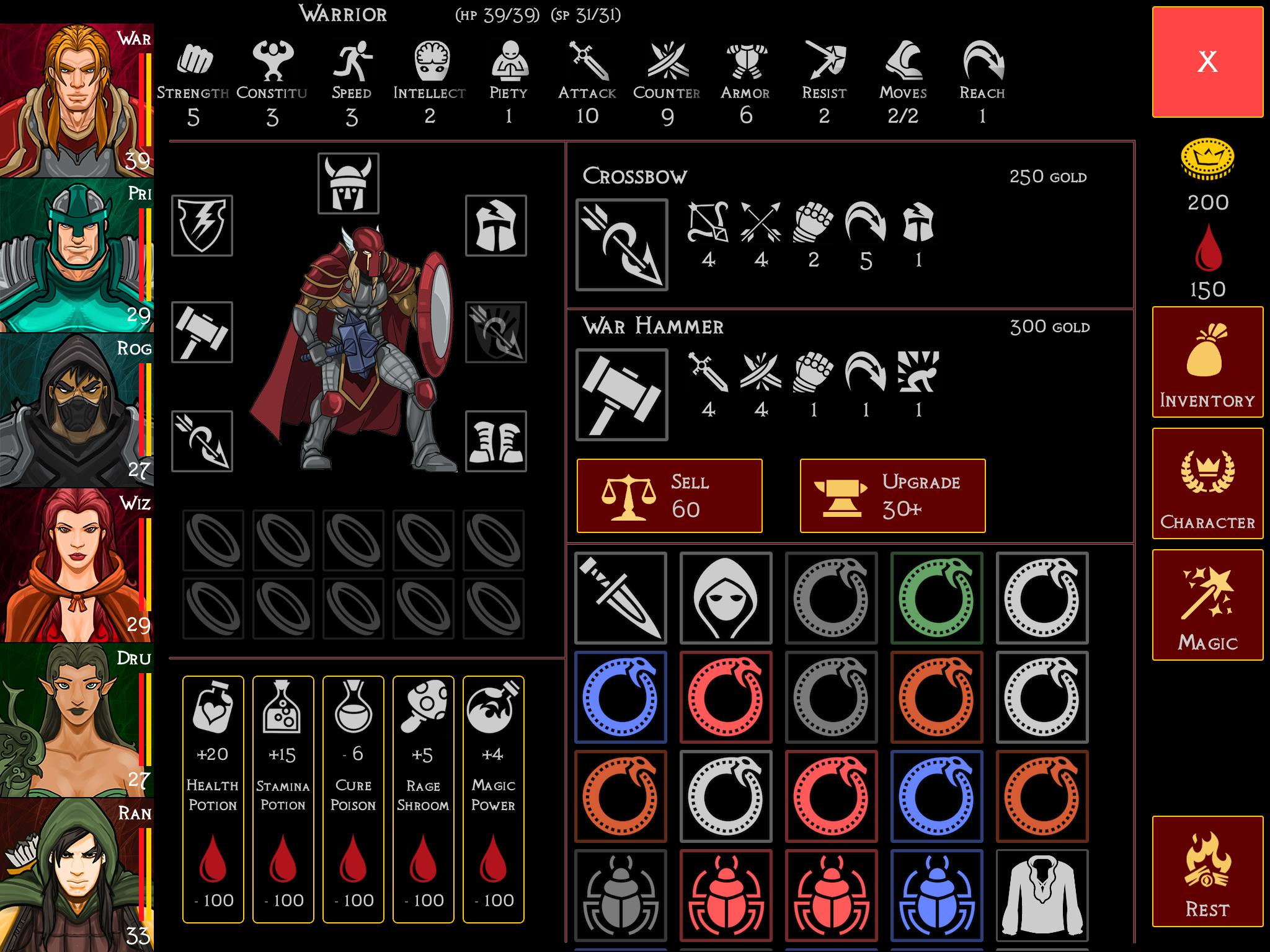
I'm building a game which will use quite a lot of flat UI elements and colors. This is my first ever time doing flatUI, and I want to make sure that I don't over do it. I read that flat UI uses bold colors and subtle gradients to indicate that elements are interactive.
I'm including an image of the inventory screen. It's really busy and has a lot of elements, and I want to make sure that my flat UI buttons won't get lost or be perceived as noise. This is why the close button in the corner is screaming red.
Other things I tried:
- Added 2px rouned corner
- 1px golden outline
- Dark red background
But now I'm facing a problem - there are 5 potion buttons under the character model, and golden border around them seems dizzying, because they are so long. I'm including an image of what they looked before.
How can I indicate that UI elements are tappable when using flat UI without overdoing it?


