0

I'm looking into a change request from a client which requires the following.

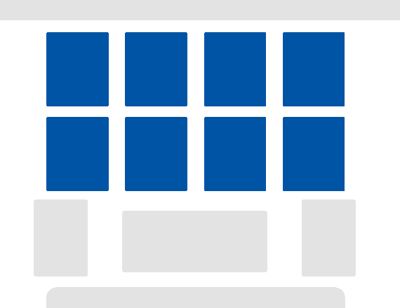
Have a look at the visual below.

The clients would like to be able to show more then 5 of the blue boxes (these show information regarding documents and when clicked it opens a list of details). He would like that this screen (home screen) would be able to fit at least 8 of these boxes without hiding any of the boxes completely

enter image description here

Any ideas on how can this be achieved?

Thanks,

6
  • I'm assuming just making the boxes smaller to accommodate 3 more wouldn't be possible?
    – DasBeasto
    Commented Aug 31, 2015 at 13:19
  • Not really, as each box has a title, brand logo and 2/3 counters at the bottom. Therefore drastically decreasing their size would effect readability. Commented Aug 31, 2015 at 13:31
  • Horizontal Scrolling? So you only display 5 of them and a user can click on < and > to switch between them like in an carousel?
    – BlueWizard
    Commented Aug 31, 2015 at 14:24
  • Or you split it into two views and make a Button that switches between the two views. I know, both of tjese approaches are very common sense and might not apply if you need to display all of tje informatio at once (For example you might not be allowed to hide the map to the next fire distinguisher in sub menus)
    – BlueWizard
    Commented Aug 31, 2015 at 14:25
  • That was my first idea, to incorporate a carousel like functionality with overlapping the left and right boxes a bit on each other and leave the middle ones as is. The problem is that my manager didn't like that very much.. lol anyway thanks for your input! Commented Aug 31, 2015 at 14:28

3 Answers 3

1

If its not possible its not possible, also feel free to push back if you think it isnt a great idea. It sounds like you need to prioritize the importance of each box

Heres some options.

  1. Throw the other 3 boxes underneath. I would only do this if all of the boxes have the same level of importance and are used just as often.
  2. If you think it isnt wise have a show more option that shows the hidden boxes. This saves real estate but you cant just glance at them.
  3. Allow the user to customize which 5 boxes they always want to see, and then have a show more for the other two.
  4. Use data to prioritize the boxes. See which percentage is clicked on the most and make those the 5 that you always see with a show more option. Another alternative is store this information for each user (use a cookie or tie it to their login if they do log in), and then show the boxes they most commonly look at. If you want the 5th box can randomly alternate to not bias the fact that they are not clicking on the other boxes because they are hidden by a show more option. If one box beats the other 4 in the rotating box maybe promote that one to the 4th box.
1

Since you have the limitations of not being able to fully hide any of the boxes and not being able to resize the boxes I only really see two options.

1. Make two rows

Just add a second row below the row you current have.

Pro: shows all the same details as your current solution

Cons: pushes all the other content further down the page

enter image description here

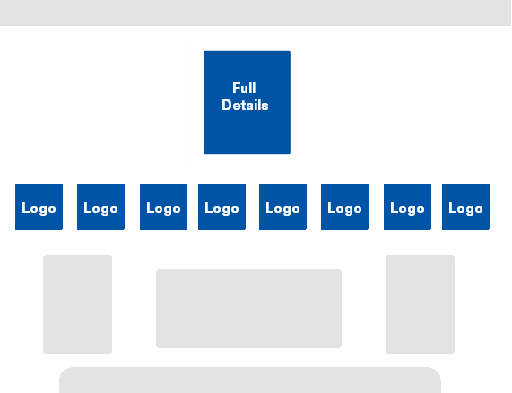
2. Thumbnail and detail box

Show only thumbnails of each box displaying the logo or title. Onlick pulls up detail box with full content.

Pros: If you hide detail box until click it doesn't push other content down the page

Cons: Shows less details by default

enter image description here

1

Thanks for the above inputs, both have a good 'quick' ideas to fix this but its not quite right. I'm sorry but I forgot to mention that this is not a web based app.. its actually a desktop Electronic Document System on Windows OS therefore I cannot just expand Vertically and add vertical scrolling.

My not-very-final idea is to add some type of Carousel which would stack the boxes on the far left & right a bit on each other. This way I get more boxes on the screen with the same real estate. One small problem that I still have is how the user can easily interact with this solution. Arrows? On hover? (Touch based PC's Issues)

1
  • Unless there is more unused horizontal space than shown in the image I think this stacking would hide pretty much all of these blocks wouldn't it? These may be relevant: Are carousels effective? - Should I use a carousel? If you do go the carousel route though I would have arrows on either side that are always visible so that users know there are more to display. Sort of like the first image here: Design Effective Carousels
    – DasBeasto
    Commented Aug 31, 2015 at 18:11

Your Answer

By clicking “Post Your Answer”, you agree to our terms of service and acknowledge you have read our privacy policy.

Not the answer you're looking for? Browse other questions tagged or ask your own question.