2

I've been thinking about changing my application so that the font colour alternates between black and dark grey on odd and even paragraphs.

I thought of this because it often takes me a long time to find my place if I'm distracted from the monitor.
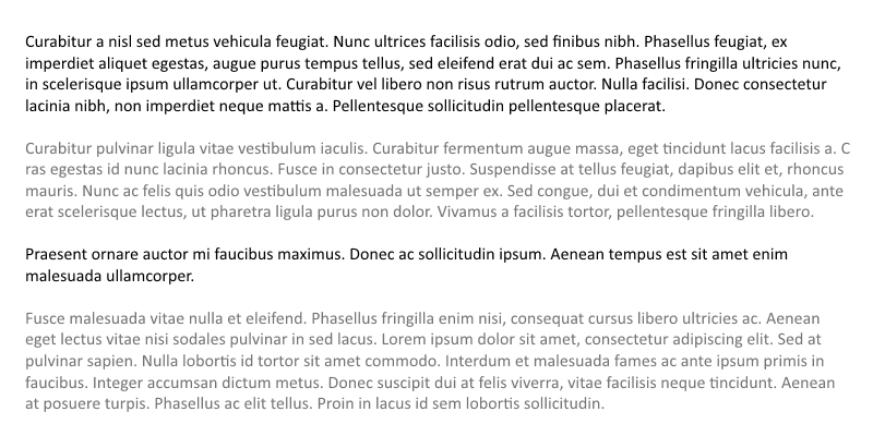
Font colours changing from paragraph to paragraph

I personally find this useful as somewhere deep down I seem to log the colour of paragraph I am reading and it helps me find my way back.

I was just wonder if there's any evidence to suggest people in general would find this useful or if it'd be too distracting?

1
  • 1
    I can see where you're coming from, but to me (and I suspect to many others) this looks like a few lead-text blocks followed by a paragraph, than a collection of 4 paragraphs.
    – Izhaki
    Commented Mar 13, 2015 at 21:28

3 Answers 3

3

Don't do it

Text readability has been extensively studied. Bolding a paragraph or changing colors will be very annoying to readers who are (and have every right to be) used to plain text layouts.

If you have a problem with orientation, then there are many other ways to solve it. Chaptering, line breaks, horizontal rules, narrower column widths, obvious scroll bars, line spacing, and font selection are all approaches to improving text readability and navigability.

There are tons of resources available to help you here because text layout is hundreds of years old as a practice.

Alternating colors are used for non-narrative text like financial tables, but these are not suitable analogs for text layouts.

1
  • 1
    Also consider that many people who use the application may well want to change colors (and often fonts) to be what they prefer.
    – jamesqf
    Commented Mar 14, 2015 at 4:47
1

I wouldn't do this for straight text.

However the one situation where something like this is useful is in tables where one has to 'read across' a row of information: in this situation it's useful to alternate the visual style of the rows.

This can be done either by using a different background colour to the horizontals of the row'grid' or can be done by alternating the style of the text itself.

0

I, along with many others I believe, don't think you should do this.

The reason is that the shades of a color are used to distinguish primary and secondary text. Such as a heading, subheading, page text etc. In your example, it looks like the darker text is the primary text (maybe heading) and the lighter text is secondary, which is not the case.

If you still want to do it, I'd advise trying two very close shades, as that might minimize the distraction. Or you can try slightly altering the background color.

Your Answer

By clicking “Post Your Answer”, you agree to our terms of service and acknowledge you have read our privacy policy.

Not the answer you're looking for? Browse other questions tagged or ask your own question.