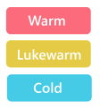
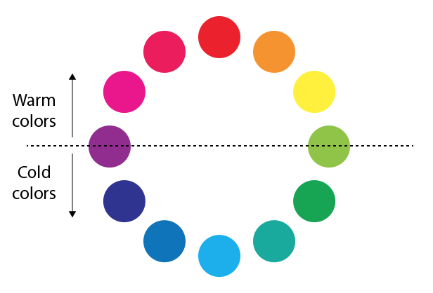
As a start, I think if the targeted data related to Temperature the Lukewarm color = purple the midway between red and blue as I'll state that now.
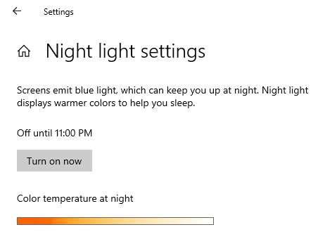
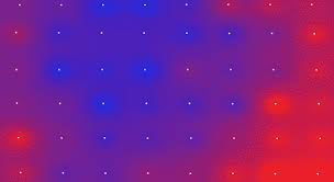
The best colors to pick are ONLY "Red and Blue" which represent clearly the temperature, so any change in the temperature will vary between these two color values by using a gradient to show the change in the degree. as in the listed image as an example.
One of the main general rules in usability: More data representations will confuse the user instead of letting him focus. Because you use colors to get his attraction, but more than that he will go to values and neglect the chart or the graphics thing.
You can read about Mapbox GL which is a suite of open-source libraries for embedding highly customizable and responsive client-side maps in Web, mobile, and desktop applications.
Maybe it's not related to your track of work, but you will get an idea of how to use the heat map and color representations well. Read more to narrow your choices!

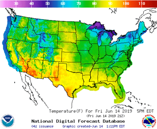
This is a temperature map, took it from the net:
You can refer to that image from this useful article I used to read recently
https://blog.ndustrial.io/temperature-gradient-maps-with-mapbox-gl-9f97fb44d5f2

