3

I have several buttons in my application that require some explanation (1-3 SHORT sentences). Something like context sensitive help.

what is the best way to provide the user this explanation?

  • Tooltip? (annoying and "hidden")
  • coach marks upon load?
  • something else?
4
  • 1
    If really required, certainly not tooltip.
    – Crissov
    Commented Oct 22, 2014 at 13:04
  • 3
    Can we see a screenshot so that we understand the context?
    – Matt Obee
    Commented Oct 22, 2014 at 14:23
  • 1
    Is your application web? Mobile? Desktop? Will the buttons always need explanation or could they be explained in a tutorial?
    – rach oune
    Commented Oct 22, 2014 at 16:47
  • This is a Web application.
    – Burgaz
    Commented Oct 28, 2014 at 6:38

1 Answer 1

1

I would strenuously avoid coach marks and tutorials. They're mostly not effective; people tend to dismiss them right away and they don't want to read a manual to get started (http://www.nngroup.com/articles/mobile-instructional-overlay/). We've personally seen tutorial walkthroughs mostly fail in usability; most people seem to prefer trying to figure out what's going on and then getting help if they need it.

I don't see a problem with helper tips under the form field row, or with help bubbles (for tapping or clicking / hovering) for users who need it. However, if the buttons represent functionality that's complex enough that they need a couple of sentences, you might want to restructure the interface to use different elements that afford more explanation.

For example: Are these toolbar-type buttons that the user will interact with many times? Or are they part of a workflow or occasional / rare use system?

If these options are part of a one-time or occasional process, instead of making them buttons you might consider making each choice a radio with a single confirmation button. The confirmation text will ideally reflect the selected option. The default option should be the most popular, least-destructive, and/or most-recoverable option. (This example is in my head after using Zendesk earlier today to deal with an account of a former employee.)

mockup

download bmml source – Wireframes created with Balsamiq Mockups

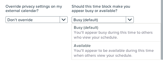
If the actions are going to be used somewhat frequently, but not enough for the user to really learn them, a fancy dropdown with explanatory text is helpful.

For example, in calendaring, most calendar servers understand an event marking you as busy (like a meeting) or available (like you have a reminder on your calendar to take medicine but you don't want it to block out meeting requests.) Here's how we explain this to users at Magneto:
enter image description here

2
  • thanks for your answer. The buttons are not one time process and they are not part of a form. The user operates the application (web application)using these buttons. I'm sorry but I can't share a screen, but imagine that I have a game with some buttons that are used by the player to operate the gave. most buttons are simple and intuitive. there are several buttons that requires some extra explanation.
    – Burgaz
    Commented Oct 28, 2014 at 6:43
  • In that case, I'd use a persistent help icon [?] near each / both buttons that triggers in-context help (i.e. a popover or tooltip). I wouldn't do a hover over the button itself; if these are repeated-use in-app tools, then potentially triggering a hover whenever you use the button gets annoying. Having a question-mark icon near the button(s) lets the user trigger help for more info but doesn't get in the way of someone who has learned them already.
    – ElBel
    Commented Oct 30, 2014 at 18:43

Your Answer

By clicking “Post Your Answer”, you agree to our terms of service and acknowledge you have read our privacy policy.

Not the answer you're looking for? Browse other questions tagged or ask your own question.