3

I have a fairly complex desktop application.
It uses some advanced search techniques and some statistics for analysis and prediction.

The help is separated with one section of no UI.
These are "Features", explanation on how they fit together, and the actual calculations behind the analysis.

Inline training has context sensitive help with like "button does X - syntax is Y".

One of my re-sellers has taken the time to create tutorials with step by step instructions. I am surprised it is needed but they would not have taken the time if they did not think they needed it.

What is a good strategy for help and inline training?

The app is complex and it is not expected that they would just logon and figure it out by themselves.
Like SSMS (SQL Server Management Studio) requires you to know T-SQL.

The app has a single manual that is the "what" not the "how".
It has inline help on specific features so the explanation of a button close to the button.

For some basic tasks we would like to have a tutorial to get them going.
Users will skip training and not read the manual.

The idea is a tutorial on some basic tasks to get them going.
But no way we can write tutorials for advanced stuff and all the possible paths. Technically we could but we just don't have the resources - a good tutorial takes time.

How to present to the user this tutorial is to get you going but don't expect you are going to learn the entire product?
My biggest fear is that the tutorial will be judged for what it does not do.

We have the same issue with features. If the feature lacks something they might expect we are careful to tell them what it does and does not do. Before you say give them what they expect. Users can have unrealistic expectations. It is about managing expectations.

3 Answers 3

3

Since there's no images or mockups I'm not 100% sure what you are asking, but I'll try to answer.

Is it too complex?

For starters, if the application is so complex that users need to have multiple inline helpers, it could be a major turn-off for them. Imagine entering an elevator and being handed a book on how to control the speed and acceleration by hand... you'd back off and take the stairs instead.

Do you think there is some room for improvement? Some ideas:

  • Only show the required fields/options, and keep the rest at default values. Maybe provide an option to change the defaults, but don't clutter the UI if the user doesn't need to change them.
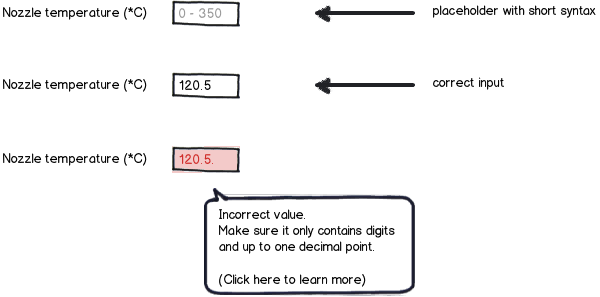
  • Provide examples as placeholder text. No need for any more complicated inline help if the syntax can be explained in a dozen characters.
  • Error check on losing focus, or even during input. Check whether the user properly entered a value (e.g. letters instead of digits, or two decimal points in a number), and change the color of the input field if something's wrong. A tooltip with quick error explanation might be useful, but it should only be shown if it's really needed.

mockup

download bmml source – Wireframes created with Balsamiq Mockups

Lengthy help section

This should only be needed if the user wants to learn about the way your application works under the hood. If it's the go-to way of learning how to use your app, the UX may need major changes. In the above mockup I added (Click here to learn more) link, which would point to a help page dedicated to input field syntax.

Step by step instructions

If your appplication needs these, it means you should consider changing the flow of your app to a wizard. It's perfect for lengthy step-by-step operations, and divides user's attention into small, digestible chunks, instead of overwhelming them with one large page cluttered with options and input fields.

3
  • Thanks. It is more complex than an elevator. I would not expect a non-pilot to know how to operate a plane by looking at the instrument panel. It does have validation on all inputs. Multiple valid paths so a wizard is not applicable. My question was more how integrate a tutorial type help in the product. Many of our competitors have online tutorials (they are web based) but we want to have more of a self contained tool (this is desktop application).
    – paparazzo
    Commented Dec 13, 2014 at 13:15
  • So, it's an app for a very narrow field, and operated by experienced users - that's important information. If there are many valid paths, can't you split them in the wizard itself and manage its "length" on the fly? Following your idea of inline help - how about dividing the view in half, displaying all controls on the left half, and showing the needed explanation on the right one?
    – fri
    Commented Dec 13, 2014 at 13:45
  • Sorry I was not clear. The product currently has a design manual that is a separate window that has no UI and no how to - ideally all the users would read it but that does not happen. For specific features we have inline help. We get users that want to fly the plane without taking any lessons or reading the manual. The idea is a tutorial to take them though some basic tasks. It is more how to have a simple tutorial and not have them think oh I am done or get upset because there is not a tutorial on advance features they just plain need to learn.
    – paparazzo
    Commented Dec 13, 2014 at 14:13
2

Here is a brief of the help strategy that we implemented, and it significantly improved the measured System Usability Score.

  1. Help should be about the domain. If help veers into "how do I use the system" it is doing the wrong thing. This is just an indicator that there is a UX problem that needs to be fixed. Removed 30% of help and 50+ screenshots that were hard to maintain.
  2. The domain has high level concepts - covered by a "Tell me more" link on the screen they are using. And specific domain "info" on fields relating more complex concepts. (While e.g. 'tell me about TSQL query language' may sound heavy handed, users actually love things spelled out at the moment they get stuck)
  3. All processes are built into the UI. Not just dumb "Wizard" style step-by-step UI, but date, progress and status sensitive guidance.
  4. One system had one high-level process that was critical, but very occasional. We didn't have resources to implement workflow in that app's legacy UI. Produced a physical guide to take them through the process. (Some times have to be pragmatic and just do the best within constraints)

Notes in this

  • no assumption made that users are expert in domain. Made sure that guidance was on hand - even if referring to external websites.
  • We didn't explain how features "worked" ('click here', etc). The right UI and an understanding of domain makes right action 'evident'
  • Yes, we have survey data that a high proportion users skip training, introductions and don't read manuals like a book. The more systems with a strong UX users experience the more this will be an expectation.

Now with that strategy background, to your specific questions

  • our "Big picture tutorial" was simplified from a 16 page booklet down to a 2 sides of a B5 card with 14 headline points. High-level, but complete enough - because the other UI and help was improved. We consistently reduced volume of help but improved it's access route and timeliness.

  • if any constraints on functionality is explained in terms of the domain knowledge, then expressing what a specific system is, or is not, capable of should be succinct and clear for a user that understands the domain.

    It is much more complex if you ask the user to mentally map from 'System Functionality Description' (i.e. How the Screens, UI controls, sequence of activities are used) versus 'Domain Capabilities' (i.e. what the system is able to achieve in a given Problem Domain)

    By way of example compare 'You cannot select Option-Y and Option-Q simultaneously' to 'System does not support aggregation for external datasources"

7
  • Thanks for your time but I don't follow your answer. I tried to google 'System Functionality Description' to 'Domain Capabilities'. I don't at all get that help should not veer into "how do I use the system". What is heavy handed about SSMS requires knowledge of TSQL? Visual Studio requires me to know a programming language. Thanks I don't mean to disagree. +1 for you time
    – paparazzo
    Commented Dec 14, 2014 at 13:51
  • Good to know - the quoted concepts were novel short-cut descriptions. Will extend in answer.
    – Jason A.
    Commented Dec 14, 2014 at 16:44
  • Also here is a simple model to separate "Domain Knowledge" en.wikipedia.org/wiki/Domain_knowledge from functionality. The book on C++ is Domain Knowledge that can be applied to all compilers and IDE's. The book on Visual Studio only has information specific to how Visual Studio works.
    – Jason A.
    Commented Dec 14, 2014 at 16:47
  • Answer was actually general enough that it was useful to me in planning something that is not really related to the situation in the question. Surely a good sign of quality answer? Commented Dec 14, 2014 at 18:52
  • Hi Blam, Visual Studio help includes BOTH the product documentation help (i.e. 'what buttons to push') and also tightly links in C# and .Net Framework API docs (the domain documentation). These are two completely different content sets in their nature. Developers are ALWAYS using the C# and .Net Framework Documentation and ALMOST NEVER read the Visual Studio 'what buttons to push' product documentation.
    – Jason A.
    Commented Dec 14, 2014 at 22:52
0

Accepting the question as stated I came up with the following design for the three types of help

  • Manual - not UI
  • Inline UI specific help
  • One tutorial

The manual stands on it's own and has chapters.

Inline the instructions just describe the the button like IncFam means Include Family. For when users enter syntax we also describe the syntax inline. We keep these close to the user control. Always use an expandar with a standard look.

We place links to the specific chapter both in the instructions and UI with just a simple ? link. Like a pull down with a certain type of data we don't need to instructions tell the use what a pull down is - the ? link just describes the data.

For the tutorial we also use ? links to the manual. And it is split screen with tutorial on the top and manual chapter on the bottom. The idea is to teach them to fish.

4
  • Please don't put commentary about the question and answers within answers themselves. Reserve the answer option exclusively for answering and nothing more. There is no problem answering your own question, provided that it is an answer.
    – JonW
    Commented Dec 14, 2014 at 19:54
  • @JonW We don't have to agree. I feel why I did not go with existing answers is pertinent. "If help veers into "how do I use the system" it is doing the wrong thing" is commentary about the question without answering the question. I appreciate the time you volunteer as moderator. Not trying to pick a fight here. I just respectfully don't agree.
    – paparazzo
    Commented Dec 14, 2014 at 20:25
  • Then that is what the comments field is for. Leave a comment against answers or your own question. That's what they're for. Answers are for answers only,which is why is a Q&A format site, not a forum.
    – JonW
    Commented Dec 14, 2014 at 22:11
  • @JonW Cool, I don't fully agree but will try to comply.
    – paparazzo
    Commented Dec 15, 2014 at 1:57

Your Answer

By clicking “Post Your Answer”, you agree to our terms of service and acknowledge you have read our privacy policy.

Not the answer you're looking for? Browse other questions tagged or ask your own question.