9

I'm working on an interface that allows users to create and edit playlists. As first time users will have no playlists, they will come across a fairly empty page that consists of a 'create playlist' button at the top of the screen (as well as the top nav, etc)

Just wondering if anyone has had to deal with a similar situation, and what are some ways in which you've taken advantage of this white space?

1
  • Great link on the web that will give you some more ideas: emptystat.es. Also see updated answer for where to find other inspirations.
    – Michael Lai
    Commented Jul 16, 2014 at 1:22

4 Answers 4

11

One method that has become more popular is to actually put the call-to-action in the whitespace itself. That way once the action has been completed the space will be filled and you won't need the call-to-action there anymore.

Other ways of dealing with whitespace is to provide instructions or messages that encourages the user to perform the action that you want, or even just an entertaining/informative piece of information. I suggest nothing too complicated or involved depending on how long you expect the space to be vacant.

For ideas and suggestions, try the key word 'empty states' in Google (thanks to suggestion in comment) and you'll find Google images, Pinterest and Tumblr inspirations.

Also, there are some websites that list patterns for mobile devices under 'empty data sets'.

7
  • 1
    Good answer @Michael Lai. I'd also suggest google.com.au/… for some quick ideas.
    – Dirk v B
    Commented Jul 3, 2014 at 3:37
  • This is a good answer. I came across the same issue and ended up using "(graphic of company mascot frowning) 'You don't have any playlists! [create one now] or [see sample playlists]!"
    – jvform
    Commented Jul 3, 2014 at 14:08
  • @DirkvB What did you put into Google as the keywords? I thought it was quite difficult to find good examples...
    – Michael Lai
    Commented Jul 15, 2014 at 23:05
  • Click the link :] Googling for "empty state" shows a bunch of apps with their hints and tips instead of content.
    – Dirk v B
    Commented Jul 16, 2014 at 0:43
  • Is this the one that you looked at: emptystat.es
    – Michael Lai
    Commented Jul 16, 2014 at 1:23
4

I'd suggest putting in some default sample playlists. That way they know exactly what can be placed there.

UPDATE:

Given the downvotes, I assume there's skepticism here. This is not an uncommon pattern.

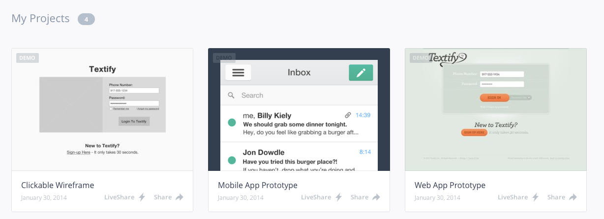
For example, for those of UX folks that have used InVision, you will notice that when you first log into the application, there are sample projects already waiting for you.
enter image description here

There's little to be confused about here. As I've just logged in, I obviously didn't create my own projects yet. These are clearly labeled as 'demo' projects.

And there's a big advantage here. I have instant context as to what this tool I just signed up for is capable of. I can immediately start playing with it without having to be overwhelmed with having to start from scratch with a blank canvas. It invites the user to play, and that's a big part of winning the user over, IMHO.

4
  • How will they know it is just a sample? How will they know how to add to the playlist? Commented Jul 3, 2014 at 9:30
  • Interesting that this got downvotes. This is not an uncommon solution.
    – DA01
    Commented Jul 3, 2014 at 15:57
  • @BartGijssens name them 'sample playlist 1'. As for HOW TO ADD a playlist, if that's not already apparent in the UI, there are bigger issues.
    – DA01
    Commented Jul 3, 2014 at 15:57
  • Not sure why this was downvoted... although it may not be as popular as the specialized empty state design, it is still useful in certain types of applications. I did upvote your answer though.
    – Michael Lai
    Commented Jul 16, 2014 at 1:25
2

In addition to moving the "call to action" into the white space, you can add some more possibilities there to construct playlists. Examples are:

  • Top Played
  • Newest Additions
  • Genre XYZ
  • Genre ABC
  • Import playlist from a friend
  • etc.

I kind of agree with the downvote for the "default playlist" since there is no useful default, I guess. But a single song/playlist will not fill the entire whitespace, so I was thinking about filling the space with more than just a single song in one step.

1
  • A 'useful default' is useful in that it's there. It shows the type of actual content that can be created/stored.
    – DA01
    Commented Jul 3, 2014 at 15:59
0

I've seen something like (don't remember the exact website) where there's a big ":(" saying something on the lines of "i don't have any favorites yet" followed by a CTA to browse more. i think it adds a human touch

Your Answer

By clicking “Post Your Answer”, you agree to our terms of service and acknowledge you have read our privacy policy.

Not the answer you're looking for? Browse other questions tagged or ask your own question.