3

I've huge tabular data set to represent on the web, PFA as sample of personal data(blured). My question is what is the best possible way to align tables vertically stacked (sample1) or horizonatly (sample 2)

Points to note:

In sample 1: It takes too much vertical space, eyes would need too much time to scan from left to right considering the wide monitors nowadays. But it is cleaner.

In sample 2: Less space vertically, less burden on eyes and less time to scan. But it'd create cluttered look in case of inconsistent height of the tables.

Or is there any other possible solutions?

PS: There could be lots of field-sets, like Personal imfo, address 1, address 2 , address 3, email, phone, other etc. And each field-sset could have 10-15 fields.

Sample 1: enter image description here
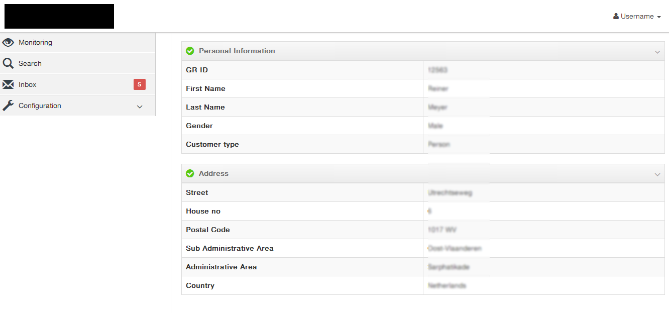
Sample 2: enter image description here

5
  • Will you consistently have the viewable space to do both scenarios? Commented Aug 19, 2014 at 7:53
  • Viewable space is not consistent. In case of sample 1, user can see limited set of fields(read less); whereas, in sample 2, user can see lots more.
    – UXbychoice
    Commented Aug 19, 2014 at 8:13
  • View space not to do with your design, what is the device view port? Commented Aug 19, 2014 at 8:22
  • Oh! Application will be used on desktop computers with resolution >= 1024 X 768. i.e. all the latest wide screens.
    – UXbychoice
    Commented Aug 19, 2014 at 8:30
  • 1
    Data needs to be tabular data where you're showing multiple attributes for multiple entities. Here, you're showing only a single entity's data, so it needn't be tabular at all; you might find it better to present it as a list of caption/value pairs, broken into logical groups. Using a tabular display is distracting and not that helpful. Commented Sep 19, 2014 at 10:46

4 Answers 4

1

This isn't a huge amount of data - it's small to medium & looks like it should similar to lots of other sites that display this kind of data. You ought to be able to find lots of examples and try/test variations quickly. (I guess I'm saying that if you stop framing the design challenge as a difficult problem then it might get less difficult.).

What is the best layout is highly dependent on all sorts of things outside your question and it'll be for you to balance the competing demands:

  1. How is the rest of the site layed out?
  2. What devices/screen sizes are you expecting it to work on?
  3. Who will be consuming the data?
  4. How will they be consuming the data and in which contexts?
  5. etc. ...

This can probably be boiled down to:

  • does the data need to assessed quickly, at once and by experts? If so, more data on the screen is probably the goal. If not, then clarity of layout and simplicity should be the goal.
  • one layout is unlikely to work on many screen sizes. Understand which screen sizes you're targeting and choose an appropriate strategy for presenting the data across them.

One last thought: reduce the amount of "administrative debris" you have in your tables. (With a two-column table it's simple enough that you might be better thinking about it as a list) All those outlined cells, zebra stripes and gradient headers are things that distract attention from the data you're presenting. They shouldn't be there unless they increase the comprehension of the data. But the data is easy enough to understand that these UI elements almost certainly get in the way more than they help.

1

Definitely sample 2 — it's much more economical in terms of real estate (doesn't waste space like sample 1).

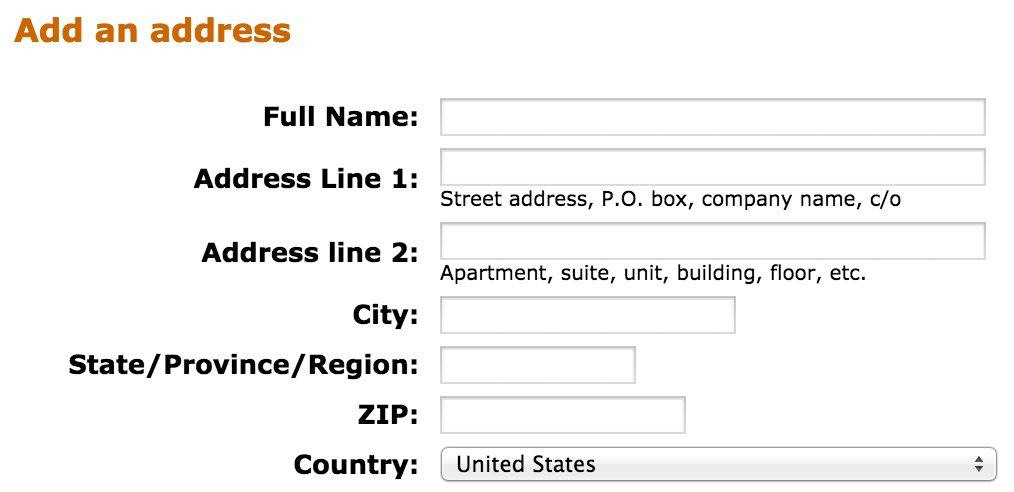
I don't see much clutter provided by the sample 2 but if you are worried about non-matching amount of rows, I'd merge Street and House number to eliminate one row in the right table. Many vendors do it, allowing one common entry form for both of them.

Amazon.com:

enter image description here

0

perhaps a tabbed approach would hide the fields until their category is clicked, only then they will be visible to view or edit

1
  • Tabbed approach might not work here as there would be 7-10 or more field-sets. And the above design is already inside a tabbed panel.
    – UXbychoice
    Commented Aug 19, 2014 at 8:15
0

If you have the space then version 2 seems ideal as it prevents the user having to click into another tab to enter or view information.

Also scrolling, in my experience, is an easier action than making the user click into tabbed panels to access information.

2
  • Option two might create a rugged look and feel due to uneven number of fields per table. look closer to table 2 , they are not aligned at the bottom
    – UXbychoice
    Commented Aug 19, 2014 at 9:17
  • I believe that's a cross-over between design and usability, the latter is what's most important here. Commented Aug 19, 2014 at 9:18

Your Answer

By clicking “Post Your Answer”, you agree to our terms of service and acknowledge you have read our privacy policy.

Not the answer you're looking for? Browse other questions tagged or ask your own question.