Where should I put the OK/Cancel buttons on my dialogs? At the bottom centered or aligned right? I've seen both and I personally don't care, but I want to create a consistent look across my application. Are there any guidelines for this or should I just do whatever I want?
-
related: ux.stackexchange.com/questions/19/…– greenforestCommented Jun 14, 2012 at 20:09
-
plz put some light on the context– kmonsoorCommented Dec 19, 2013 at 19:37
-
What more context could he provide? He asked a specific question that applies to a specific setting?– mginnCommented Jul 19, 2015 at 14:11
-
Whichever you do, be consistent, and be consistent in whether 'Okay' or 'Cancel' comes first. Nothing more annoying than habitually clicking on the spot where the 'Okay' button almost is but having the 'Cancel' button be there!– Steven NotoCommented Jun 29, 2016 at 3:53
17 Answers
I think this applies to this question too and answers it:
(Spoiler: It doesn't matter.)
In cases like this, it often doesn't matter what you do. Either choice has good arguments in its favor, and no choice is likely to cause usability catastrophes. It might save some users 0.1 seconds if you pick the "right" choice for certain circumstances, but it's simply not worth it to conduct sufficiently elaborate research to find out what that choice is. Better to spend your usability resources on those things that can change your key performance indicators by 83% or more.
More info: useit.com/alertbox/ok-cancel.html
-
7And test it. test it. test it to ensure that It Doesn't Matter. ;)– CSSianCommented Aug 25, 2011 at 17:26
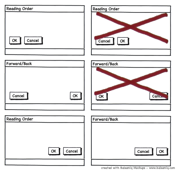
When strictly speaking about alignment, there is no right answer other than to be consistent.
However, the alignment of buttons is related to the positioning or logical order of the buttons.
There are two general paradigms that can be applied to the positioning of buttons**.
- Reading Order - The first button encountered in reading order is primary (Ok) and given priority over subsequent options (Cancel)
- Forward/Back - Forward progress or action (Ok) is associated with movement to the right while backward or undo (Cancel) is associated with movement to the left.
The alignment of the buttons can influence the perceived paradigm of the user. As such some combinations of alignments and positions can be conflicting and thus confusing for users.

** this assumes left to right reading; perhaps not the same for right to left reading languages.
-
I personally prefer Ok, Cancel in the final case as it puts Ok first in the tab order.– SteveCommented May 23, 2011 at 12:16
Do what fits in with your application and the target OS.
However, as you point out, being consistent across your application is probably more important.
-
3Definitely do what fits with your app. Ideally this will also match the operating system that you're in as well. Commented Aug 9, 2010 at 20:45
-
-
1Your app should be consistent with itself, of course, but it should also be consistent with the platform. Let’s also explicitly say that “OK” and “Cancel” here should merely be stand-ins. The buttons should say what will happen when they are pressed rather than simply “OK” or “Cancel”. Commented Aug 10, 2010 at 20:21
-
They are always on the right, and the user expects them to be on the right. Make sure you space them enough and give them different styles to highlight the primary action.
I prefer to position the most-likely action (OK in this case) on the right and give it some kind of color to make it easy to spot and the less-likely action (Cancel in this case) on the left colored in gray or a color along the lines of the form background.
I think it is bad design to place them next to each other. Following the "don't make me think" approach, when I need to cancel - I stop and look for the button, but in all other times I just want to act automatically.
-
+1 at least I think it's bad design to make them stand out the same amount if one option is an obvious default action. I too generally go with the default action as a button and the cancel action as a link - just like this comment box has a Save Edits button and a cancel link ^^ Commented Oct 5, 2010 at 16:58
For a linear process (like an installer), aligning "Next" buttons to the right (in a Western environment) might be more intuitive.
I'd say that the order of your buttons is more important. On Windows, the "OK button" is always on the left and the "Cancel button" on the right. Because users don't read, swapping OK and Cancel buttons (like some ported Mac applications do), confuses the user.
It's depends of your platform. Windows places the buttons on the right side in the order < OK > < Cancel > and Mac OSX in the order < Cancel > < OK >. Like other answers.... be consistent. For button placement i would prefer the right bottom side.
i think "OK" or your prioritised action button should be on left because of following reason 1: Good percentage of user use keyboard on forms or dialogue boxes and user will take less time to reach most favorable action via tabbing if they are on left side. 2: Eye rotation or Fitt's Law 3: Think about blinds (semi blind) people or use of application when you are driving or accessing application on speech mode. 4: last not the least use verbs as your action
There are plenty of threads available in this forum, pls go through them
Also keep in mind my suggestions are not for small devices.
I think it's easy to critique topics like these on a case-by-case basis, but I think everyone should consider an entire design system and/or pattern library when voicing their opinion and/or test results. The fact of the matter is, depending on the content and testing, some may show higher conversion with OK on the left and OK on the right.
However, when considering an entire design system, do you consider consistency being better than when works best in individual left/right tests? I agree that you want to intentionally inverse the "forward" action when there are considerate negative externalities, such as "Delete Payment Profile", something that is not reversible, etc., placing the CTA - in those instances - on the left and cancel on the right.
But, even with this in mind, let's imagine that a majority of users are windows users (at this time), and you are going a stepped progression checkout flow. You would expect "checkout" or "Continue" to be on the right, with back or cancel on the left. That is also the case for most modal usage cancel/Ok layout (except for Foundation), but that does not jive well for those folks arguing individual A/B tests, or using testing that have come up with a higher conversion of it being on the left, vs the right.
Personally, in testing experience, CTAs work best in the right, but I'm always curious what metrics people have that have a style guide or design pattern showing CTAs in the left-most position.
I think it depends on the design. If you are using a standard design for your form, I would place the OK/Cancel buttons on the right side (http://bit.ly/9IzQo0), but if you are using CSS to change your forms then I would place them in the center (http://www.tumblr.com/register).
If your form fields are left-aligned, it seems to make sense to left-align your buttons as well. Here's some research on where users' eyes actually go and how fast they react: http://www.lukew.com/ff/entry.asp?571
This suggests that left-alignment of these two options is the best design choice – especially when the form controls above are also left aligned. Placing the “Submit” and “Cancel” buttons on the left meant that people’s eyes had less distance to travel.
In terms of their eye movements, people were least efficient when using [an option with buttons right-aligned].
I generally use OK on left, Cancel on right.
The only case where I could see altering this pattern (and this is splitting hairs, mind you) would be for irrevocable actions on the part of the user (ie., delete my account, kill all humans, etc.) and then I might want to deviate to force them to think about the action or to force the default action to be the safer option.
According to the Gutenberg Diagram, the terminal area (where the site presents its final call after the user has scanned the page's content) is the bottom right of the screen. Because of the natural reading pattern of western readers, having the buttons in this location actually reduces user fatigue, as they finish their browse in this location. If buttons are located on the bottom left, the users will generally finish in the terminal area and have to return to the left based on recall to make their action. This pattern applies both to pop-ups as well as edit/add screens.
This general pattern also applies to the order in which buttons are positioned. If you list OK before Cancel, the user will almost always view all their options before selecting the one they want. In the majority of cases, the user will want to click OK over Cancel. This means that they view OK, then Cancel, and then move back to OK. Very minor, but still added work.
- The order doesn't matter as long as they are close together to imply that they're siblings. That is, the OK and Cancel buttons do different things but they affect the same element.
- For a left-to-right language, I would put the buttons in the center or flush right.
- I would emphasize the OK button with a color that matches the branding.
Great answers here. What no one has mentioned is Fitt's Law which governs the speed (and ease) of clicking targets in a GUI. It gives some hard science to where to place primary buttons.
Basically Fitts Law (https://en.wikipedia.org/wiki/Fitts%27s_law) states that the size of the target and distance act predictably on the time it takes to hit the target. When a button is in the corner of a "box," the target size is arguably infinite (the only really infinite target sizes are the corners of your computer screen where the cursor comes to a stop all by itself). While speed isn't always a primary consideration, comfort (ease of use) should be.
Interactive demo (without corners!): http://simonwallner.at/ext/fitts/
-
And then comes the natural question, where do right-handed people tend to keep their mouse cursors? :) Actually, I posted an answer earlier on, but it was deleted by moderators, because of duplicate answering: "I think usability specialists make one huge omission when thinking about right/ left placement - they omit to put mousing in the account and reason only over reading patterns: cogsci.stackexchange.com/questions/2056/…"– drabsvCommented Jul 1, 2016 at 9:56
-
My personal experience of hundreds of hours of usability testing is that their mouse/cursor tends to follow where their eyes go if they are considering click targets (like which button to push); if they they are just reading and they regularly use a scroll-wheel or scrolling touchpad, they leave the cursor stranded somewhere.– RashcomCommented Jul 6, 2016 at 19:11
-
Well, you would not expect people to move their cursor in a direction different than their target, would you? The question is where do people tend to leave the cursor when not actively using it. "They leave the cursor stranded somewhere" - is "somewhere" arbitrary place or does it tend to go right? Is there a difference in the feeling of comfort when having to drag the cursor to one direction or another? My own observations are that people feel and openly express to be comfortable when frequent clicking is accessible at the right side of screen.– drabsvCommented Jul 11, 2016 at 9:58

