0

Possible Duplicate:
Button order Save | Save and next | Cancel | Previous

I have a Form widget with Five Step. Steps 2-3-4 having previous and next and cancel button. Step 1 having next and cancel button and step 5 having Previous Save Save and Repeat and Cancel button. I am worried about placement of these buttons on the form widget.

5
  • 3
    how does it look it, the layout? can you post it?
    – sree
    Commented Jul 3, 2012 at 11:42
  • This question might have been answered already. Search for 'previous next' or 'button alignment'. Commented Jul 3, 2012 at 11:53
  • As per one school of thought, you should place all negative targets like cancel away from your positive responses. So depending on your layout (web form vs desktop based dialog wizard) you should separate cancel, previous from next, save, save and repeat in groups with appropriate layouts. As sree mentioned, sharing your layout will help in getting better response.
    – djagatram
    Commented Jul 3, 2012 at 11:53
  • See Should the okay/cancel buttons be right aligned or centered? I'm thinking this is a duplicate but it's very hard to tell without a picture
    – Zelda
    Commented Jul 3, 2012 at 12:33
  • common solution withouе knowing details could be button "Prev" on left border of widget and button "Next" on the right respectively
    – shershen
    Commented Jul 3, 2012 at 14:30

1 Answer 1

1

As far as possible you want to keep the buttons in the same location on each page. So step 1 could just have two buttons "cancel" and "next" - right justified, and then steps 2, 3 and 4 could have three buttons "previous", "cancel" and "next" - again justified right.

By keeping the locations basically the same the user is less likely to click the wrong action at each stage. For example they can keep their mouse at the same location and click "Next", "Next", ... "Save" and complete the action. By keeping "Cancel" in the same place they will always know where to go to abort the whole process.

Step 5 is a little more problematical because it has the extra "save and repeat" button. To keep the buttons as close to the bottom as possible you'd have to leave space for the "repeat" button thus moving the buttons away from the right hand edge. However, if you keep the buttons as close as possible to the right hand edge you'd have to have the "repeat" button on another line. Neither approach is ideal.
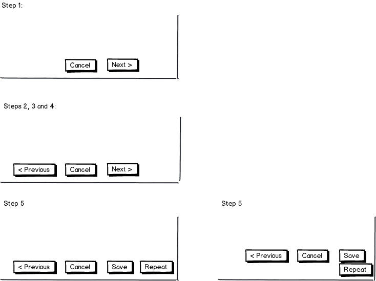
mockup

download bmml source – Wireframes created with Balsamiq Mockups

8
  • What is your layout assumption? why step 5 has to be like that? please share your assumption...
    – sree
    Commented Jul 3, 2012 at 12:08
  • @sree - I'm not 100% happy with step 5 and was thinking of revising it. The goal was to keep the buttons as close to the bottom left as possible.
    – ChrisF
    Commented Jul 3, 2012 at 12:09
  • Thanks Chris, I was actually reading cjforms slideshare which has created much of the confusion slideshare.net/cjforms/… Commented Jul 3, 2012 at 12:14
  • Also here in her theory Save Should appear before Cancel and Next Should appear before Previous. So this becomes more confusing. Commented Jul 3, 2012 at 12:16
  • @sushilbharwani - my point is that the buttons should be one the same place at each step, the order could be altered, but I think the one I present is more logical.
    – ChrisF
    Commented Jul 3, 2012 at 12:18

Not the answer you're looking for? Browse other questions tagged or ask your own question.