2

I have a login dialog for a desktop application, something like this:
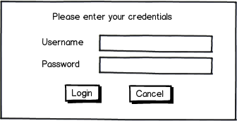
mockup

download bmml source – Wireframes created with Balsamiq Mockups

When the user clicks on Login, the color of the button changes (it's a toggle button) until the credentials are verified and the program starts. But I think it's not obvious enough that the program is loading, so I want to make it more evident. So far I came up with these solutions:

1- Change the cursor to a clock (only inside the login dialog)

2- Add some text above the button saying "Loading" or similar

3- Change the text of the login button to "Loading" or similar once clicked.

Is any of these better than the other? Are 1 + 3 combined good enough?

1
  • Is there a reason you choose to tell the user that you're loading, when what you are really doing is verifying their login?
    – André
    Commented Feb 20, 2013 at 8:14

4 Answers 4

5

Assuming this is an application destined for Windows, I recommend turning to the Windows User Experience guidelines. Specifically:

Progress Bars

Modal indeterminate progress bars

Indicate an operation is in progress by showing an animation that continuously cycles across the bar from left to right.

Used only for operations whose overall progress cannot be determined, so there is no notion of completeness. Determinate progress bars are preferable because they indicate the approximate percentage of the operation that has been completed, and help users determine if the operation is worth continuing to wait. They are also less visually distracting.

In this example, Windows Update uses a modal indeterminate progress bar to indicate progress while it looks for updates.

Mouse and Pointers

Activity pointers

The activity pointers in Windows are the busy pointer and the working in background pointer.

  • Display the busy pointer when users have to wait more than one second for an action to complete. Note that the busy pointer has no hot spot, so users can't click anything while it is displayed.
  • Display the working in background pointer when users have to wait more than one second for an action to complete, but the program is responsive and there is no other visual feedback that the action isn't complete.
  • Don't combine activity pointers with progress bars or progress animations.
1
  • This is the best option for me because I am in fact designing for a Microsoft Partner. Activity pointers seems to be the best approach. Thanks.
    – Yisela
    Commented Feb 20, 2013 at 1:54
4

The old way of showing a loading indicator always had the term "Loading..." or something similar on it. That is really a legacy requirement as when they first came out people didn't know what they were. These days it is not necessary to show text with it. The Android HIG for example suggests using a simple spinner with no text, which I agree with.

When it comes to what you should show: you should use a simple loading spinner or animation if you simply want to show that something is loading, but you don't have any specific information to show in terms of how far the loading is, or how much longer it will take

I would suggest an animated one, but I don't want to annoy you by forcing you to watch some animation :)

enter image description here

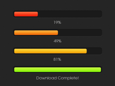
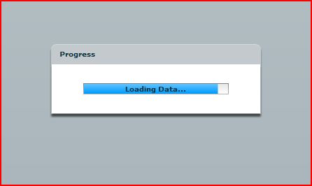
You should use a progress bar with optional additional information when you either know how long it will take, or you have additional information to show people. Giving this information minimises the feeling that the program / service is taking too long as it feels like it is at least doing something.

enter image description here

enter image description here

1
  • When the program loads I actually use a loading bar, but instead of one whose color grow, I use a full color one with stripes that move to the right. That way it's both at the same time: a loading bar, and a spinner :)
    – Yisela
    Commented Feb 20, 2013 at 1:56
3

Your idea will work but I would recomend going for a simple affordance of just showing a loading indicator and perhaps also showing a loading text below or above it like the example below.

enter image description here

To specifically call attention to your loading indicator, you could just hide the login and cancel buttons and show the loading indicator in their place.

The advantage of this over your method is :

  1. Its cleaner since it (the loading icon) occupies the primary point of focus after the click

  2. Your loading text will not have to fight for notice with the other elements in the page since it is right below a dynamic indicator

  3. You dont have to rely on the visual affordance of a cursor to convey a message and the user will know the status immediately on glancing at the page.

1

Unless you're doing some heavy lifting to log the user in, the one or a couple of sql queries to authenticate user should be just about instantenous. Maybe your queries are inappropriate or database structure not right, if you can't execute the authentication in less than 10ms. During this wait time disable the login button (cancel button should still actually work at this time) and change your instruction text "Please enter your credentials" to "Authenticating...". You can treat that line as a good status/instruction line also for when they get the credentials wrong. The login shouldn't take any longer than absolute maximum 0.5s. In that short time it would be distracting to introduce progress bars and other whizz-bang things that users don't really want to see at all.

1
  • You are right, it is taking way more than it should, around 3 or 4 seconds. I'm just doing the design, but I know the developers are wondering about this, and will eventually decrease the time.
    – Yisela
    Commented Feb 20, 2013 at 7:43

Your Answer

By clicking “Post Your Answer”, you agree to our terms of service and acknowledge you have read our privacy policy.

Not the answer you're looking for? Browse other questions tagged or ask your own question.