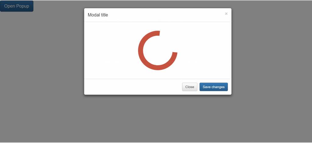
Like most things, it depends on the context. Did the user submit a form? Create a project? Make a payment? Each of these options have their own patterns that work well for each use case.
From past experience and user tests, modals with loading indicators increased perceived wait time and frankly, they just feel clunky and inelegant.
The idea is you want to always give the user feedback after some action and let them know what's going on . I complete an action and the system says "Hey, we got it from here. Hang tight while we work our magic." User Action -> Feedback
Let's take a look at a few examples, I don't have any screenshots on hand so let's use our imagination.
Option 1: Disable buttons after user interacts with them
This is great for payment forms. I submit my payment and the button gets disabled to stop them from making multiple requests. Bonus points if you put some form of a loading indicator in the button itself.
Option 2: Dedicated loading page
This works well for things that take time to process. Amazon AWS, MongoDB, and Google Firebase—to name a few—all do this when creating a new project. They understand these processes take time so they place the user on a dedicated loading screen with some form of spinner and usually feedback indicating to the user what step of the process they are on in the backend. For example:
- One moment while we set up your project, this will take a few
moments...
- Creating x
- Creating z
- Wrapping up...
In some cases for longer wit times, i've seen products tell the user to check back later or they'll shoot them an email when their 'thing' is ready. The key for this option is transparency and good microcopy.
Option 3: Page 'skeletons'
Let's say they user is waiting for their new dashboard to load or some content to populate the page. Skeletons, or grey flashing boxes in lieu of content is a great pattern to leverage when content takes less than a few seconds to load.
As i mentioned above, the best course of action really depends on context/use case. Note, a big factor in choosing a pattern is how long will it take for the system to finish processing the user's action.
Closing notes:
- Custom spinners have the highest perceived wait time (mobile)
- A device's native spinner has a shorter perceived wait time compared to custom (mobile)
- Skeletons have the shortest perceived wait time of the 3 (desktop and mobile)
I'll find the article with above information and make an edit as soon as I can.


