6

I am thinking a lot the matter of the position of the ajax cart.

I have place my temporary show cart on the bottom of the page. This is just an information for the user when its add products on the cart. He can close it at any time and its not the cart that go to pay, just information to know what he place on.

It something like this image.
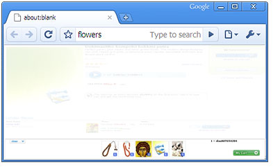
enter image description here

And I am wondering if this is psychological bad for the customer and think the products as not so good (because they are down).

Looking other sites they prefer to place the cart on top on the page but I do not like it because they spend a lot of space that way.

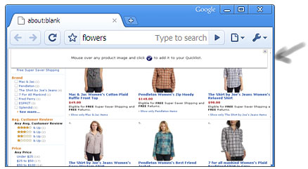
Amazon have a floating quick list view that stays on top and block the view enter image description here
C&B in the new version have a static view of cart on a menu place that is not blocking the view, but you need to open it (as menu) to see it. In the previous version C&B have the cart on the bottom of the page, but with out give the option to the user to totally close it, just make it smaller and it was not so nice on the navigation.
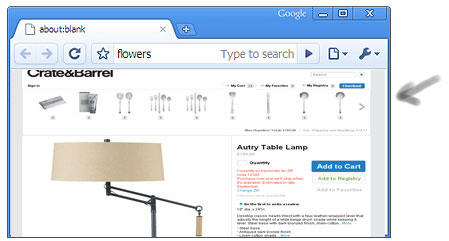
enter image description here

For me the final goal is to make the user move easy-enjoyable on the pages but also buy. And the buy is first goal, all the other goals coming seconds for the UI.

Can you please share with me your option about that ?

Update.

    The cart is **REMAIN** on bottom or on top, except in the 
case that is part of menu and is just on top.

3 Answers 3

5

Users expect to find a shopping cart link in the top right corner of the page, according to a study by Michael Bernard & Ashwin Sheshadri.

Since you're concerned about using too much space, I suggest putting a link at the top with a summary and an arrow pointing down (e.g. Shopping Cart (4) ⇓). That way you can keep the cart at the bottom and your users won't have trouble finding it.

Honestly, I wouldn't worry about customers thinking products at the bottom are "not so good." If you're interested in applying psychology to e-commerce, you might enjoy the book Neuro Web Design: What Makes Them Click? by Susan M. Weinschenk.

2

My gut feeling is to place the cart on the right.

I think the eye scans more naturally left to right (at least for most languages), so any changes there would be more evident than something way down on the page.

Does that make sense to you?

1
  • On the right is not so much space for all the product icons except one. On the right there is the buy button, that leads you on cart. The cart !remain! on bottom or on the top
    – Aristos
    Commented Aug 16, 2010 at 7:56
1

The navigation content should stay on the left (or up because people start at the top of a page for a book) so they can get to content.

In the center should be you main content.

In the right should be other import stuff once your done looking at the content.

This is because its like reading a book. Treat navigation like a word, they need to navigate first then they will go to the right (the next word) which is the main content. Then once they are done with the content and want to make their final decision they will go the right (the next word) which is the cart.

2
  • +1 The left-to-right thing is so important, and it's important to understand it (even though I think most people do it anyway out of instinct) Commented Aug 15, 2010 at 7:33
  • The eye is go where you make it to go. Its not like a book to start from left. And you need to make the eye to stay on page and not disorganized.
    – Aristos
    Commented Aug 16, 2010 at 7:59

Your Answer

By clicking “Post Your Answer”, you agree to our terms of service and acknowledge you have read our privacy policy.

Not the answer you're looking for? Browse other questions tagged or ask your own question.