1

I'm building a webApp with mobile support, and I'm facing a big issue when dealing with mobile screen and it's size limitations.

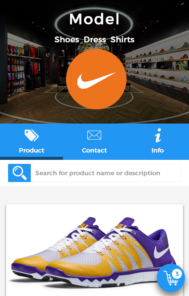
It's important to note this webApp isn't about a single company. It's a multicompany service, this is why on the screen I'll show below, there is a big header with the company name (Model) and it's category (shoes - dress - shirt).

Currently my webApp is an e-commerce project, some of the requeriments is to have a search function within the list of products so I have these main objects I need to keep:

  • Search field, to search for products;
  • FAB button (or other method) to show the shopping cart (once user clicks on it, it animates to fill the entire screen with the shopping cart, checkout methods, etc..);
  • Main menu, to navigate on the webApp;

The problem is, these fields are either conflicting a lot with each other, taking too much attention away from the product, or being too small so the interaction is even harder. This is an screen example of the app:

enter image description here

And this is a basic menu (which I still didn't placed on the screen, but will be fixed at the top):

enter image description here

The big tab and header is just at the beggining, once the user scroll down, they go up and don't fix at the top.

Why am I using this tab?

I'm using it with those 3 links (products, contact, info) because it's a multi-store webapp, it's not about a single company.

So instead if I had it in the main-menu, the user wouldn't be able to access those pages until he selects a company and then the menu would appear. By putting this tab, I can show users how to access the company info, contact and products.


The problem

As you can see, if I keep both elements: menu, search and FAB cart, they start to take too much space and conflict, specially when user opens up the keyboard to type on search.

Note: All those 3 elements must be visible all the time, or at least in a obvious/very easy place to access.

What I tought

I was planning to mix the search field with the menu, once the user clicks to search, the field opens up to type. But I tought it was going to be very compressed as weel. Unless I remove the page title, which will take away the information about where the user is.


I'm in a huge conflict on what to do in this case and I'm running out of options/ideas. What do you guys think?

1 Answer 1

2

Focus on what the user wants: Products!

Users don't come to an ecomm app to enjoy the UI. They want to shop. Start there and get everything else out of the way. Ask yourself, "How can the UI make shopping as simple as possible?"

The ecomm story

In my experience, the user has four primary steps.

  1. Find a product

  2. Confirm product details

  3. Add the product to their cart

  4. Check out as painlessly as possible.

That's the whole "conversion funnel" your app should be addressing. "Contact" and "info" don't fit there.

Issues in your design

  • There is a lot of real estate at the top of the view dedicated to not shopping. That's a bad sign.

  • Why place the three tabs across the middle of the view? In Material tabs usually live at the top; in iOS, it's at the bottom edge. In this case, Contact and Info seem inappropriate for such dominant navigation.

  • Placing the search box in the middle of the page will slow users down. When they come to the app with a search term in mind, they'll look at the top.

  • According to Google, "Not every screen needs a floating action button". Put the cart in the top right of the header where users expect it. Then you have the freedom to introduce the FAB for something like add to cart on the product detail page.

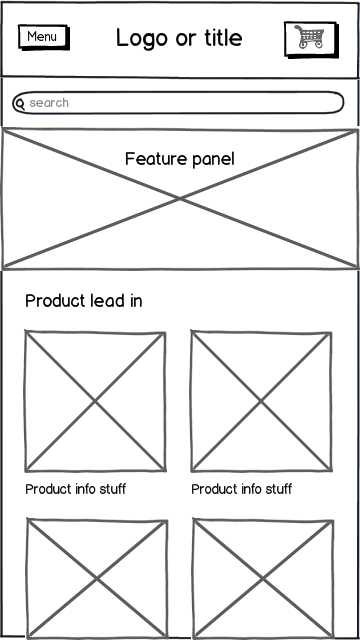
In the simple wireframe below, you're in the Products area because that seems like the right place to start. Contact and Info can be accessed in the menu and exposed in the footer. I can't imagine an e-comm scenario where those two things are of primary importance to the user.

mockup

download bmml source – Wireframes created with Balsamiq Mockups

8
  • Oh.. I'm sorry, I forgot to mention the Tab use, it's important to have it there (at least I think it is). Can you read it now? This is why the search field isn't at the top, because user just need to search if he is in the product page. So I created this "imaginary line break" (which is tab) where things doesn't change, just change below the "line break". Commented Jan 21, 2016 at 9:56
  • But I do understood the purpose of your comment. I'll just wait to see if there is any other considerations based on my edits. Commented Jan 21, 2016 at 10:03
  • See my updated answer. I understand that you intentionally put the tabs there, I just don't think it's the right decision. Take a look at your view again with the app bar in place and you'll see that you've spend a lot of space on UI. User's won't respond well to that. Commented Jan 21, 2016 at 17:26
  • sure sure! I understand. But the contact/info are important, this is the only section where the user can access these 2 pages. What do you recommend? Put them in the menu and show only when the user is in this section? Commented Jan 21, 2016 at 17:36
  • As I mentioned in my answer: Contact and Info can be accessed in the menu and exposed in the footer. Commented Jan 21, 2016 at 17:40

Your Answer

By clicking “Post Your Answer”, you agree to our terms of service and acknowledge you have read our privacy policy.

Not the answer you're looking for? Browse other questions tagged or ask your own question.