32

An application has a fixed size, i.e 800x600 px. However, a problem I often run in to is that the page's content isn't enough. It's simply too little content on a big area.

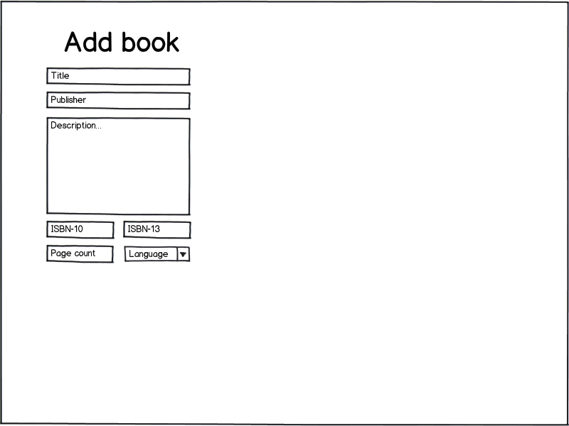
Consider the mockup below, the "box" is of fixed size:
mockup

download bmml source – Wireframes created with Balsamiq Mockups

This example is a crucial step, and probably shouldn't be merged with another step. Nor am I looking to add unneeded content, since it'll only clutter the UI.. Resizing the fixed area isn't a viable option either, at least not sufficiently enough (prefarably not at all).

I'm sure I can't be the only one who encounter this problem, but what do you do when you find yourself in it? The mockup is as said only an example, but feel free to re-use it to demonstrate a solution.

3
  • Is this a web application or a native application? Commented Dec 18, 2012 at 22:06
  • @Charles This is a native application which will run in full-screen. If the window-size isn't big enough, this fixed-size box will be centered on a background which does fill the whole screen.
    – Zar
    Commented Dec 18, 2012 at 22:08
  • When you say that the application has a fixed size of 800x600, what do you mean by that? Can you explain that constraint in more detail? Commented Dec 18, 2012 at 22:25

3 Answers 3

26

I can think of four broad techniques for tackling this issue.

Firstly, it looks to me that you could probably get away with increasing the size of your UI components and copy. Text really needs to be 14px or above to be well-readable anyway, so there are practical benefits to doing this beyond just aesthetics.

Secondly, if you feel a page seems 'orphaned', and the form is an action relating to some other table or group of elements on another page, you might get away with showing the form as a lightbox. It's not great practice to choose UI elements just because they look 'nicer', but if it's appropriate from a UX perspective then it's something you should look at.

enter image description here

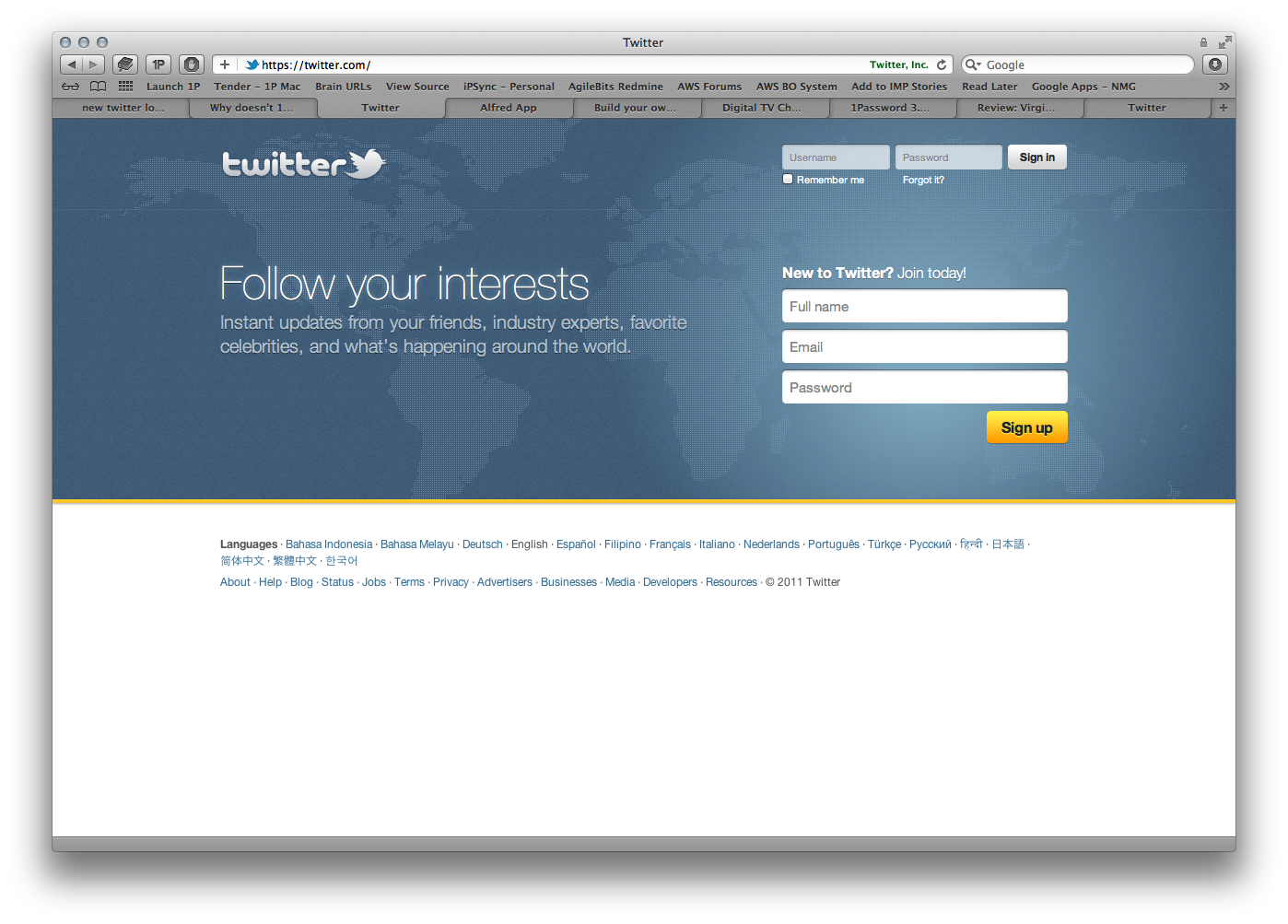
Thirdly, you can add secondary content to the page if it helps promote the activity, or provides help or advice. This is what Twitter does on its login pages (below), but be careful not to steal attention from the form itself. In Twitter's case, the bright white UI elements and subtle highlighting around them keep the form the centre of attention.

enter image description here

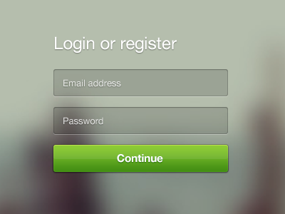
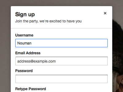
Finally, you can make the whitespace more interesting. A common technique on login and 'gateway' pages is to show a blurred stock photo background, as in the following example:

enter image description here

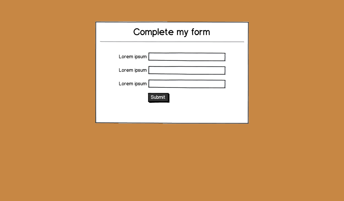
Web-savvy audiences (i.e. other designers) might find this a little clichéd, though. Another technique is a simple colour or gradient for a background. Using something darker than the page body again helps draw the eye to the form.

mockup

download bmml source – Wireframes created with Balsamiq Mockups

5

Whitespace is a design element. You should use whitespace well and spread your content out to what makes the content the most readable and usable, rather than trying to cram it together. You could also have bigger text - most sites have their text too small, especially for forms.

Overall the if it's usable for your customers, then the rest of it is an aesthetic design decision where as long as you aren't making it less usable, you can make it more pleasing to look at.

2
  • I agree, but on a page where whitespace is ~80%, it won't look as good. It'll be very hard to make it look attractive.
    – Zar
    Commented Dec 18, 2012 at 22:11
  • @zar Have you confirmed that your customers don't like this? Often it's an assumption.
    – JohnGB
    Commented Dec 18, 2012 at 23:08
3

In your mock, you should also think about where error messages, labels and submission button will go. With those elements included I think you'll find there is much less white space.

Also, If the mock is to scale it would make your fields very very small, 200px is on the narrow side for text areas and fields. I would suggest making these take up at minimum of 300px - 400px wide.

Your Answer

By clicking “Post Your Answer”, you agree to our terms of service and acknowledge you have read our privacy policy.

Not the answer you're looking for? Browse other questions tagged or ask your own question.