6

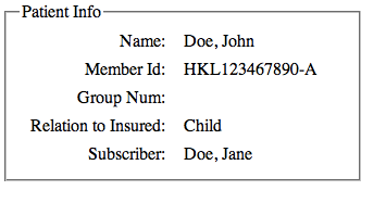
I've been asked to look at one of our legacy applications from a usability perspective. On one screen, we have a situation where data is displayed in two columns (eg. Key: Value) where we've right-aligned the left column and left-aligned the right column.

The result looks something like this:
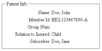
I personally find this hard to read. The values run right up next to their headings, and it's hard to differentiate at a glance what is a value and what is a heading. (In the actual application, unlike my mockup above, there isn't even a space between the : and the value, so it looks like Name:Doe, John.)

I've tried left-aligning the first column (see JSFiddle), but the gap between the label and the value seems to lessen the association between the 'heading' and the value on the right.

I've seen the research done on aligning labels with input elements, that suggest that the best placement is either immediately above the input or right-aligned next to it, but does the same apply for simple text presentation? Is the above really the best way to go about displaying this data? And is there any research, similar to that done on labels for input fields, that is done for plain text?

3 Answers 3

10

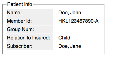
I guess if you put the rows a bit further away, and perhaps give a visual clue on baseline it should work.

See: http://jsfiddle.net/s35bh/2/

A bit subtle perhaps, therefore not necessarily the best solution, and you should be able to do this through alignment and proximity rules, but it does the job.

My rule of thumb is: if you're out of options grid systems of swiss design can give to you, simply draw a line.

(This time, it's the white line between rows).

enter image description here

Or if we go back to the original solution, you could just simply signify the gap between columns (as per standard swiss-style grid based design)

http://jsfiddle.net/6kmJP/1/

enter image description here

2
  • 1
    I really like your second solution, increasing the spacing between the label and the data. It should be relatively simple to implement and expert users won't be as affected by a drastic change in the overall look of the field. Commented Oct 17, 2012 at 18:38
  • 1
    Well, it works effectively only if it's part of a consistent grid, that is, the same gap, width, alignment edge is used elsewhere on the page or screen
    – Aadaam
    Commented Oct 17, 2012 at 18:55
1

Most studies I've read regarding label alignment are for consumer-based applications. With legacy apps used by internal users that look at the same screen day-in-day-out, users will quickly learn to rely less and less on labels. Instead, they rely more on positions and colors.

So another way to remedy your situation is to use the left-aligned version, but reduce the size of the label, keep the bold, but make it lighter color. Keep the emphasis on data, instead of labels, and don't over-design just to make visual correlation between them.

Here's a mockup.

http://jsfiddle.net/s35bh/3/

1
  • +1 for your first paragraph. I think this is why the existing solution has remained in place for as long as it has -- because the expert users are so used to the placement of the information that they completely disregard the fact that it's practically illegible to someone who does not stare at this screen for hours every day. Commented Oct 17, 2012 at 18:36
1

If the form is read-only: It is always best to recommended to right align the labels and left align the values of the variables. Do make sure there is at least 3   between the labels and the values for better readability.

If the form is write: Same positioning, however, indicate required fields by placing a star before the labels. Make sure the star has a different color usually something like red to indicate required fields.

Your Answer

By clicking “Post Your Answer”, you agree to our terms of service and acknowledge you have read our privacy policy.

Not the answer you're looking for? Browse other questions tagged or ask your own question.