6

A table in our web application contains items where one column specifies whether the item has a policy bound to it or not.

This column can display three different states:

  • Has policy : ACTIVE
  • Has policy : INACTIVE
  • No policy

The user should be aware of these three exclusive states, but you can never be sure.

My manager wanted to use padlock icons to display the state of policies, where a locked padlock represents an active policy and an unlocked represents an inactive one. The question now is how I should communicate the absence of a policy for an item in the table. I've developed a first draft that looks like this:

enter image description here

The problem is that I get a feeling that the icon containing an oblique padlock with an "un-allow" sign in front of it could just as well communicate to the user that a policy cannot be set for the item rather than that it just doesn't have one...

And I don't simply want to leave the cell empty when an item has no policy. The idea is that these icons should act as action buttons to display a modal window for setting the policy for a specific item, and expecting the user to click on "nothing" to adjust settings would be a violation against the component affordance.

How would you prefer to display the absence of something in circumstances such as this? Am I thinking of this in the wrong way?

8
  • 5
    Why are you using icons at all? , they're not a standard, don't save any space (given a "Policy" header), and are unlikely to be more understandable than "Active," "Inactive," and "None." Commented Jan 31, 2012 at 14:02
  • 1
    A question mark or an empty square should be clear. Just add a tooltip and mention it in the release notes somewhere.
    – Barfieldmv
    Commented Jan 31, 2012 at 14:04
  • 1
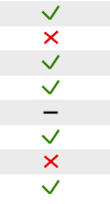
    To approach @Michael. You can emphasize the text visually with a green checkmark and red cross icon (before text). For "none" don't use a icon.
    – sysscore
    Commented Jan 31, 2012 at 14:12
  • @Barfieldmv an empty square isn't too bad. I'll keep that in mind! Thanks! Commented Jan 31, 2012 at 14:13
  • @Barfieldmv question mark is'nt a methapher for empty rather for unlear (mixed) status.
    – sysscore
    Commented Jan 31, 2012 at 14:15

4 Answers 4

6

You're right that the current icons are very much unclear. Personally, I read them as "locked", "unlocked", "locking not allowed".

The rule of iconography is to use text controls whenever an unambiguous image isn't possible. "Policy" is a rather abstract term so you'll have a lot of trouble finding a clear graphic representation for it. Thus, I suggest changing the icons to the respective phrases - active, inactive, not set - and color coding them (though, make sure that the colorblind people can distinguish the shades).

8
  • Thanks. I realize using descriptive words would probably be the appropriate way to go in this instance. My manager however has his mind set of using icons when applicable, which this is according to him. I'm trying to find a standard icon for "undefined"/"not set" but haven't had any luck. You wouldn't happen to know of any? Commented Jan 31, 2012 at 14:11
  • @AndroidHustle: If your manager is so insisting on icons (which isn't the recommended solution), use the padlocks for active/inactive and not set as words since the absence of state has no visual metaphor.
    – dnbrv
    Commented Jan 31, 2012 at 14:47
  • Fair enough, I think that could work actually. Displaying "Not set" in an oblique-ish text. I hope its affordance will encourage the user to click it though. Commented Jan 31, 2012 at 14:56
  • Using words only does make it harder to for instance glance if there is any policy active. You would need to read line by line reading through a list of "inactive" and "not set" before you know there is nothing active. Color coding as suggested may be a solution for this. Commented Jan 31, 2012 at 15:05
  • @BartGijssens: Actually, scanning the column shouldn't be so hard since all words start with different letters.
    – dnbrv
    Commented Jan 31, 2012 at 15:11
3

Maybe a approach for an icon solution could be a stroke for "none". But make the editablilty of this column clear.

Example

1
  • thanks sysscore. I can see where you're coming from. problem is though that were already using a similar set of icons for actions, with checks and x's, where the stroke indicates "remove". It would be ambiguous to have it represent the undefined state of a policy as well. Commented Jan 31, 2012 at 14:52
3

I agree with dnbrv, your current icons look like locked, unlocked, cannot be locked.

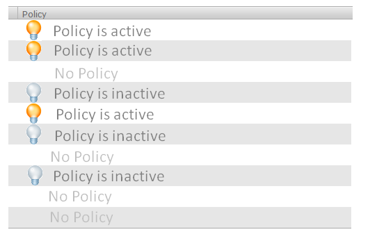
  1. A similar meaning of "active/inactive" is "switched on/off". You need something that shows and ON/OFF state without using animation/movement. A light bulb is what comes in my mind.
  2. How about not using anything for "no policy"? If there is no policy, then why try to show its state?
  3. How about making the meaning of the icons more clear by using some text?

Something like this, but then more beautiful:

enter image description here

As an alternative, you could also do it iPhone style by showing an ON/OFF switch (described here: http://www.mobisoftinfotech.com/blog/iphone/iphone-switch-control-uiswitch-control-tutorial/) but then it should be read-only istead of a real switch.

3
  • Hi Bart! Thanks for the answer. I've also decided to go along the lines of what dnbrv suggested. The reason for the padlock is that the policy is a policy that in short says "items bound by contract for XXX time", meaning that they have limited options to adjust the item. The padlock is a metaphor for describing the meaning of the policy really. Commented Jan 31, 2012 at 15:07
  • 2
    The biggest problem with this solution is that active/inactive policy is written in the same color and includes the complete phrase Policy is..., which makes it harder to scan (you see different icons but the beginning of the copy is the same).
    – dnbrv
    Commented Jan 31, 2012 at 15:12
  • OK, maybe it should just read "Active", "Inactive", and "No Policy" or soemthing like that. Commented Jan 31, 2012 at 16:30
1

My gut feeling keeps telling me that a text/simple icon mix is the way to go. The icon-only solutions are terribly confusing.

Your Answer

By clicking “Post Your Answer”, you agree to our terms of service and acknowledge you have read our privacy policy.

Not the answer you're looking for? Browse other questions tagged or ask your own question.