3

This one is a bit tricky: I have to give the user 2 actions for every object on my app: Add to list and Feature (that's the best translation I could come up with). The problem is: Add to list adds an item to the users list and Feature puts it on the user's front page but also adds the item to that list. So, how to handle feedback here?

The interface has to show both icons/buttons at the same time, and it has to give the user feedback when the item is already on the list or if it has been featured.

My solution so far is not close to satisfying: the icons' states change when they have been used, but giving feedback on a button that the user has not actively tapped on is quite confusing.
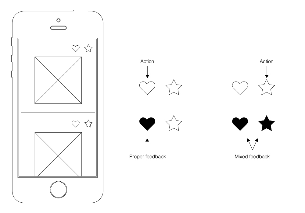
the heart icon lights up if the other one has been used...

Is there a pattern for this kind of situation I am overlooking? Can my approach be way off?

Edit: According to Izhaki's point about Group Theory, I could go with something like this, witch is a good progress:
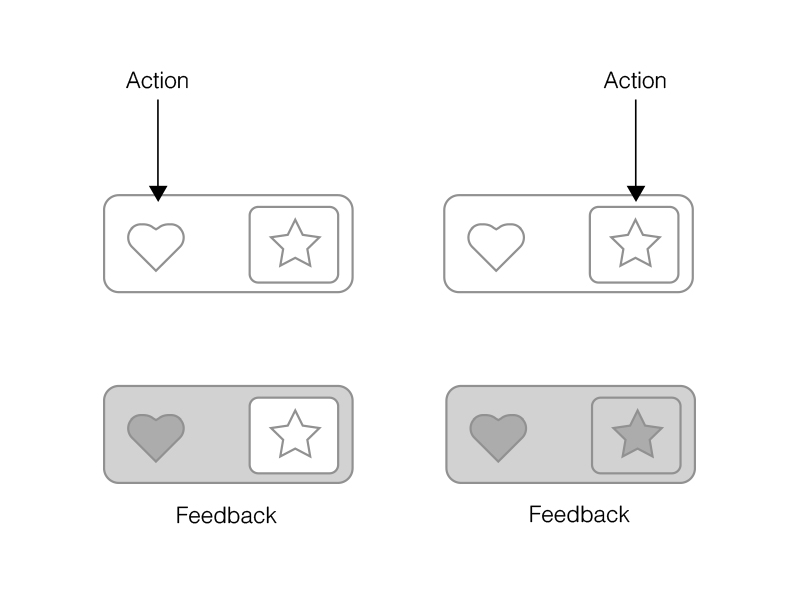
enter image description here

IIt still feels quite complex for my average user. Maybe I should try a whole different approach, something like a two-step confirmation? User adds item to list and is asked if he wants to Feature it also?

1
  • Yeah, it seems like you're defining Featured as a sub-group of Added-to-List but you have them equal in the navigation. Therefore, I think the Feature button shouldn't be visible until the item has been Added-to-List. Have the one action button showing (zero confusion, zero consideration) and put the Feature button in a cool animation that rewards the user for taking that action.
    – moot
    Commented Mar 10, 2015 at 18:39

3 Answers 3

4

Group theory

I think you are applying your knowledge of the functional logic, where in your mind it's a case of:

A or ( A and B )

But that suggests that B can exist on its own, and you are treating B as an independent group like so:

Two circles side by side, one labelled A the other B

But this isn't really the case - with the interface provided, say someone presses the star, which will highlight both the heart and the star, and then presses the heart. In theory, only the star should stay on, but that is disallowed.

Instead, what you have is the full list of items A, and B which is a sub group within A, like so:

Two circles, labelled A and B, with B contained within A Which really leaves you with the logic:

A or B

In other words, the user either selects A (heart) or B (star), where the fact that B also mean A is implied.

Hidden logic?

Now that implied hidden logic is likely to be problematic. You could make things clearer by instead of providing a heart and a star icons, provide and heart and a heart with a small star on it.

Also, it could help if the interface makes it explicit that what's in B must also be in A, something like this:

Two rectangles - A and B, with B contained at the top of A

Priority patient is still a patient

Not sure the analogy will work, but consider a doctor that can add patients to a system - a patient can be just added (group A), or added as a priority patient (group B). If a patient is a priority one (group B), he or she must also be a patient (group A). Following that line of thought could possibly help here.

1
  • Great point. I've added some progress to the original post. Commented Mar 10, 2015 at 14:42
1

Don't think there's a pattern for this, but I've seen this done in games (adventure rpgs) for collecting items and placing it into inventory/bags. They animate the movement of the item into the right location. This translates fairly well into mobile apps.

This assumes your two lists are visible on a tab bar. User taps on the action. You show an thumbnail (or icon) that represents the item and you animate it to the corresponding area on the tab bar. A minor "blip", color change etc would be nice to denote the item has been placed into the group.

If it needs to go into two groups consider making the thumbnail do two bounces. First into the main expected group, then over to the extra group.

1
  • Hi nightning, thanks for that, but it is a single list that is hidden inside the user (hamburger) menu. The feedback has to be present in the item cell so the user can know he already has it listed and/or featured when viewing multiple items at once. Just to clarify: both actions add the item to the same list, but each with a different state: added or added&Featured. Commented Mar 9, 2015 at 22:17
0

To echo and add on @nightning 's answer above, you can check out several apps that use animation to provide feedback of moving items to lists.

Apple's mail app famously shows an animation of the message being flown to other folders when you move it.

Another example you can see in Ikea's iOS app: when you add an item to your shopping list, the picture of the items flies into the list shortcut on the bottom.

Your Answer

By clicking “Post Your Answer”, you agree to our terms of service and acknowledge you have read our privacy policy.

Not the answer you're looking for? Browse other questions tagged or ask your own question.