1

I am making a chart with a time axis. This axis can have yearly, monthly, dayly, or hourly ticks, depending on how big the timespan is.

For monthly ticks, I'm in doubt as to where should the ticks be exactly. I can think of 2 options:

  1. Each tick is on the first day, at 00:00 hs, of that month. The problem is that since months have unequal durations, the ticks won't be evenly spaced and that might look bad.
  2. The first tick is the first day, at 00:00 hs, of the first month that appears. Each other tick is exacly 30 days after. For 12-20 months (the most I would show), I don't think the ticks will be too far off the actual first day. However, it still bothers me that they won't be exacly on the first day.

Since there are millions of websites with monthly charts, surely there is a concensus on this! What's the best option? Or maybe the most commonly used option?

3
  • 30 days ≠ 1 month. Showing a tick after a 30-day increment is not a monthly view. I'm wondering why evenly spaced, labeled months don't work for your project. Can you post a screenshot of your axis?
    – Izquierdo
    Commented Dec 29, 2023 at 16:24
  • @Izquierdo I havent created the chart yet, it will be a normal time axis though. "why evenly spaced, labeled months don't work for your project". Um I never said that... You are suggesting that I should show fixed 30-day intervals, and put the month name on each tick (not caring that they wont land exactly on the first day of each month)? That would be Option 2.
    – Juan Perez
    Commented Dec 29, 2023 at 16:55
  • 2
    Are there day and week tick marks showing inside each month, in the "month" view? If not, just show evenly-spaced month marks. That's how just about every month chart works.
    – Izquierdo
    Commented Dec 29, 2023 at 17:06

1 Answer 1

0

For each type of time axis you implement, the tick will represent exactly one unit of value that you want to break it down into, unless you are putting in major and minor tick marks to break the single month unit into days.

I assume that you are aggregating your data by only one period type at a time, that means each graph should only have one type of value on the time axis. It seems like you would only have the problem you are talking about if you plot a graph that is based on data aggregated by day, and you want to display it by month. Instead you should aggregate the daily data into months and display it accordingly.

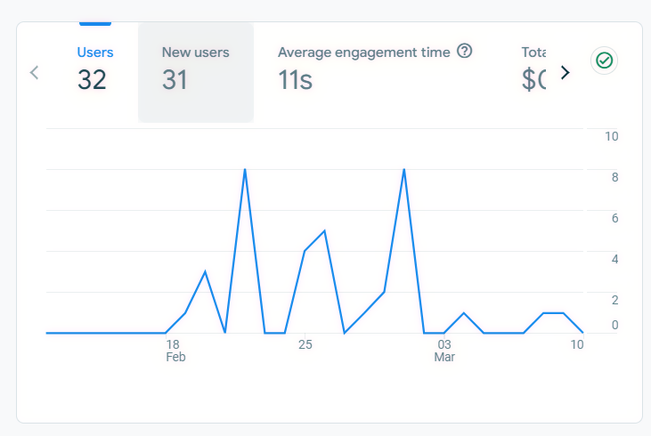
Alternatively, you can display the daily data and have each tick represent the value for each day, and provide tick labels at even intervals without it being aligned to specific months. An example is the data for Google Analytics where dates are labelled at even intervals apart.

enter image description here

Your Answer

By clicking “Post Your Answer”, you agree to our terms of service and acknowledge you have read our privacy policy.

Not the answer you're looking for? Browse other questions tagged or ask your own question.