9

I am currently working on a project that needs an overhaul. I came across an interesting concept which I personally did not use before.

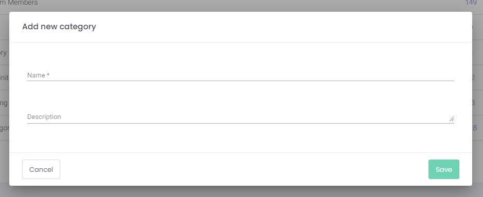
This app has three types of buttons.

What the buttons do:

  • Cancel - Closes modals.
  • Add - Opens a modal which will contain a form.
  • Save - Saves your changes in a page or saves data inserted in the modal.

What colors look like:

  • Cancel - outlined - gray border & dark gray text

  • Add - filled - blue background & white text

  • Save - filled - green background & white text

Another thing that must be pointed out is that this application will have themes for each company that will use the product. Most likely the theme will customize the colors used and of course the logo (nothing else).


  1. Is it better to keep the green/blue difference on the two primary actions, or have one primary action color (in this example, blue)?

  2. Should additional secondary buttons match the color of the primary buttons, but show as outlines? For example, if we keep Save as a green button but decide to make it secondary, would that become a green outline secondary button?

Is having color distinction is more important than the other aspects?

Add button Save button and Cancel

3 Answers 3

23

Color alone should not be used as an indication of meaning, as Shreyas Tripathy points out.

However, there is benefit to having a separate color for actions that change the state of your data, such as save actions, like in your example.

In my applications, I tend to implement the following , which is also suggested by common style frameworks as Bootstrap:

  • Primary—Probably uses the main brand color. These colors indicate the main interaction points, and help guide the user through the most common workflows.
  • Secondary—Styled as either an inverted primary button (white or transparent background, with the primary color for the font), or a more subtle color, like a gray. These are safe actions. They carry less visual weight and are used for cancelling, or returning to a previous location.
  • Success—This would be your green "Save" action. These actions finalize and apply their changes and return them back to their main workflow.
  • Info—Used to toggle extra details, or show info that is all read-only. These are only used to provide extra information, not to modify data or take the user to another place in their journey.
  • Warning—Might be an orange or yellow color, to indicate more impactful changes. Used when the user should take an extra pause before confirming their actions. These can be used rarely when the user is making a change that they should be more sure about before continuing.
  • Danger—Usually a red, to indicate a destructive action. These can help the user realize that they are about to do something permanent, irreversible, or destructive.

I'm not of the mindset that these colors add "visual clutter" if they're used consciously and consistently. They have the ability to increase a user's comprehension of each button when used appropriately. Also, it's unlikely that you'll have a page that has all of these at once—I find my applications do not appear to have a rainbow of buttons, because each is used only within its appropriate context.

I'm not sure how you are planning on supporting the theming, but if it's performed within the app (as opposed to letting them just upload their own CSS), you can encourage your users to select colors that will provide sufficient contrast. If you're feeling extra helpful, you can calculate the contrast ratio for their selected colors and determine automatically if their chosen button background colors should use a black or white font color to ensure appropriate legibility.

If the theming happens within your application, you could provide a brief description of each intention like I have here, and allow them to choose the colors that they would like to assign to each of them. I'd recommend providing them with suggested defaults, and let them tweak them from there.

Again, color alone should not be the indicator of what these actions do, but they can help the majority of users get a better sense of how their actions will impact the system.

5
  • I can't believe I haven't thought about how Bootstrap does it.. Very good points! I guess the more complex the app is, the more I feel I should indeed embrace colors. Regarding the theme, each theme will be done by us for every client - they cannot customize by themselves. Really nice insights. Thank you!
    – Adrian
    Commented Apr 21, 2021 at 15:58
  • 2
    "Color alone should not be used as an indication of meaning" Everyone working in UX should be saying this over and over in their heads until it sticks. Commented Apr 23, 2021 at 4:48
  • I'd rather call the Success button class Perform or Positive Action, because pressing it doesn't imply that there was some success but only indicates that the user is done with something. Calling it Success in documentation will probably confuse other designers and they will use the Success class for other purposes. • • • Also, when there is some action with “negative impact” (e.g. confirmation of stopping some process), the button styles should not confuse the user – cancellation and cancellation of cancellation are neither “positive” nor “negative” action so they should be neutral.
    – jiwopene
    Commented Apr 25, 2021 at 16:25
  • @jiwopene You could name the success button whatever you want—I was just using the standard names that Bootstrap chose, so it would perhaps help designers that are already familiar with this framework. They apply these semantic terms to more than just buttons (text colors, panel borders, alerts, etc), so this is standard across all of those elements (e.g. "text-success" applies the same green color to text). As for your "confirmation of a negative impact", I'm not sure what you mean by "so they should be neutral." What is neutral? Commented Apr 26, 2021 at 14:37
  • @maxat…, When we have dialog for confirmation of cancelling some process (e.g. large data download), there are typically two buttons, where one means “Cancel it” and the other means “Do not cancel”. When we mark one as success button, then the user can, and quite likely will, skip reading the text and just hits the highlighted button. When no button is highlighted (they are styled the same), such confusion of user (or mistake) is probably less likely to happen. The buttons must have different text (Stop download and Continue). (I've already seen buttons Cancel and Cancel next to each other.)
    – jiwopene
    Commented Apr 26, 2021 at 17:14
7

Having too many variations in buttons is a bad idea. What you mentioned is absolutely the best approach i.e.

I personally would keep just one style for primary buttons and one for secondary (the gray outlined and the blue one).

This is good not just because it eliminates visual clutter, but also because it works without colours. We tend to forget that a good chunk of people are colourblind and that not all monitors have the best colour reproduction.

If your buttons can be clearly separated from one another when they are turned black and white, you have succeeded in making them 'confusion-proof'. Or in other words, passed the user accessibility test.

0
5

I have this exact situation in my current role. This is how I'm approaching the problem.

  1. Establish a relative hierarchy of the button styles. E.g. Primary, Secondary, Tertiary and as others have said, ensure these are visually distinct in ways other than colour.

  2. Ensure this hierarchy is applied properly throughout the app. This can be a problem with legacy systems that have previously used colour to differentiate actions (e.g. Having two primary button styles, one for saving & one for delete with the only difference being colour.)

  3. Consider very carefully whether using semantic colouring or tenant theming is the right way to handle button styling. If your tenant colours are ever, red, green, amber, blue etc which are common semantic colourings, it can result in some nasty end results when you also have to combine a screen with say, a non-semantic primary action for a tenant with a conflicting theme. Additionally, if you intended semantic meaning from colours which a tenant can change. You need to consider them changing them to match their brand without considering that meaning.

1
  • 1
    I am really happy I asked.. You guys already answered big time. It's much clearer now for me.. Thanks
    – Adrian
    Commented Apr 21, 2021 at 16:13

Your Answer

By clicking “Post Your Answer”, you agree to our terms of service and acknowledge you have read our privacy policy.

Not the answer you're looking for? Browse other questions tagged or ask your own question.