2

I recently read the "Should 'Yes, delete it' be read or green" (Should "Yes, delete it" be red, or green?) thread and was impressed with the responses. I'm currently having a very similar problem with buttons in an interface that reflect state.

The buttons cause two separate background processes to pause or resume. The default state is that the process is running, but if they're not this should immediatly be visible.

We've tried:

  • Button has the color of the state (green for resumed, red for paused)
  • Button has the color of the action you're about to perform (pausing the job, or resuming it)

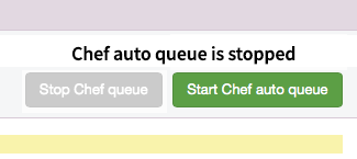
Both have their problems, and neither seems logical. The labels have always been "stop the job" or "start the job". Because these buttons are part of the interface, an accompanying label isn't the easiest to add. Here's a screenshot of how it looks right now:

current status

The TLDR of the problem is: you want to instantly see the state of the jobs, most importantly when the job is paused. But it also has to be clear what the button does: start the job, or stop it

Any tips are much appreciated!

3 Answers 3

6

I wouldn't rely on colours for the various reasons already given in the answers here.

I feel that what you are really looking for is more suited to the play / pause paradigm, so perhaps the most intuitive way to handle this is to imitate the icons used to play / pause music and videos. On youtube and other video sites, a pause icon is displayed on the button while the video is playing, and a play button is displayed while the video state is paused. Remember that the icon on the button should display the action available to the user upon pressing it, not the current state of the process being run or paused.

Of course the state in this case can be easily inferred by the user from the available action on the button.

1
  • I agree. Play, Pause, and Stop icons are the way to go for sure. Commented Apr 4, 2014 at 14:07
0

I agree that icons might help with the function of the button, and if the actions are "Stop" and "Start" that adds to the affordance, and would help clarify the state further for the user.

Since these are meant to show state AND function, presumably when you are in a particular state that control is not enabled - you wouldn't need to press "Stop" again if you were already stopped, for example. You might consider greying out the control that represents the current state; and if you want to be really explicit (never a bad thing when dealing with inherently ambiguous controls), you could add a status line so there is no doubt:

If the queue is not running, things might look like this:

enter image description here

Then while running, it might appear thus:

enter image description here

Being that explicit about the state might also afford you the opportunity to make the actual buttons more purely functional and less critical for their status; you might therefore be able to make the whole thing a bit more compact:

enter image description here

enter image description here

Separating state from functionality (and being explicit about it) can really help with clarity for users.

Hope that helps a bit!

-2

I highly recommend not using red and green background for buttons. Use blue as the primary action like in Bootstrap and gray as the secondary action button.

2
  • 1
    Why do you recommend this? We need answers to give explanation behind them, not just subjective opinions with no reasoning. Can you expand on this answer?
    – JonW
    Commented Apr 4, 2014 at 19:08
  • You don't want to have a red-background button with the following text: "Don't delete me" and a green button with "Delete me". Which one is the primary action? A good rule of usability heuristic is to ensure that all action buttons have uniform callout. Unless, there is a case where you need one button to stand out more than the other. In a form, "Save" and "Cancel" button, "Save" is usually the primary button shown by a eye focusing color because you want the user to direct their attention to saving the content. In the above example, either use Red or Green, Don't confuse the user.
    – DarkLord
    Commented Apr 4, 2014 at 21:02

Your Answer

By clicking “Post Your Answer”, you agree to our terms of service and acknowledge you have read our privacy policy.

Not the answer you're looking for? Browse other questions tagged or ask your own question.