3

I work on a desktop application that lets people create visual scripts. They can add properties to objects, and every property can have a user-defined icon for easy identification. I have added a picker widget that looks like a large button showing the icon, and when clicked opens a menu that lets the user select from the complete list of emoji.

However there is currently no way for the user to disable the icon (“clear” or “select none”), and I am wondering how to implement this. I have thought of the following:

  • add a right-click context menu with a single “Clear” or “Select None” entry; I don’t like this because it is not obvious that right-clicking will do anything, and a popup menu with only one entry seems weird.
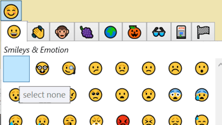
  • add an empty emoji at the beginning of the list, so the user can select it just like the others; I don’t like this because they will need to scroll to the top of the list, and maybe even navigate to the first tab; also none of the emoji have any borders so an empty button will just be appear as a blank space, and may even look like a rendering bug to the user.
  • add a “Clear” button… somewhere in the picker menu? I could not find a good place to put it. Also, should it have text or would an icon suffice? The emoji are very diverse and colourful, so an icon may not be appropriate.
  • add a “Clear” button outside the picker. If so, what should it look like?

What are good examples that I could get inspiration from?

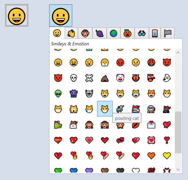
For reference, here is what the picker looks like right now:

emoji picker

Here is what an empty entry would look like:

empty button

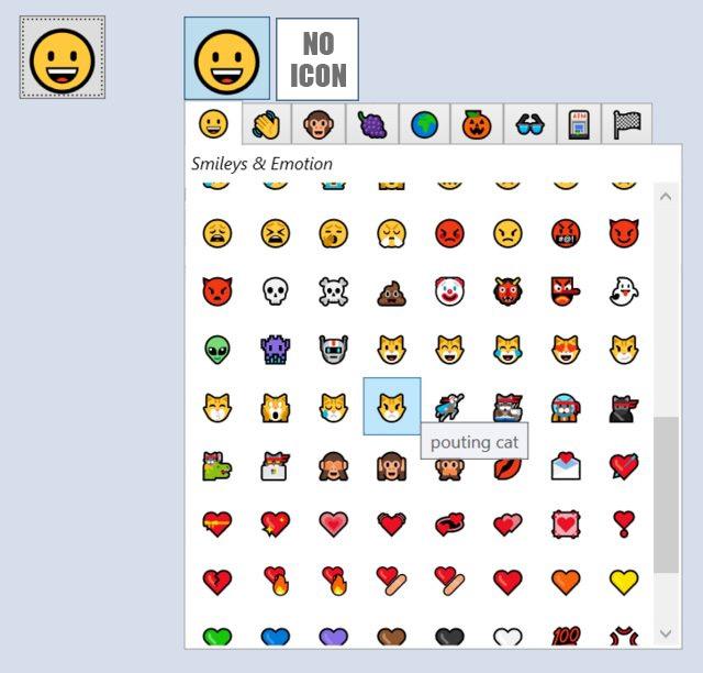
And an external button:

external button

4 Answers 4

2

Here's a suggested flow -

  1. If it's possible, within each property you could have an interaction that says, "Choose a suitable icon" and that opens up the picker widget in-place.
  2. User selects an icon and at the place of the "Choose a suitable icon" this icon is shown.
  3. Next to this icon, there are two interactive icon buttons - one for edit and other for clear selection.
  4. Clear selection just takes the UI to state 1.

If you need to start with the icon placeholder for some reason, maybe you could consider placing the Clear selection interaction at the bottom. The initial placeholder could be a blank transparent rectangle with a hover/tooltip saying, "No icon selected" for better usability and understanding.

Hope that helps!

2

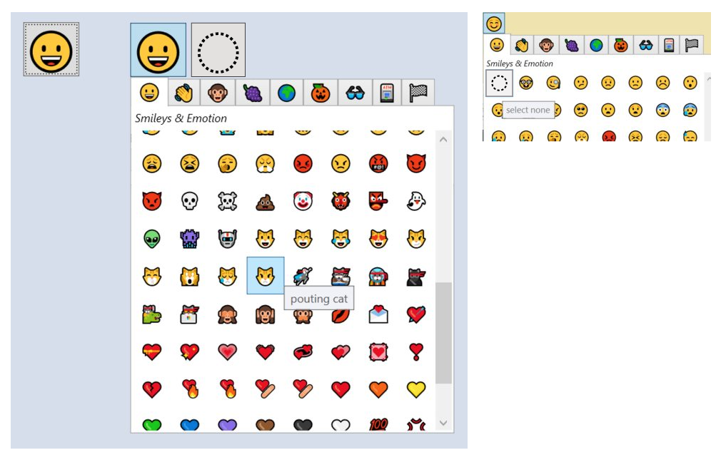
The select nothing for an icon could be the absence of icon or the icon not defined.

enter image description here

1
  • 1
    Thanks, that’s an interesting suggestion, especially since the character ◌ (U+25CC) is readily available. Commented Mar 3, 2021 at 11:27
2

I think it should be a button icon next to the currently selected icon. That's where it best fits. You could put a text explanation next to it too if you think it's needed. Clicking on it is pretty explanatory and not that big of a discovery violation.

enter image description here

0

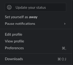
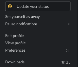
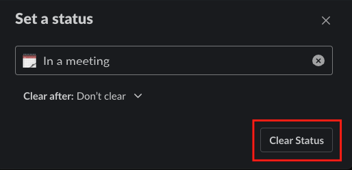
Slack is done this job very well. When you couldn't select any status it shows a line icon with a place holder text and when hover it replace it with real emoji. This indicates the users can change the emojis and enter the status.

Default view

Hover View

Clear Status

Your Answer

By clicking “Post Your Answer”, you agree to our terms of service and acknowledge you have read our privacy policy.

Not the answer you're looking for? Browse other questions tagged or ask your own question.