1

On a mobile app what would be the best way to differentiate between viewing a current 'item' vs selecting an 'item' using icons.

In my specific case, its for a religious app where the person counts each day towards a holiday and a religious text is said each day. They can either view the current days text or select a day from a number picker dialog box (so I don't want to have a single icon which contains both the number picker with an option for today as I don't want to add unnecessary complexity or the extra step of choosing a day as people will almost always want the current day).

As of now I just have it as a drop down menu which has 2 options saying 'Today's Text' and 'Select Day', but I would like to have icon only options for greater visibility/quicker access.

5 Answers 5

1

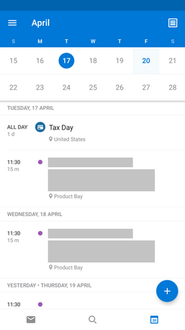
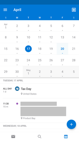
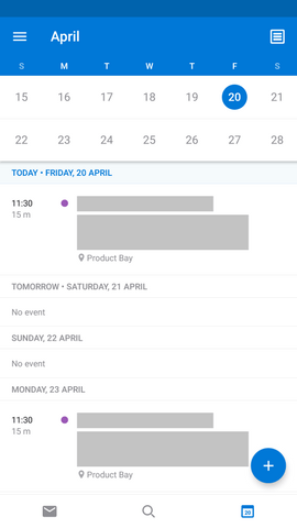
Take a look at how Microsoft Outlook mobile app displays the calendar and today's events.

The default view shows Today's events:

MS Outlook Today's View

You can easily navigate back over the past week or over the next week:
Note how 'Today' is still highlighted.

MS Outlook Selected Day's View

For a more detailed history, you can swipe down the calendar area to open it up and see an overview of which dates have/had events, and then select a date to go to.

MS Outlook Calendar View

0

I would suggest using a calendar like icon with a check in the center to signify today. Then a normal calendar icon to signify other dates. If you search Icon for today, you will see several examples of that icon. Another suggestion would a calendar with an arrow to signify today. This is an example from FontAwesome.

As for your initial question, I would suggest using an "active" styling similar to common practice in HTML. User would be acclimated to this. For instance changing the color of the the current 'item'.

0

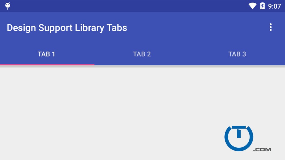
Why not use fragments/ viewPager with a tab layout that will do that for you.

Have your two fragments : today and pick date, the tab layour automatically uses your colorAccent to underline the active fragment, the Today fragment is loaded as default.

Upon swiping or tapping on pick date, the second fragment comes into play and you can select a date, after date is selected a new activity with that date as the title is created and all info are given.

enter image description here

0

1 question I have on this.

Q. How many days in the past would the users usually go back to?

Ans 1: Usually 2-3 days back I would use the following as a potential solution

Display today's date and today's text as the default. Enable swipe on this card to show the previous date and previous date's text. You can have up to 5 cards like these. This takes care of the users needs to look at up to 4-5 days worth of texts.

Ans 2: Any day in the past Use a date-picker where the users can pick any date and then the text for that date can be displayed in a dialog. That way the default for today always stays and they can always get back to it.

Another approach:

Alternatively you can combine the two approaches together and have 5 cards along with a date picker to pick a particular date.

Let me know your thoughts! Happy to chat further.

0

I think you may be hinting at my answer in your own question. Why not show today's text by default, and let them pick other days using your dialog?

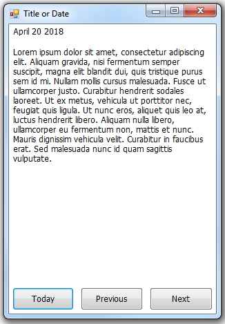
Okay, I whipped up a Windows form for you after my comment about adding a gesture to go to today's date. Your comment about polluting the screen with a button to achieve this made me think about how "polluted" the screen might be just by adding a button. Personally, I don't really think using the entire screen for text is very appealing--you need some margins, etc. or it looks like smashed ants.

enter image description here

You probably don't have a title bar, but if you did you could put your app name or the date the user is on. I did add the date the user is on above the "Lorem" where your text would go. The buttons on the bottom don't seem too obtrusive to me, but I guess it's a matter of personal preference.

4
  • Welcome to UX.SE! Be sure to take a stop by the Help Center to get a feel for how we answer questions here. After that, you can edit your answer to expand on your suggestions a bit. Your answer could afford to include some examples, sources, a wireframe/sketch, or some other forms of support. Thanks, and welcome! Commented Apr 19, 2018 at 18:07
  • Thank you for this answer I do show the current days text by default. However, if they switch to another days text I need an easy and obvious way for them to get back to the current days text (I'd rather not pollute the screen with a "Go to todays text" button on the screen that shows another days text).
    – yitzih
    Commented Apr 19, 2018 at 18:23
  • @maxathousand--thanks, I will try to do that. My answer was so simple that I really didn't think it needed much expansion.
    – Roger D
    Commented Apr 20, 2018 at 15:03
  • @yitzih--if you track just the last day they were on, the Back button could be set to go to that day's text. For situations where they've looked at many days and want to go back to today, the only thing I can think of (besides having a button) is to set up some sort of gesture to go to today. (It could be as simple as swiping left or right.)
    – Roger D
    Commented Apr 20, 2018 at 15:07

Your Answer

By clicking “Post Your Answer”, you agree to our terms of service and acknowledge you have read our privacy policy.

Not the answer you're looking for? Browse other questions tagged or ask your own question.