2

I am trying to redesign a wizard step in a mobile application setup. The user should input the year and months of experience and there should be an option to select something like "I don't have any experience at all".

The year and month are both important for business requirement reasons, so, for example, "6 years and 11 months" has a significant difference with "7 years".

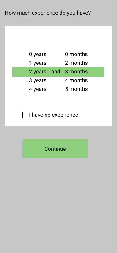
What I have come up with so far is something like the design below:

enter image description here

Basically, I am using the pickers like iOS's design patterns.

My research involved searching for drop-down patterns in mobile devices and they usually end up saying that pickers are the right way for dropdowns; either like this or in a modal.

However, we might have up to 20 years of experience and scrolling through 20 items and then 12 more items for months might not be that intuitive.

Also, I am not sure about the check box that says I have no experience either. Is it enough that we have already 0 months in the pickers? Should the input be disabled completely when they check the checkbox?

I'm open to any ideas since I am kinda blocked. So any suggestions could help me think of something better or more intuitive based on the answers.

1
  • I think the spinner is a good solution if it is implemented like in iOS, where one can scroll past the visible area and also fling the spinner to keep it spinning and get down faster. So I can just swipe quickly upwards and the spinner would quickly spin down to the 20s and I could then stop it and fine adjust it. Furthermore you can probably cap experience somewhere at 20 years and just put "more than 20 years" to keep the spinner range small.
    – Falco
    Commented Jan 18, 2022 at 14:03

2 Answers 2

1

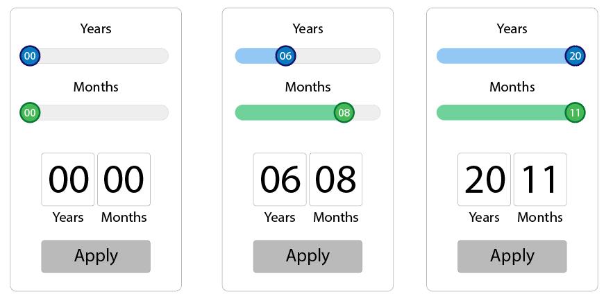
You can use a range selector like this one with a result viewer where the "no experience" is when applying the default position = 00 - 00

RangeSelector is a "double slider" control for range values.

enter image description here

7
  • I wouldn't recommend a range selector, as it's difficult to select a precise value. MDN says it well: "Because this kind of widget is imprecise, it should only be used if the control's exact value isn't important." Some good use cases for range selectors are volume or screen brightness adjustments. Also, if a user would like to enter more than 20 years 11 months, they cannot? Or would you have to update the range selector to now span 0-25? 0-30? Now it's even more difficult to use. Commented Jan 18, 2022 at 13:49
  • The question says "up to 20 years". I wonder what could be imprecise when jumping from one to one in 20 or 12 steps? A range control with jumping steps makes it very precise.
    – Danielillo
    Commented Jan 18, 2022 at 14:11
  • I saw that the question specified "up to 20 years," but there's a very real chance that limit could change in the future. I just meant that the precisely selecting a value on a range selector requires a higher degree of physical dexterity than the proposed iOS picker-style input because the amount of screen space dedicated to each value is much smaller. Say, ~350px of device screen width (after left and right margins subtracted), you're left with 17.5px per value. Touch is already a coarse input mechanism and 17.5px is not a lot. Commented Jan 18, 2022 at 15:09
  • – there's a very real chance that limit could change in the future – 😅 Well, if we base all the questions and answers on what can become in the future... An answer is something acceptable or not within the limit of what is questioned in its formulation. Answering based on assumptions would make this endless, and also quite imprecise 😉 .
    – Danielillo
    Commented Jan 18, 2022 at 15:16
  • Designing with the reality in mind that a certain requirement might change is wise, not pointless, especially if a small change might render a certain design unusable. The design proposed above is already quite a tight squeeze into the available width. Having a little forethought now might save OP from having to completely redesign this screen when the limit is raised to 30 years, and users are complaining that 11px per value is far too small to accurately input their job experience. Commented Jan 18, 2022 at 16:29
0

I am not sure if I understand correctly:

So, your sketch shows the full page? There is no dropdown/overlay involved?

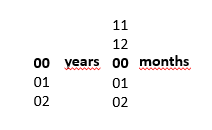
What came to my mind was somthing like the way we select the settings for a timer: revolving digits for years and months. The green bar in the sketch confuses me, what can be scrolled?

I would try something like this:
number spinner, years, numberspinner, months where each column can be spun individually
A graphics designer will have to work on this, of course ;-)

Regarding 0 years, 0 months for no experience: This depends on the users. For people with lower tech affinity I would add an extra checkbox or switch.

Your Answer

By clicking “Post Your Answer”, you agree to our terms of service and acknowledge you have read our privacy policy.

Not the answer you're looking for? Browse other questions tagged or ask your own question.