21

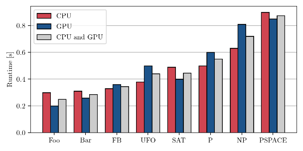
I am presenting results from an experiment in an academic publication. Here is what the figure currently looks like:

Current figure with mean of two bars added as a third bar

The gray bars are the averages of the red and the blue bars.

Goals

  • I want to show the reader how the methods perform on average, as displayed by the gray bars.
  • I would also like the reader to be able to compare the methods based on the red bars and based on the blue bars.

Problem

Right now, the visual complexity is quite high and the repetitive color pattern makes it hard to immediately see what's going on.

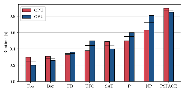
I have tried removing the gray bars and displaying them as horizontal lines between the red and the blue bars, but that did not look good either:

5
  • 2
    The proper way is the second way but you can connect the dots to make a line showing the average.
    – JonH
    Commented Nov 12, 2020 at 18:11
  • Are you really suggesting a reader capable of understanding that sort of data won't absorb it better without the interference of the grey bars? Either way, how do the red bars and blue bars help the reader to I would also like the reader to be able to compare methods? Results, surely, but methods, how? Commented Nov 12, 2020 at 20:11
  • 2
    Simply making the order (red, grey, blue) instead of (red, blue grey) solves a lot of the problems with clutter. Commented Nov 13, 2020 at 5:43
  • 1
    This isn't an appropriate use of a bar graph anyway. Use a scatterplot, violin, or boxplot to show the distribution around the mean. Commented Nov 13, 2020 at 14:47
  • 1
    I would just stick with your second and add a legend entry for the line (maybe make the lines a little less wide). Also, reconsider your colors; they might be little hard to distinguish if they're printed in grayscale or for someone with total colorblindness.
    – anjama
    Commented Nov 13, 2020 at 19:34

6 Answers 6

32

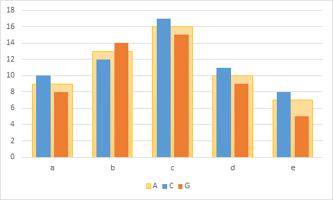
You could show the average in a large bar, and put the separate categories inside in smaller bars.

If you use Excel and use two axes, make sure they both have the same scale.

Bar chart with parallel histograms pairwise inside a parent box

1
  • +1 This is an elegant solution, that is very hard to mistake for anything else! :)
    – mishan
    Commented Nov 14, 2020 at 15:50
15

If you really just mean the average of the two numbers, why not just leave the gray bars out, with nothing in their place? It's pretty easy to estimate visually. I think that's why there are few examples for you to base your design on.

1
  • 2
    It's easy to imagine datasets for which the average is not easy to estimate visually. Commented Nov 13, 2020 at 14:32
14

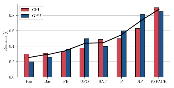
A simple idea would be to show the average as a line graph, like this:

enter image description here

5
  • 14
    Thank you for this suggestion! I like that it highlights the performance difference between neighboring methods. On the other hand, the curve might suggest some kind of trend, as if the x-axis would display a numeric quantity. However, interpolating between two methods does not really make sense. Do you have an idea of how to fix this? Commented Nov 12, 2020 at 11:14
  • 4
    Personally, I wouldn't be inclined to interpolate, because the chart shows bars as well. But YMMV. Perhaps using a dashed or dotted line would help?
    – Glorfindel
    Commented Nov 12, 2020 at 19:20
  • 34
    Personally, I hate joining things up with a line if the x axis is not naturally totally ordered. It’s very misleading. Commented Nov 13, 2020 at 5:31
  • 1
    @AdamChalcraft exactly. It suggests that UFO is the average of FB and SAT, for example. Commented Nov 15, 2020 at 7:48
  • This is the solution that is used in some popular libraries, like highcarts, so it must be pretty common... For me, the most elegant solution for average is a vertical line for every set of data, 1 px width, in the middle, but only if the evolution is not important. If on the x-axis are month, for example, the evolution of the average is ok to be visualized as a line graph. Commented Dec 11, 2020 at 14:16
14

Your second one seems fine to me to be honest. It's the least extra 'ink', and it's how single series bar charts show averages, you're just doing it for the items at each x value. You can see an example here for your exact situation --> https://peltiertech.com/add-individual-target-lines-to-each-column-chart-cluster/

What you will find is that it's fiddly to do this in most chart drawing packages (that link has a way of doing it though for excel)

1
  • I agree. I think OP's second one is better than any of the 5 alternatives suggested so far. The only change I would make is add a 3rd legend entry to show the black line as the mean/avg
    – anjama
    Commented Nov 13, 2020 at 19:21
6

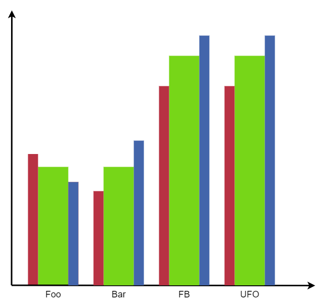
Given that you want the viewer to focus on the average value (but with the individual components available for comparison), I would make the central bar represent the average, and make it wider than the bars either side (representing CPU and GPU alone). I would also probably go with a more "standout" colour than grey for the average:

enter image description here

The widths of the outside bars and their colour/brightness compared to the central bar will affect how much (or how little) they will fade into the background.

5

Thank you for your answers! They have all been insightful and I don't think it makes sense to accept a single answer since the specific requirements differ from case to case.

Here is what I went with in the end. It is very similar to plotting small horizontal lines, but I found the diamond markers to be much more visually appealing.

Final solution the OP used

2
  • I would say black ticks were best of all. But it depends on what you want to accent in your chart, of course. With ticks it is a bit easier to see actual values. Commented Nov 16, 2020 at 10:16
  • That's what I like about the diamond markers - their left and right corners still make it easy to see the actual values. Commented Nov 16, 2020 at 10:33

Your Answer

By clicking “Post Your Answer”, you agree to our terms of service and acknowledge you have read our privacy policy.

Not the answer you're looking for? Browse other questions tagged or ask your own question.